- Modern English Lakeside
- Lakeview Modern
- Waterfront Stone and Glass
- Lake Point Estate
- Sunny Lake Home
- Sonoran Modern
- Contemporary Prairie Style
- Linden Hills Cottage
- Lakeview Shingle Style
- Kenwood Shingle Style Cottage
- Timeless Lake Home
- Calhoun Contemporary
- Excelsior Bayside Cottage
- Modern English Country House
- Minnetonka Shingle Style
- Contemporary Cape Cod
- Stone and Shingle Courtyard Home
- Equestrian Country House
- Italian Villa
- Edina Arts & Crafts
- Nantucket on White Bear Lake
- Modern English Cottage
- Shingle Style Reimagined
- Bluffside Home
- ▪





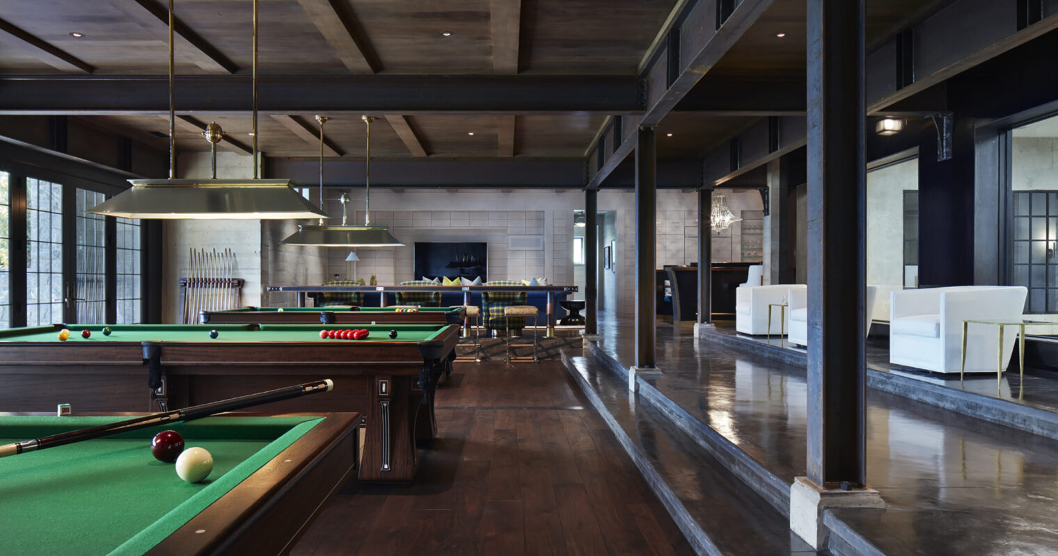
Modern English Lakeside
Lake Minnetonka



Lakeview Modern
Minnesota
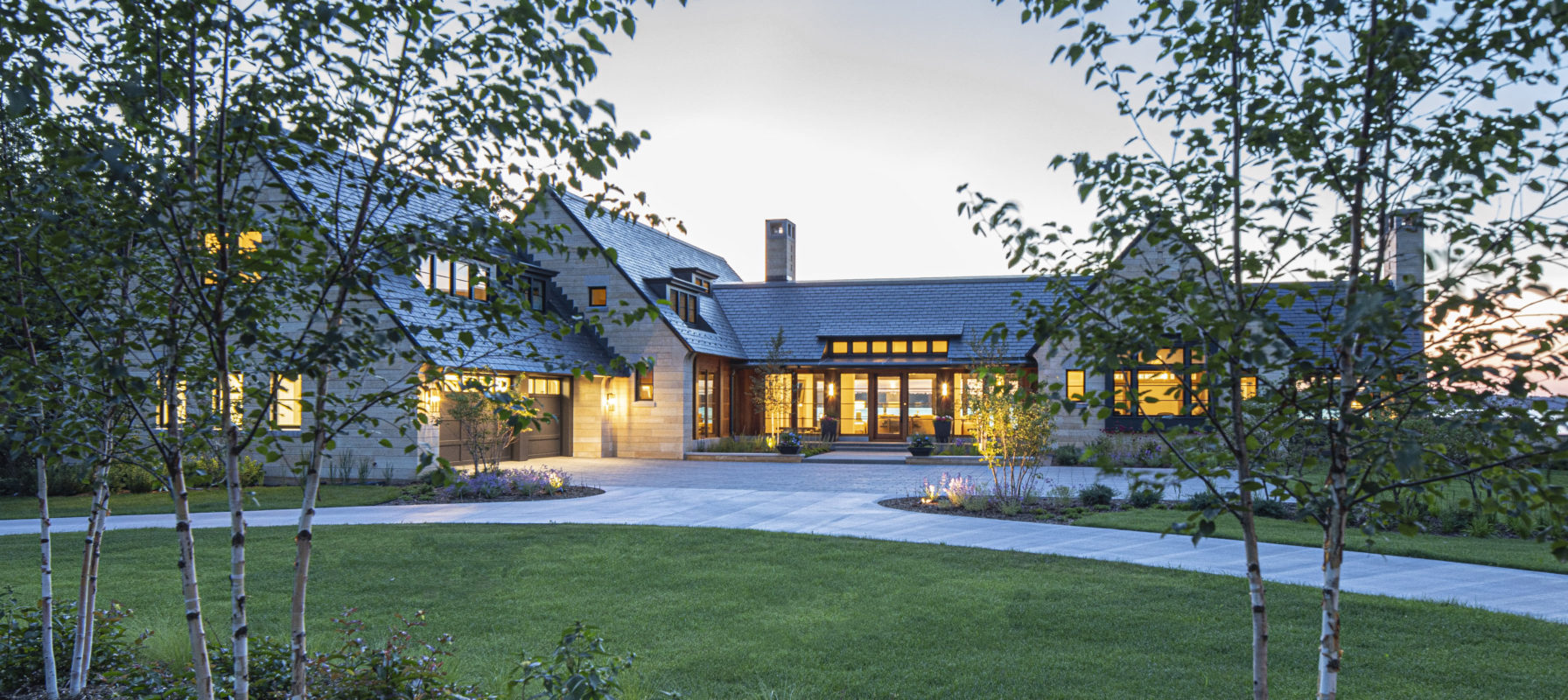
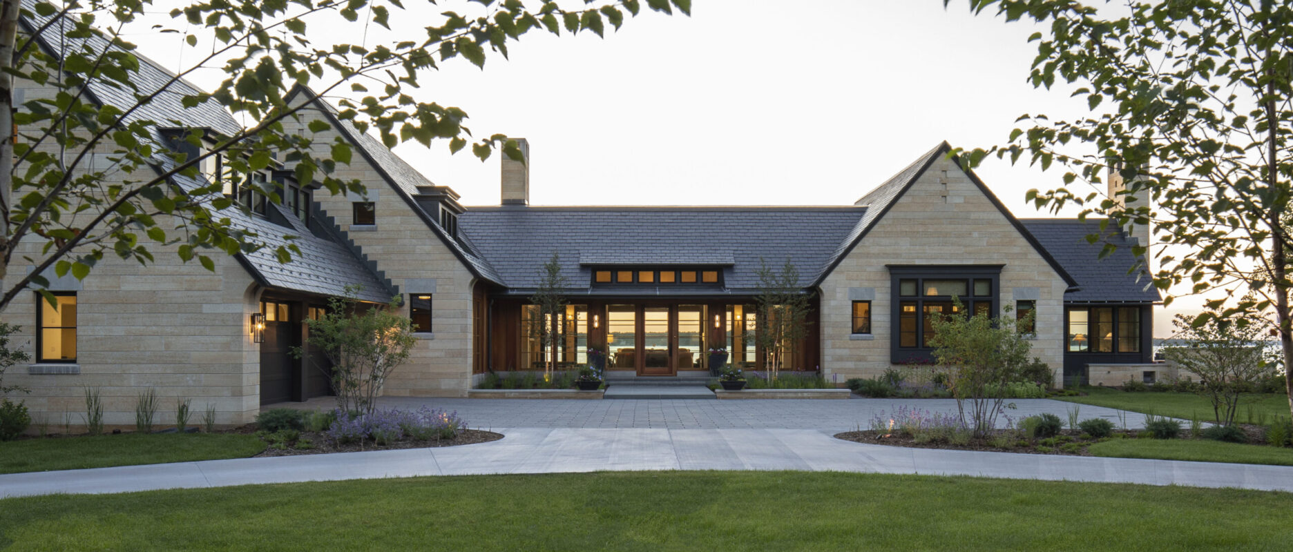
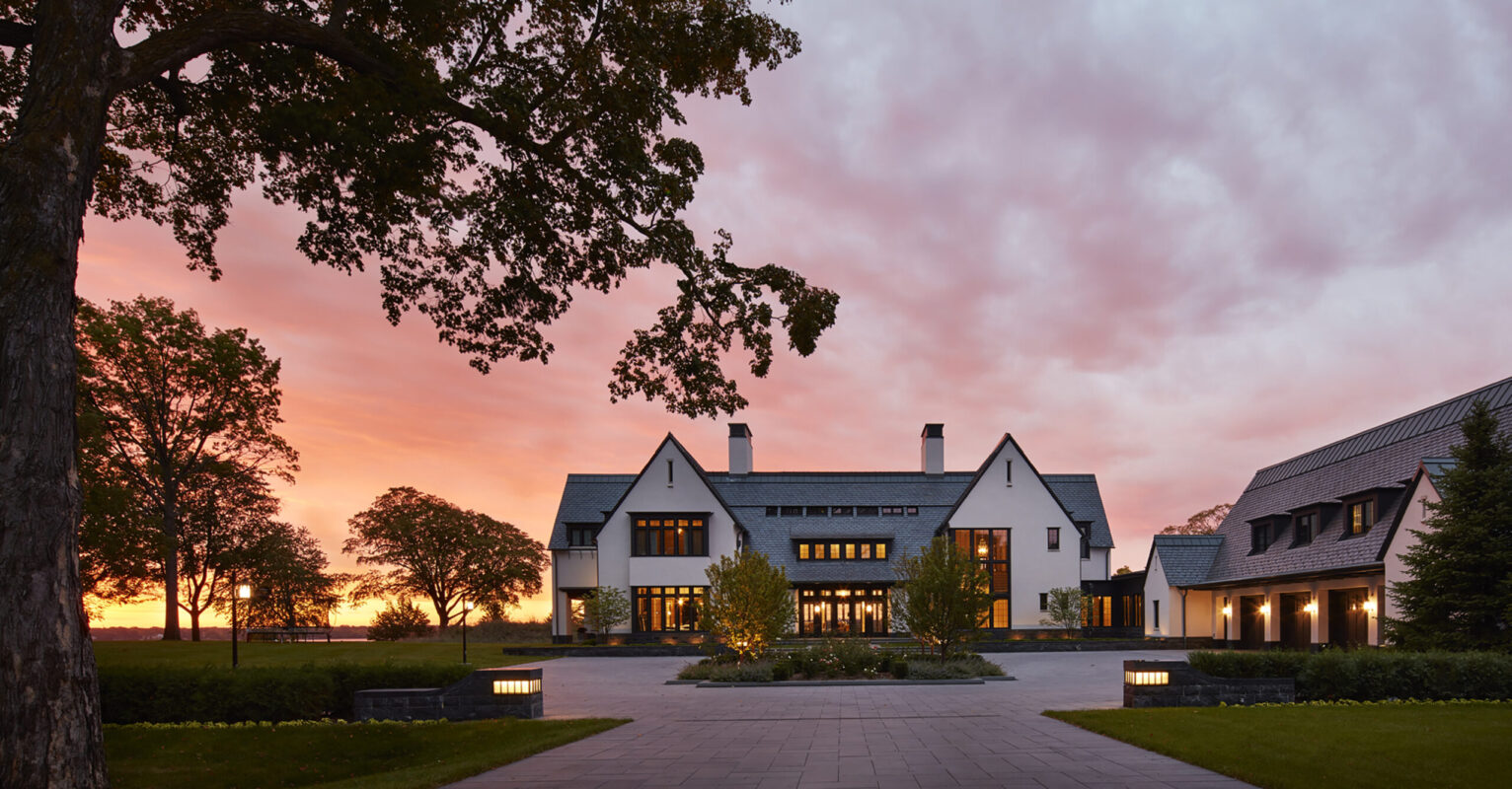
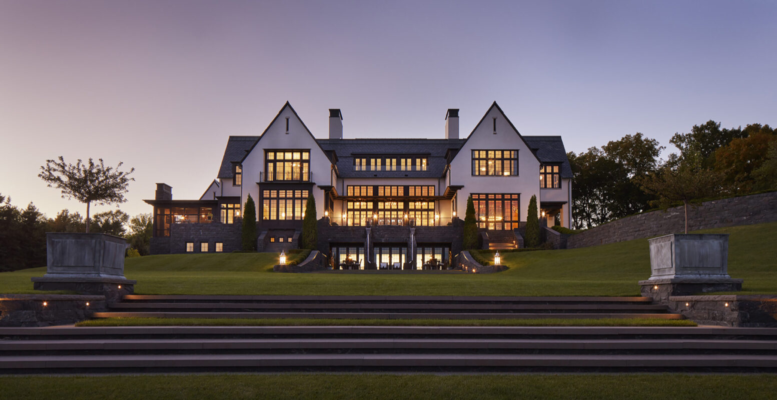
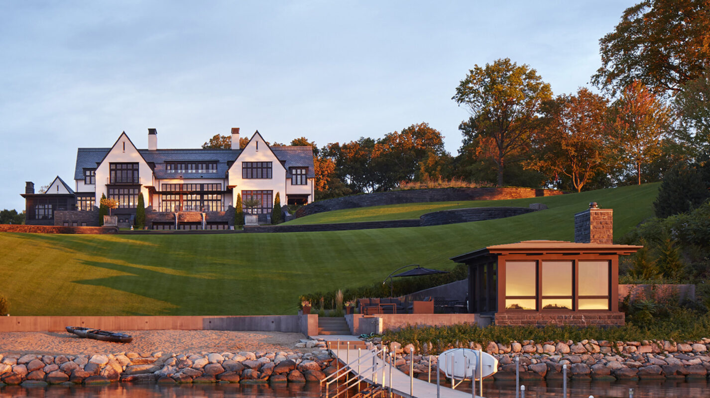
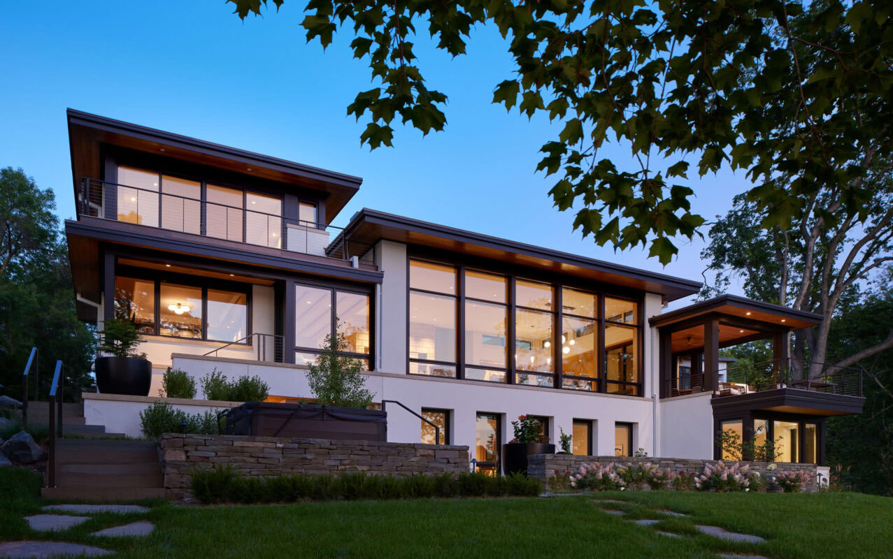
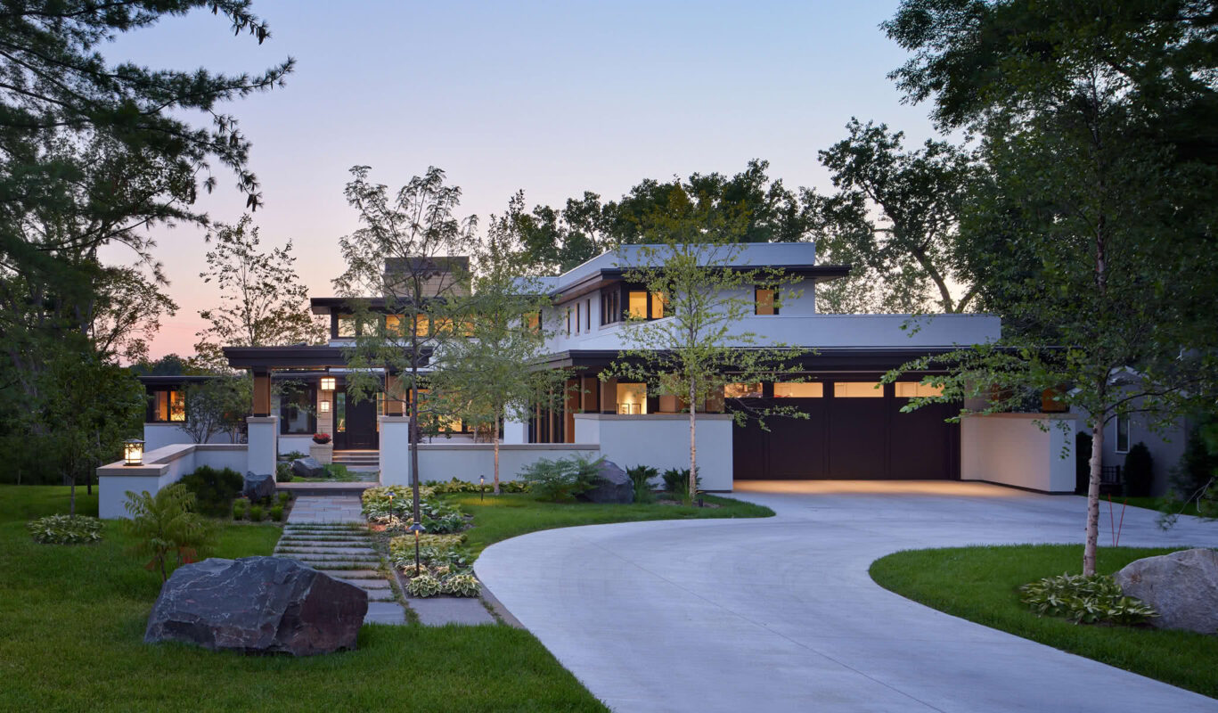
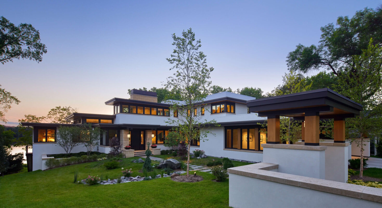
Our clients wanted a traditional look for their new home on a lake—but the feel of a tranquil retreat. Limestone gable “anchors” lend traditional form. But in material execution and planning, it is modern, with glass expanses creating openness and light.

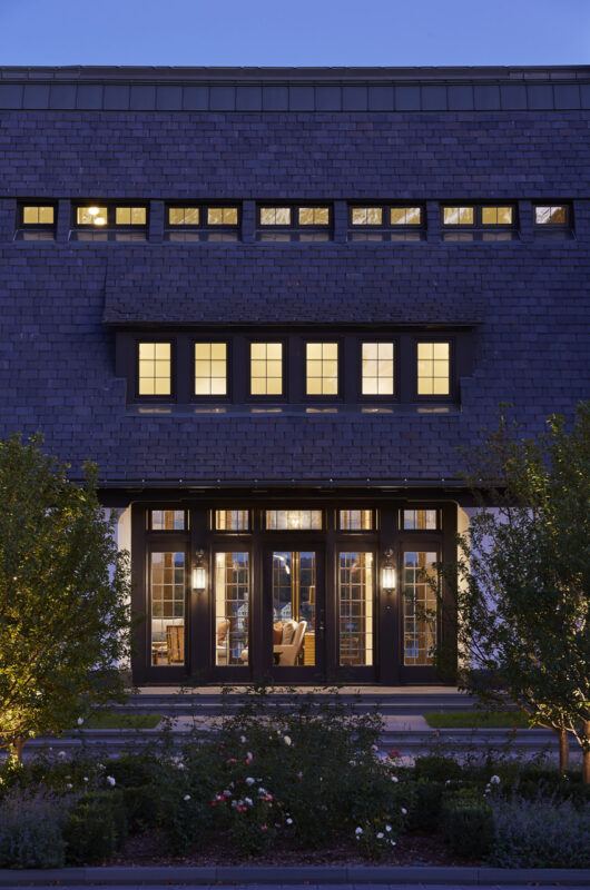
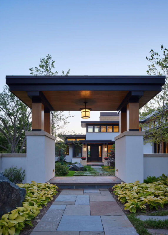
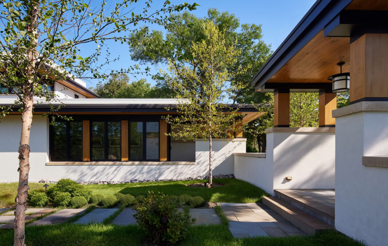
Typical entryways often obscure the main attraction. Here, you’re invited to the lake itself. South-facing dormered windows bring in dappled sunlight throughout the day.
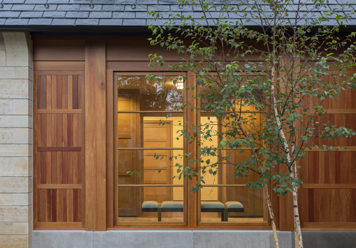
A restrained palette and clean lines give a tranquil, calm presence. Natural Honduran mahogany provides warmth to the composition.
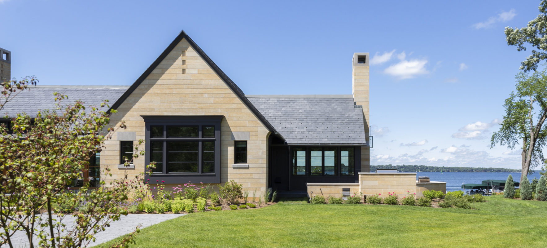
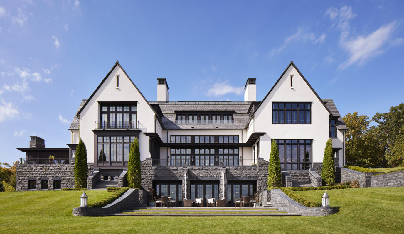
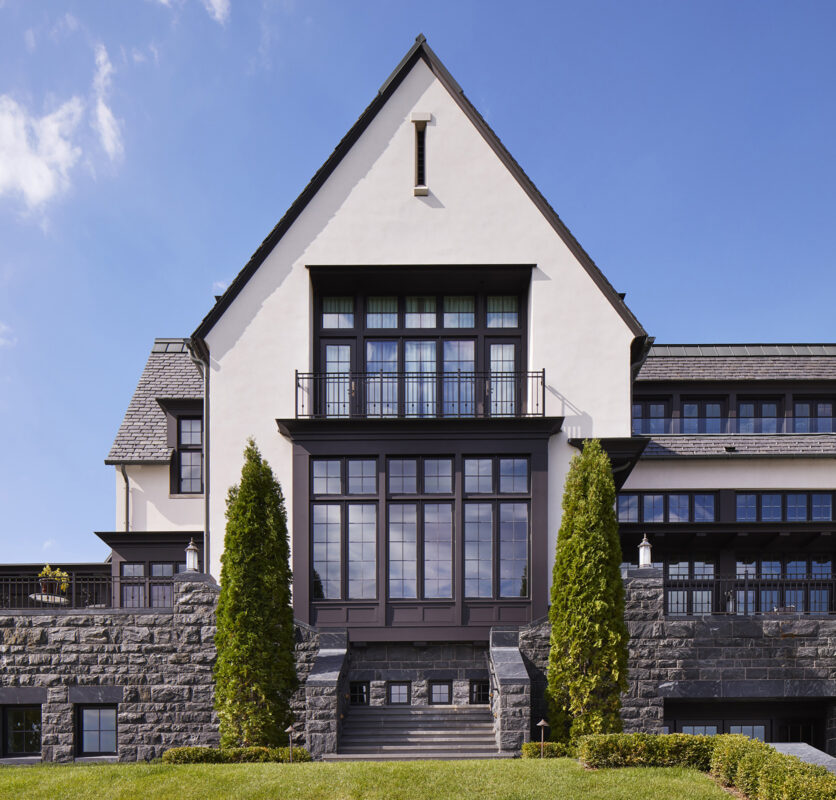
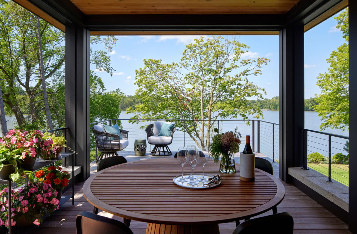
Kasota stone conveys the sense that the home has been here forever, and provides a visual counterpoint to the glass. Exterior fireplace and outdoor “rooms” are integral to the design, and add to the joy of lake living.
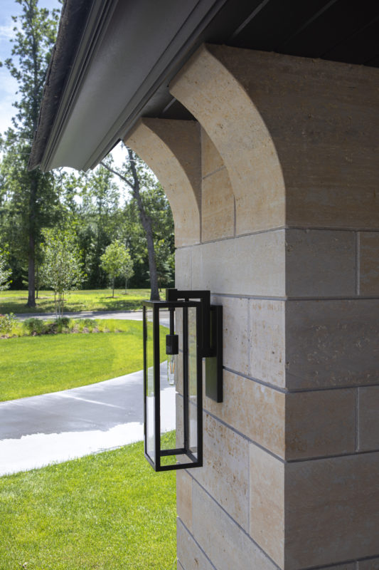
A great deal of design thought is evident in details like the bracketing of stone, the warmth and variety of textures, the moldings.

The cut-granite wall and landscaping design reinforce the clean horizontal lines. A lakeside living room is created by the paired gables and walled terrace, while the actual living room is set back for a bit of privacy from neighbors.

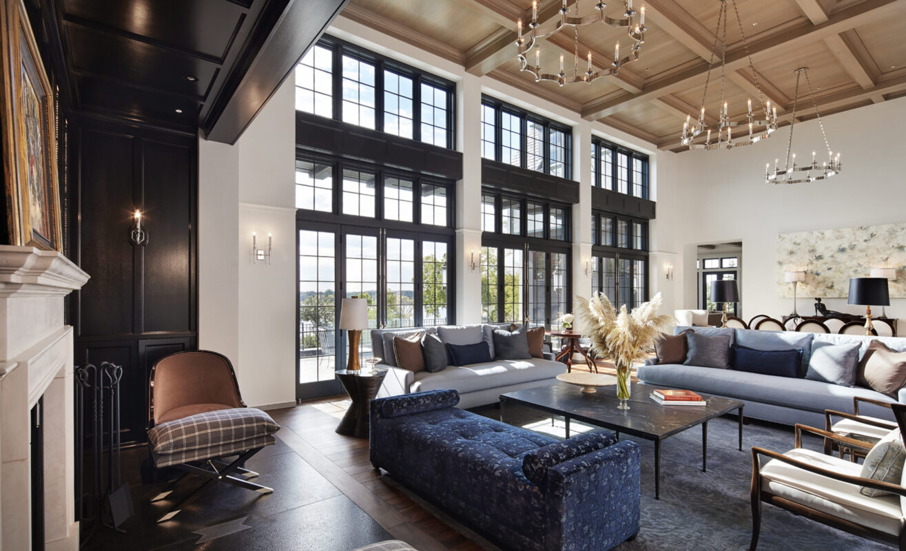
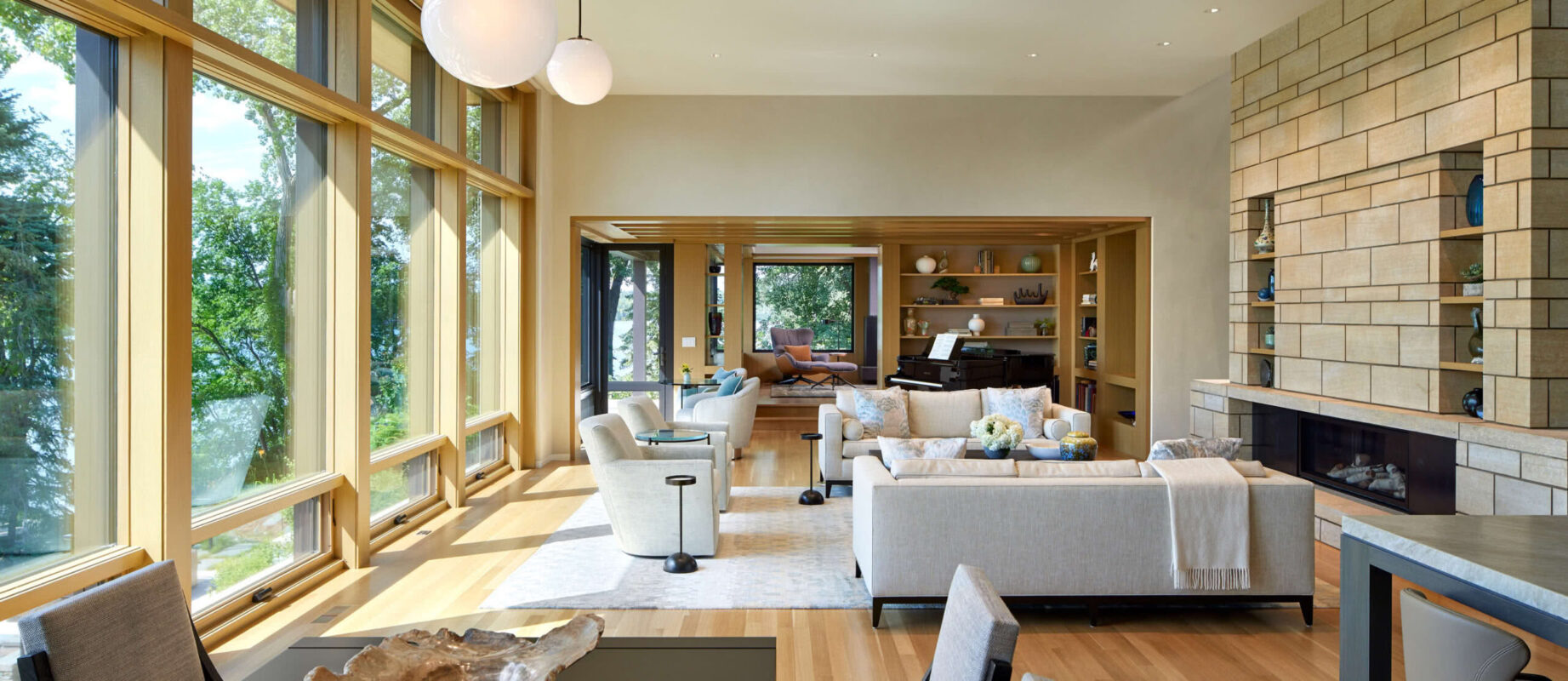
Black walnut floors contrast with the softness of unpainted, lime-plaster columns, walls and ceilings—which provide a depth and play to sunlight.

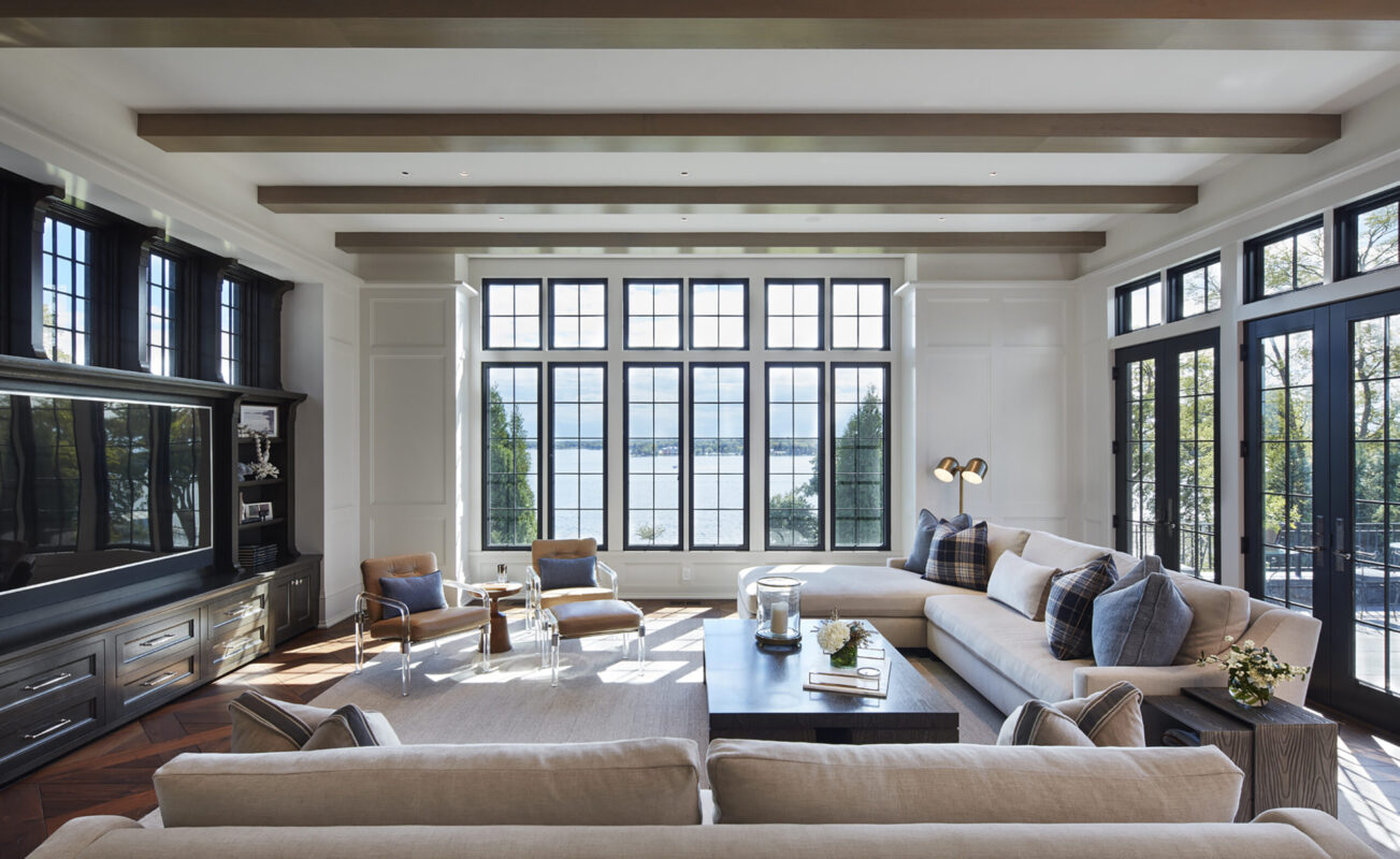
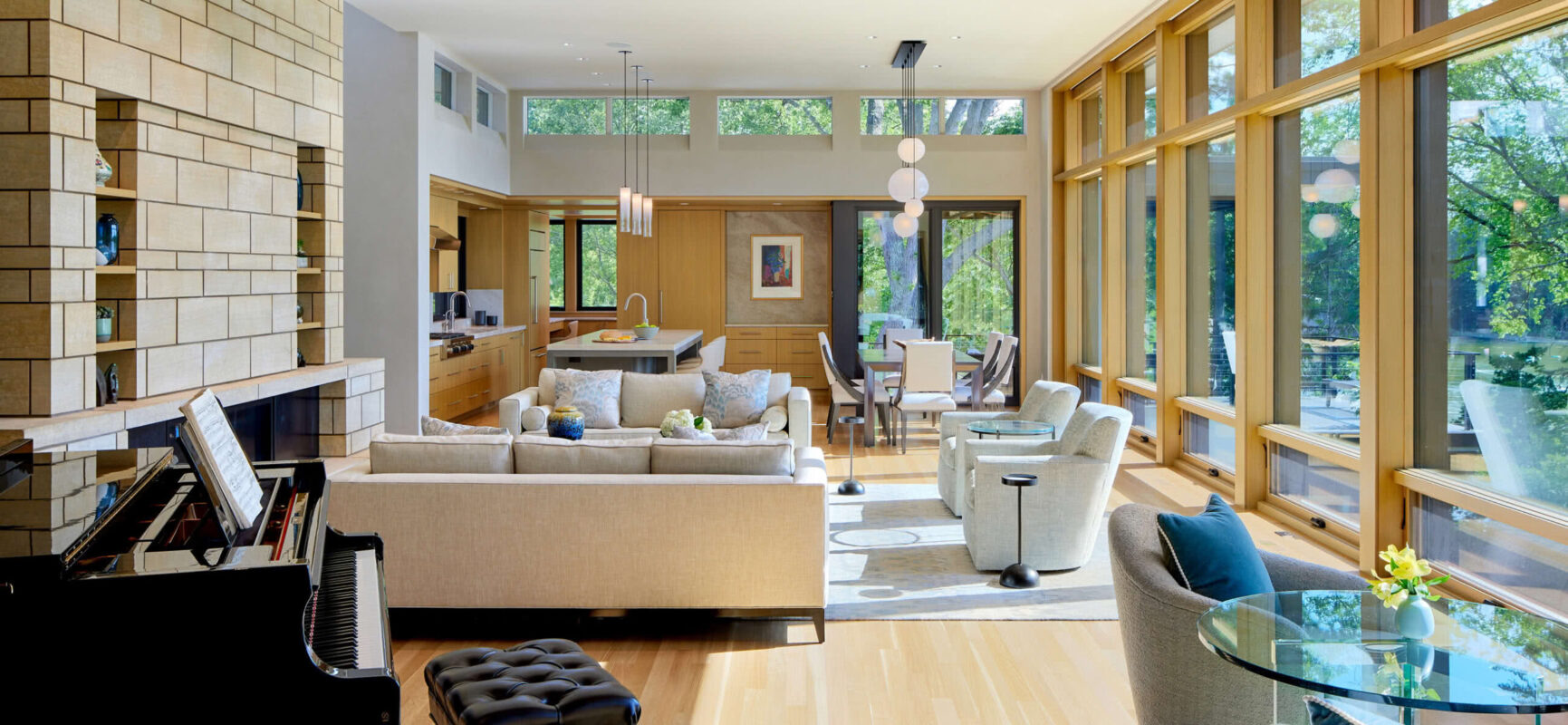
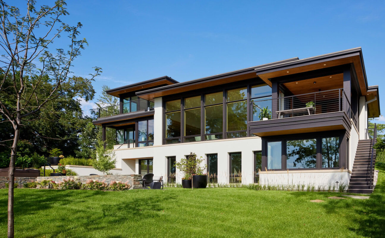
We stretched the house plan along the lake to provide more rooms with great views. By keeping the living space narrow and flanking it with glass on both north and south sides, light pours in and creates a dynamic space all day.
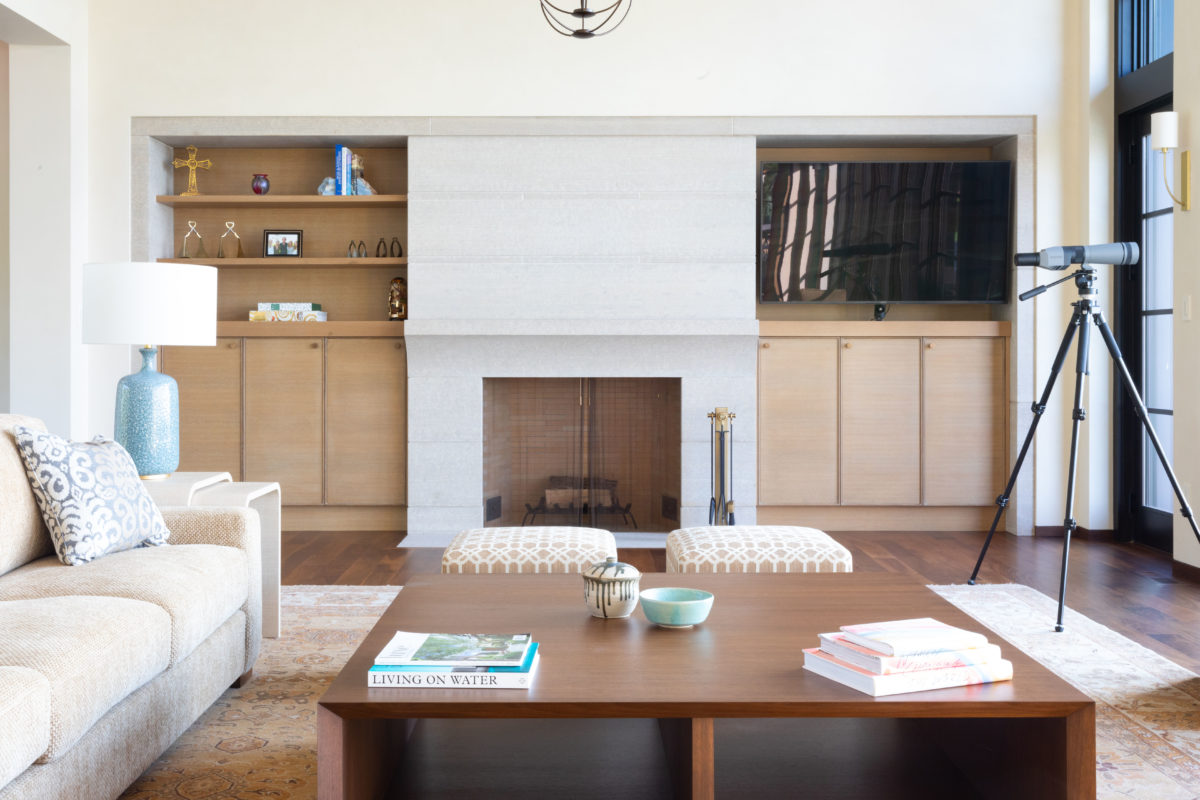
The fireplace stone is from the same quarry as the home’s exterior, but lighter in color—creating a visual echo. Subtle detailing, a subdued palette and continuous, horizontal lines add to the overall calm.
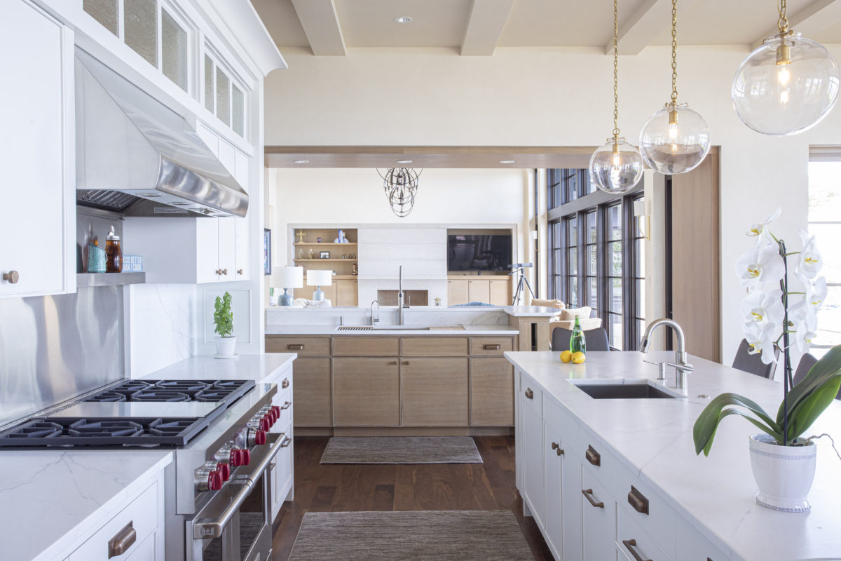
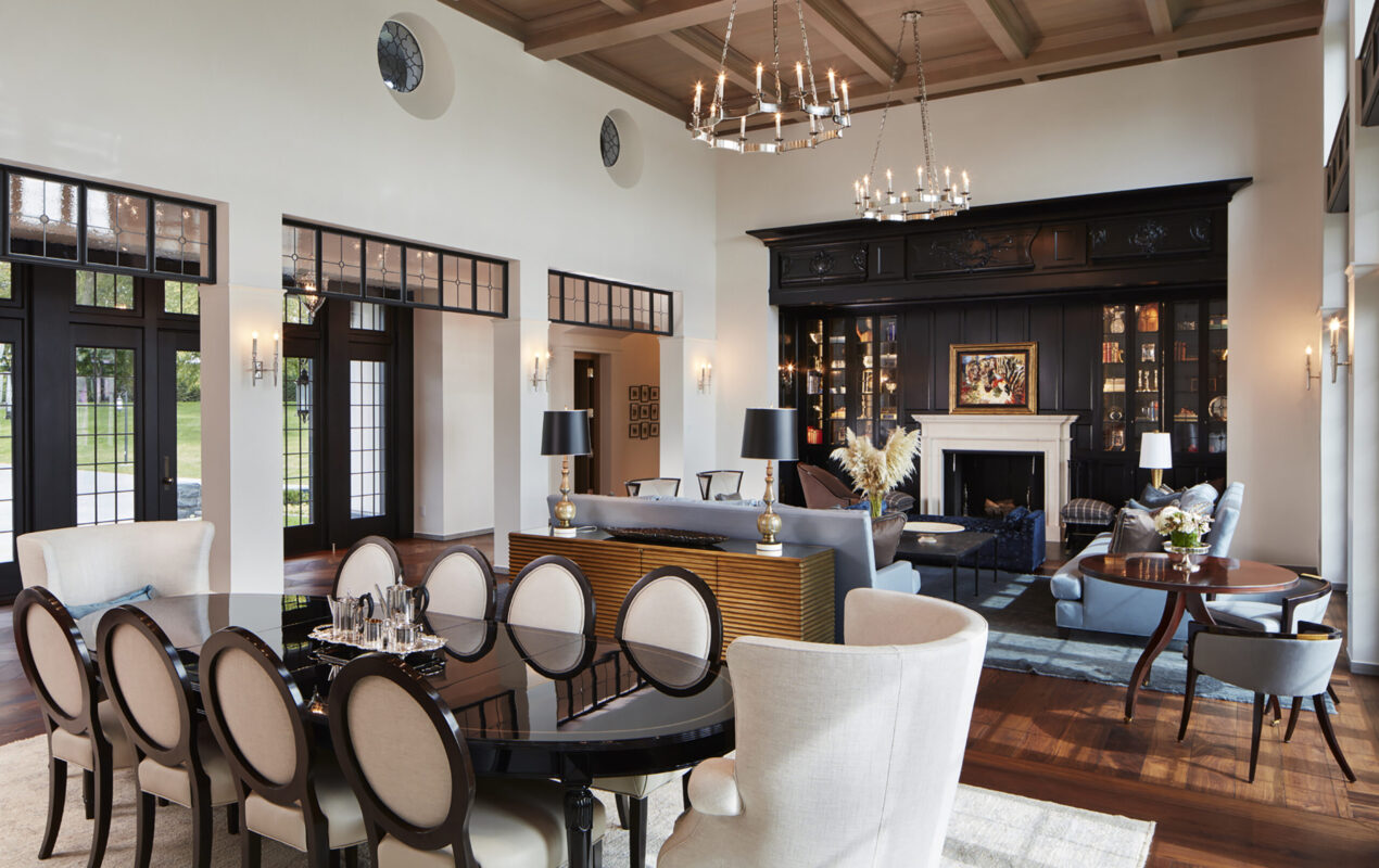
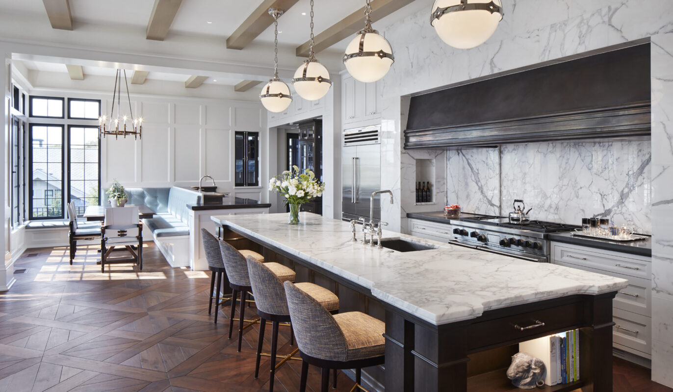
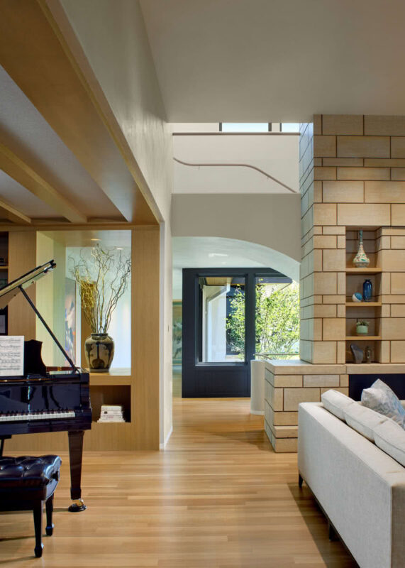
Living spaces are open to each other and organized on strong axes, borrowing views and sharing light from room to room. Rift-sawn wood cabinetry, with little variation in grain, and minimally marbled Carrera countertops add to the sense of tranquility.

A peninsula, framed around and under in oak paneling, transitions living space into dining space. The curving, shelved area at its end provides a subtle focal point, and moves the eye into the next, light-filled room.

The floating pantry with overhead “windows” fills multiple functions—from elegant sink, cooking, and counter space on one side, to invisible storage and workspace behind it, to conduit of natural light.

The stretched-out form of the house, with its multiple room projections into the landscape and large expanses of glass, erases the barriers between indoor and outdoor living areas.

A lowered ceiling and warm wood panels create an intimate, cozy room, while the use of stone on floors and walls synchronizes interior and exterior.
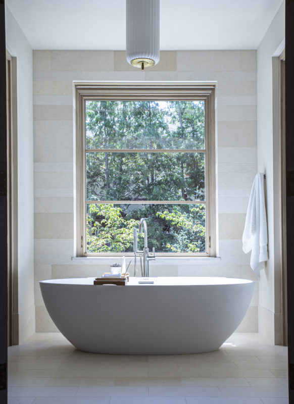
Here, a study in Zen—created with simple shapes, symmetry, and a minimal palette of natural materials.
Waterfront Stone and Glass
Northern Minnesota


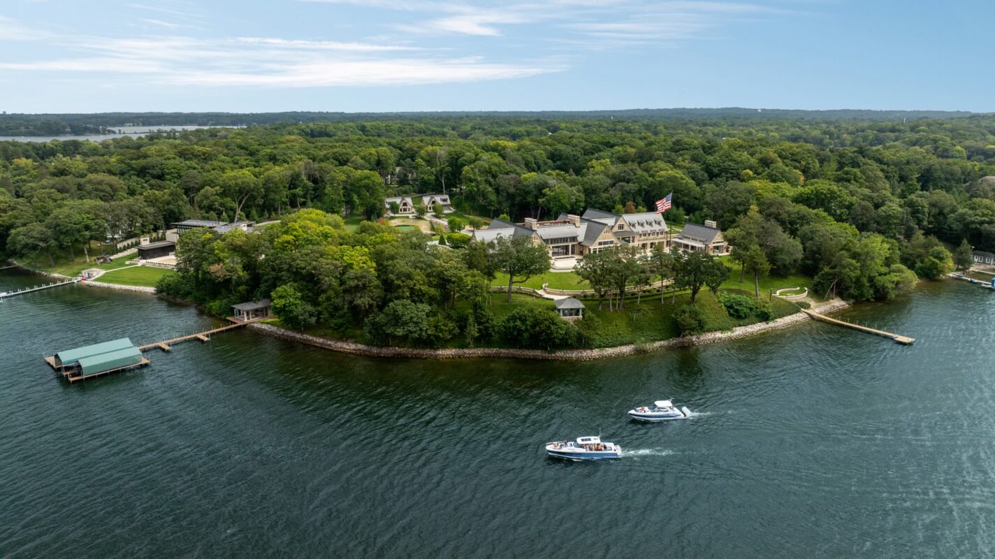
Lake Point Estate
Lake Minnetonka, MN

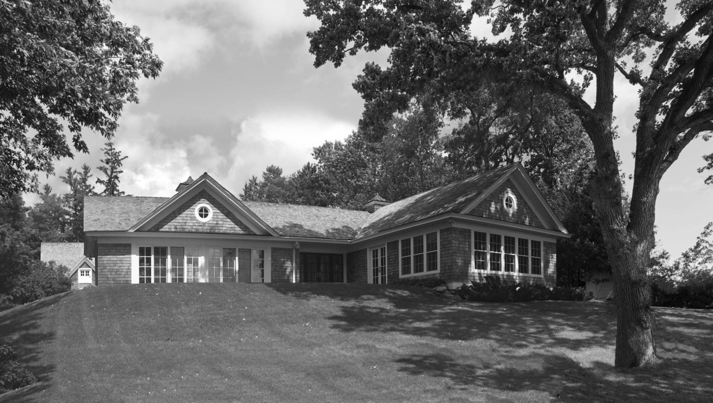
Originally a pool/guest house, the homeowners had always hoped to remodel and move in when ready to downsize.
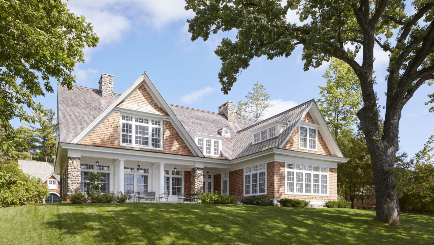
The challenge? To create a home that feels historical, yet is designed for contemporary living—while making the most of the original structure.
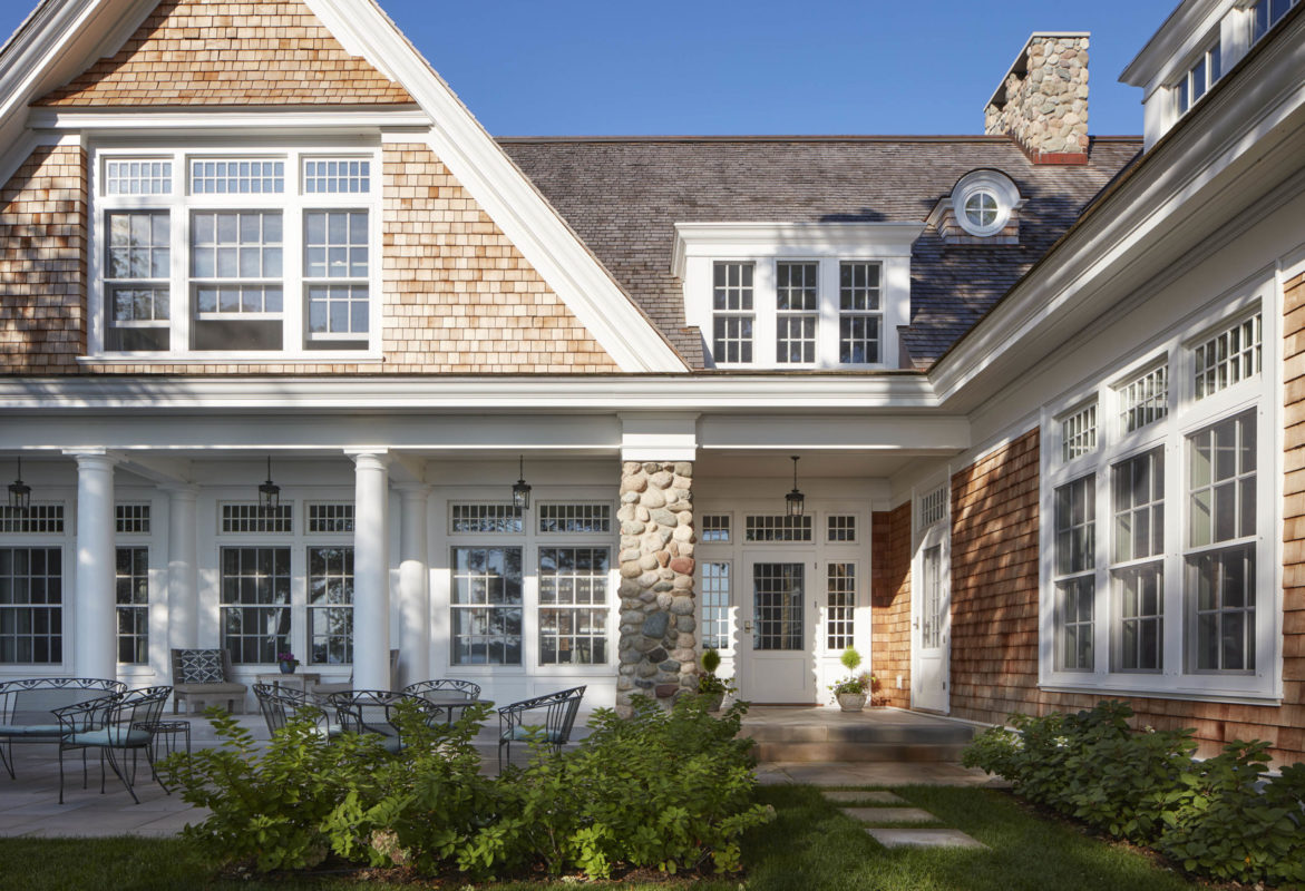
It’s rare to see a wall of windows on a Shingle-style home. Here, the porch creates an architectural frame, allowing those windows to work harmoniously with the design style.
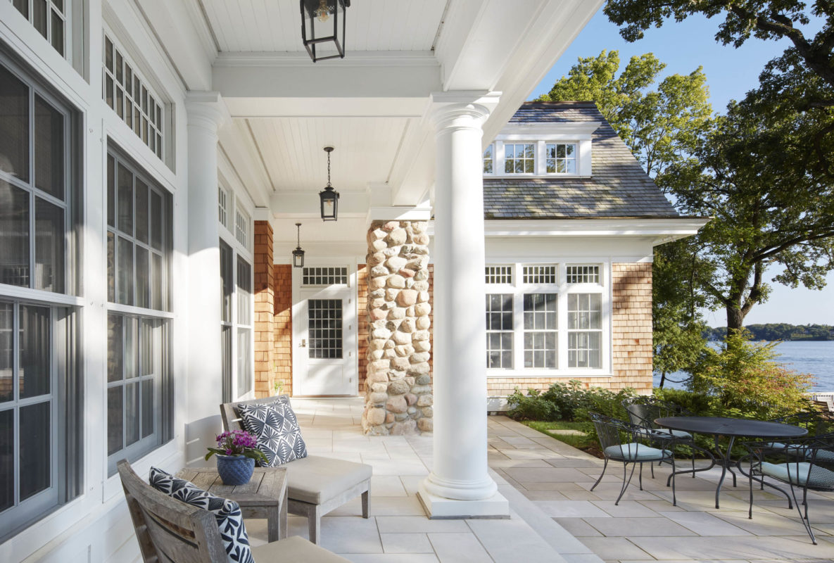
Wood columns and flared fieldstone piers create classic yet relaxed architecture, fitting for a casual lake lifestyle. The porch is designed just deep enough to sit in under the rain, but not so deep as to block light from reaching inside the home.
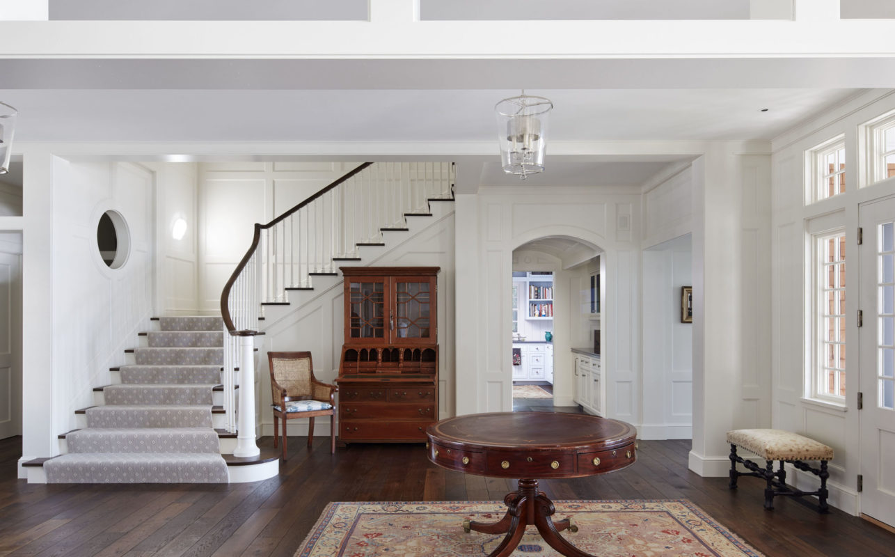
The entry allows visitors who come in from the street (left) to be drawn directly through to the lake (right). The stairway straddles the line between casual and elegant, and round windows outside are echoed inside.

Resonating frames provide a sense of calm. Rather than a solid header to separate rooms, we used an open transom to add a sense of airiness. The fireplace creates a wall for a cozy study on the opposite side.

For a bit more privacy on the street side of the home, windows sills are higher, but still maintain the proportion, scale and design of those on the lake side. Bringing in lots of light, while providing wall space for a robust art collection, was part of the challenge.

Though not completely enclosed, the study provides the intimate retreat our clients desired—and a spectacular view.

The barrel-vault of the ceiling accommodates the stairs overhead, while echoing the curved detail of the circular windows—creating a charming area to pour a cocktail.

To keep the kitchen clean and open, we added a support pantry behind, housing small appliances, etc. The tapered legs of the island echo the detail of exterior columns and stairway newel posts. The extra-wide doorway provides gracious passage to the porch.
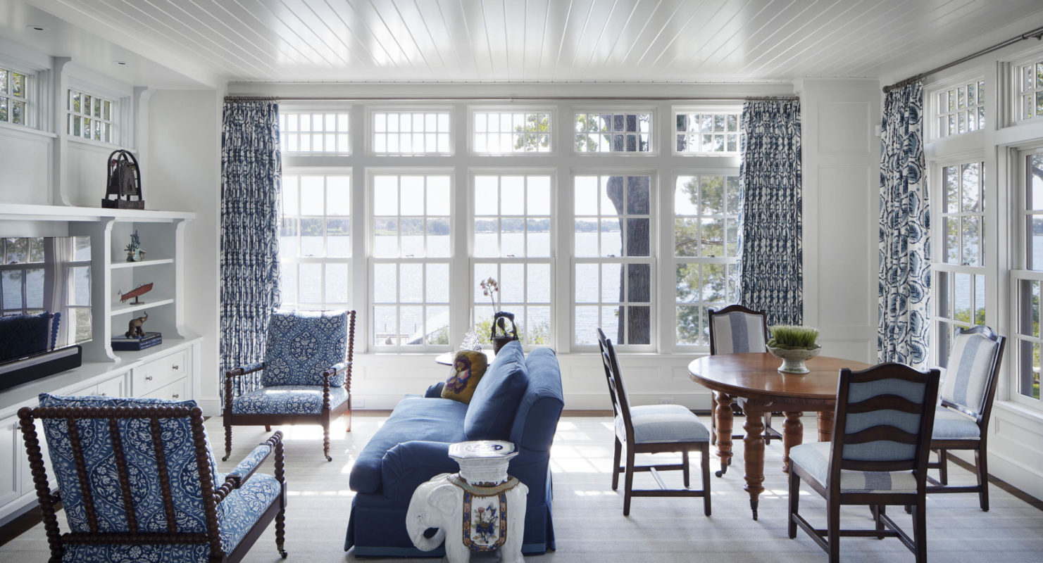
This room was part of the original pool house. The original scale was made to feel more expansive by adding transom windows to three sides. An enameled ceiling adds casual charm and bounces light.

Every detail—from the design of the newel posts to the sculpted plaster ceiling that bounces light from the high window—was carefully considered. In the background, an upper “living room” acts as an ante room to the main bedroom suite.

A bedroom needn’t be a big box. Here, the recessed area above the bed invites cozy repose while providing space for individual reading lights. The recess is repeated in cabinetry on the left. Outside, a view to enjoy morning and night, through a wall of windows.

Even from the closet and dressing area, the homeowners enjoy an angled view of the lake and boathouse. The oriel window outside creates the perfect window seat inside.
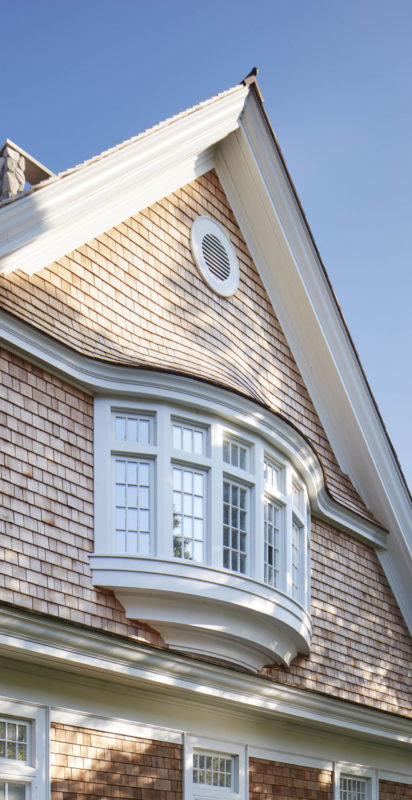
For construction of the curvilinear oriel window, a signature of Shingle-style architecture, we mapped out every framing piece and provided full-scale templates for the complex framing under and behind.
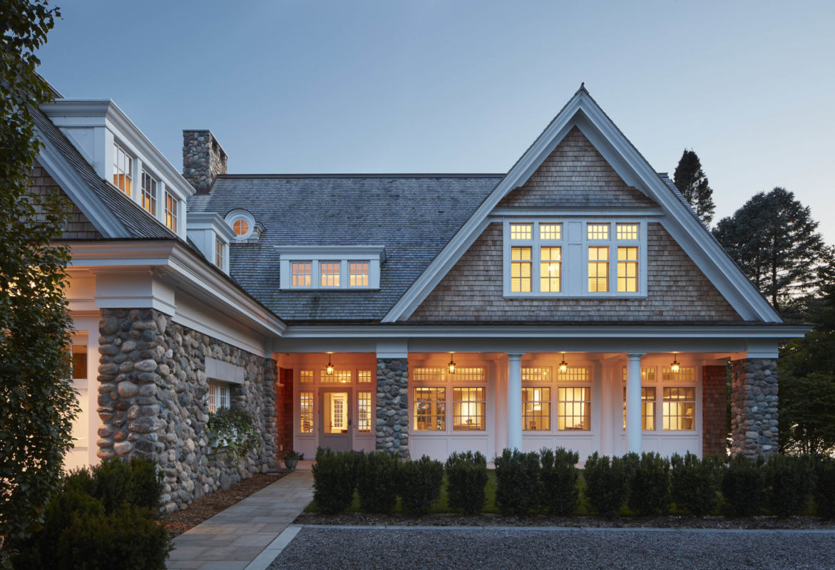
Hand-built stone pillars and an inset planter provide a casual, inviting pathway for guests. Hanging pendants on the porch illuminate a typically hard-to-light area, providing a soft, warm glow.
Sunny Lake Home
Lake Minnetonka, MN
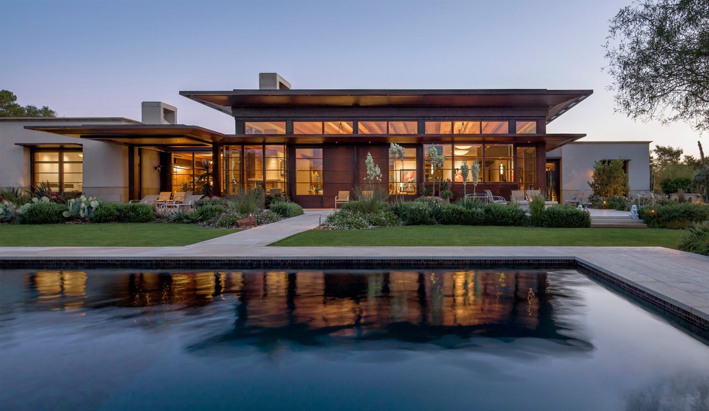

Originally planning to buy an existing home, the homeowner found nothing designed or built well enough. He called TEA2. Designed in concert with the desert, the home is both centerpiece and backdrop, setting off a stunning landscape.
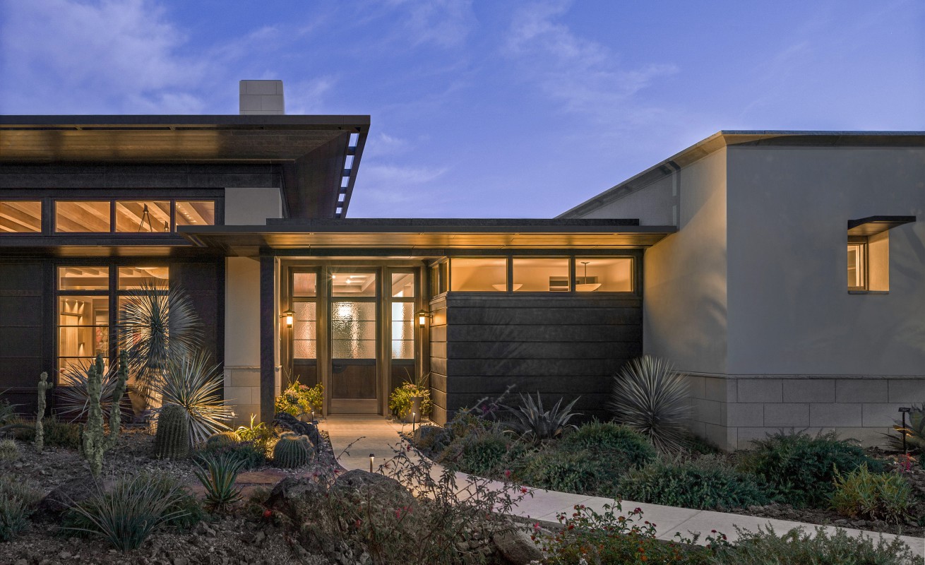
Most desert homes are an expanse of white stucco ending in sky. We look at it more holistically: solid versus void, light versus mass.

The palette of materials all draws from the Sonoran Desert.

The desert can be brutal on building materials. This pre-patina-ed copper cladding (we tested many finishes) proved resilient and beautiful.
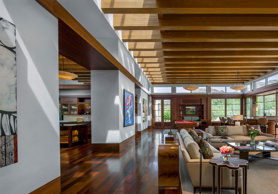
Instead of shutting out the light, the home skillfully embraces it. Millwork baffles control the sunshine that enters and animate beams of light.
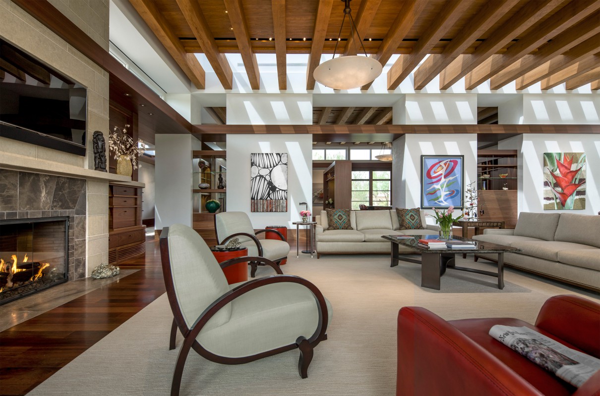
Curated “walls” define space, display the owner’s artwork collection, but leave the room feeling just a step from the desert.

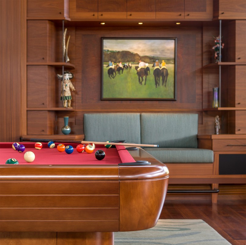
Magnet attachments under the display shelving allow easy access to LED lighting, ensure a tight fit and eliminate unsightly fasteners.

The handmade, compound-curve, integrated ventilation register (bottom right) is itself a work of art—a marriage of function and beauty.
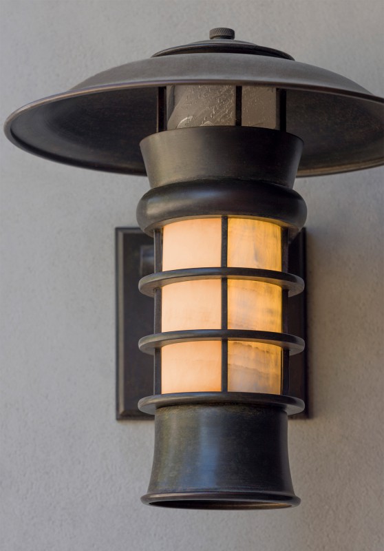
Details, details. Minneapolis metal artist Peter Vanni brings to life our custom-designed light fixtures.
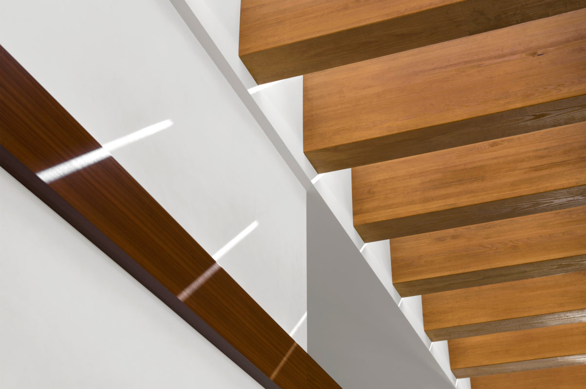
Millwork baffle detail. The pattern play of light changes as sun crosses sky, creating an ever-changing experience with the desert sun.
Client Perspective
“The perfect balance between the materials used can't be overstated. There is a richness yet simplicity to the design, which make for a very comfortable living space. We love our home! ”
- Dianne S., Arizona

Sonoran Modern
Arizona
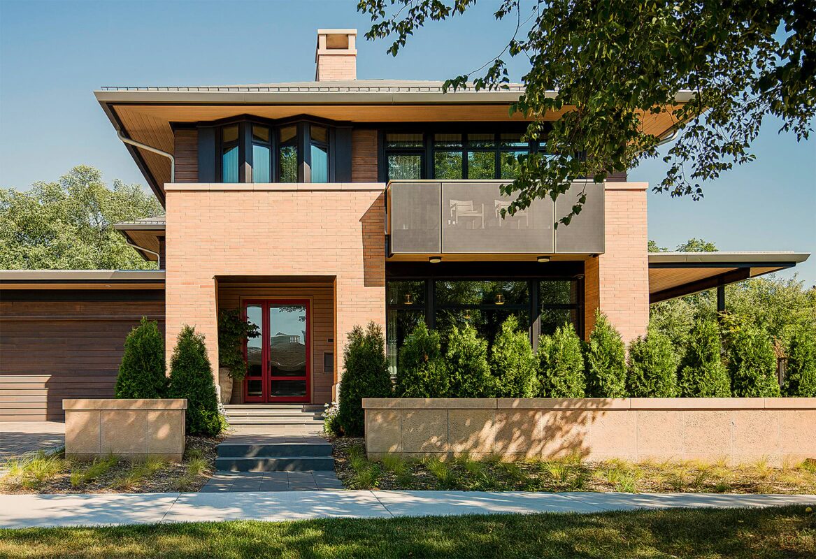
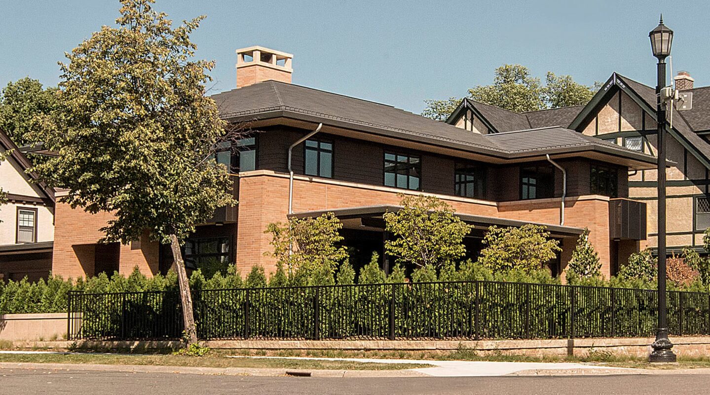
The homeowners put a high value on privacy, a precious commodity near a city lake. Prairie-style architecture provided inspiration: Deep protective overhangs and tall brick walls feel both private and completely at home in this historic neighborhood.

By eliminating spindles on the stairs, the entryway becomes gallery space. The curve, the treads, the understated handrail are all designed to reach maximum height quickly and fluidly.

Wood beams and brick pilasters define distinct areas of use in the central open living space — creating layers of intimacy for after-dinner retreating. A pilaster-framed buffet cabinet brings light and forms a gallery backdrop for the custom table.
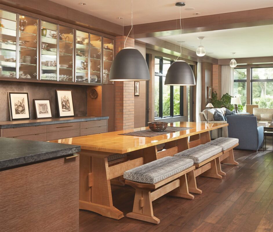
By designing from the inside out as well as from the outside in, special spaces can be created to showcase art and heirlooms — like the 12-foot solid curly maple table, designed by TEA2 and handcrafted by woodworkers at St John’s Abbey.

Thanks to ample glass, warm wood tones and light buff stone, the living room exudes a sense of comfort and welcome, a contrast to the home's more reserved exterior expression.
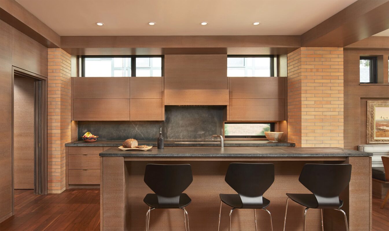
The kitchen is carefully de-materialized, taking its beauty from clean lines and earthy, hand-hewn materials: beehive-kiln-fired brick, rift-sawn oak, soapstone, and unfinished brass — 180 degrees from a more typical stainless steel and granite kitchen.

A five-step wire brushing/finishing process gives cabinets a unique distressed patina, revealing the wood grain in rich layers. Handcraftsmanship is a defining element of Prairie-style homes.

The tension between design ideas is evident here: minimalism without starkness, craftsmanship without the usual flourishes like trim and paneled cabinetry. Simple, high windows provide light and screening.

The sunny alcove is stripped to its essence, blurring the line between indoors and out. The deep bench provides a boundary and sunny seating the length and width of the room. Beyond the couch wall, the beckon of shelter and privacy.
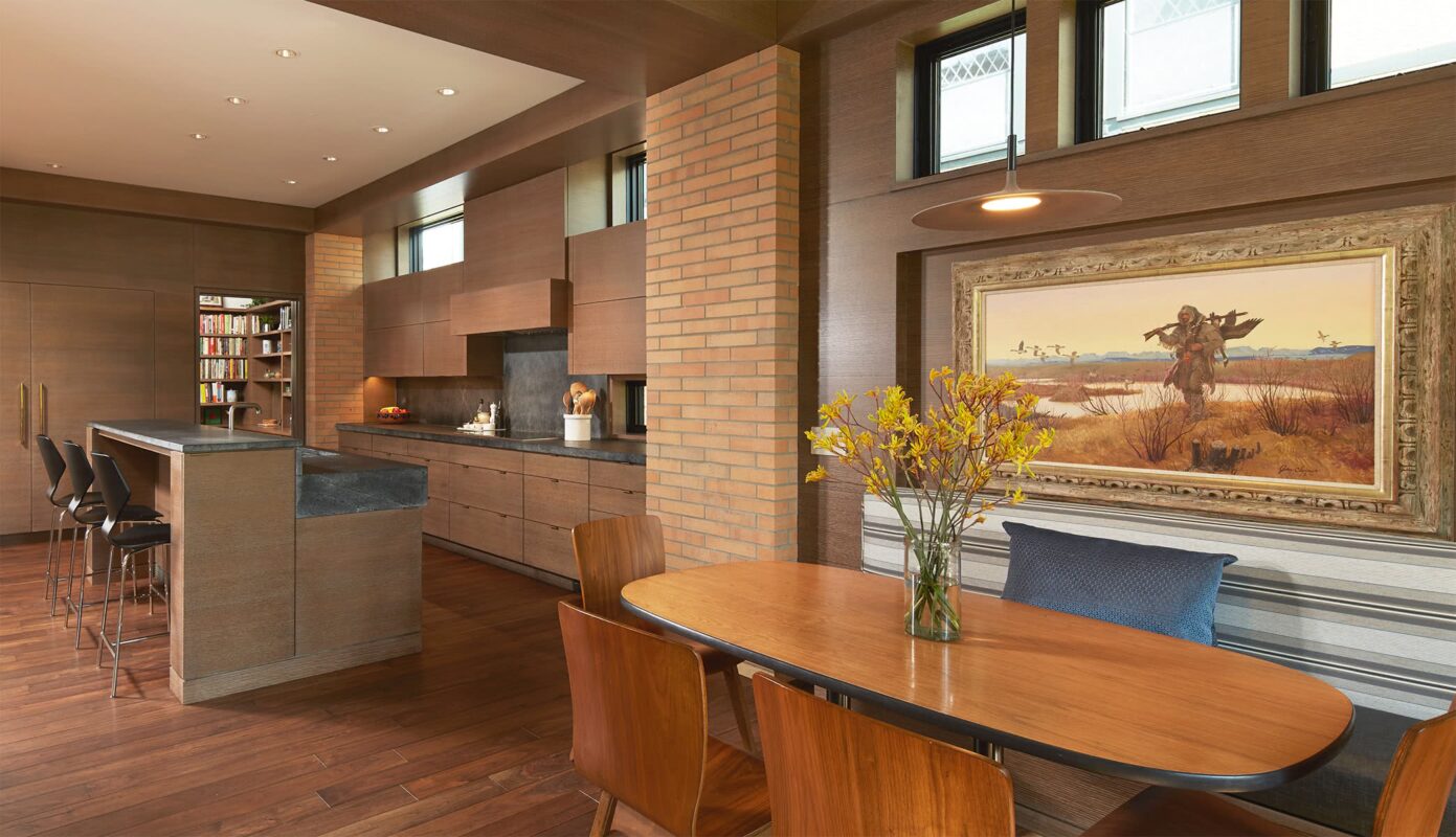
Pilasters bring the exterior brick into the interior, giving an expression of solidity as they emulate the load-bearing properties of brick, supporting the beams above. The paneled wall design incorporates a favorite piece of art.

The ideal home provides opportunities for both prospect and refuge. Here, glass creates an expansive view (prospect) while the warm brick, along with multiple layers and levels of grass and plantings, create the sense of refuge.

The long, low roof line and elongated brick add to the horizontality representative of Prairie-style architecture and the work of Frank Lloyd Wright. The visual takeaway is solidity, security, and privacy — even though most of the walls are comprised of glass.
Contemporary Prairie Style
Minneapolis, MN


The homeowners had a strong sense of aesthetics and a limited budget. The goal was to create a smaller home with all the welcome of a cottage. The effort was a true collaboration between architect, contractor and homeowners.

Sited into a hill, the garage could have been in front, obstructing the house. Instead, our design made it a material part of the character, along with the entrance and wraparound window. The front entry and roof “reach down” from the first floor, inviting people up.

Instead of specifying costly wood trim, we designed an economical cottage aesthetic of thick walls and limestone sills. To simulate hand plastering, the homeowners applied a rough mud coat over drywall, and sanded. Each window creates an event, leading one upward.

The house is laid out simply. It is pushed to the north side yard to maximize the living space on the south and allow those rooms to be bathed with south light.
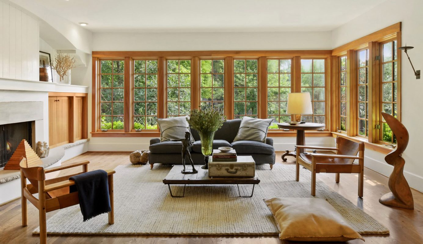
By choosing a few items (windows, doors, floors) of superior quality and character, the homeowners got the most value for their investment.

The wall material is plywood, routed vertically to look like tongue-and-groove boards. The deeply set, natural wood cabinets create warmth while hiding a television.

Reminiscent of French or English cottages, the home design is driven entirely by simplicity. The raw floors are recycled wood finished with a dog friendly, penetrating flat-oil finish rather than polyurethane.

Instead of the small rooms typical of cottage style, the kitchen was designed to be inviting and open to the rest of the house (but not too much!). The refrigerator is anchored into the wall, making it part of the room’s architecture.

Using the same wall treatments and open shelves as the living room makes the kitchen feel like an extension of that space. By using simple kitchen cabinetry—and lower cabinets only—the homeowners also saved money.

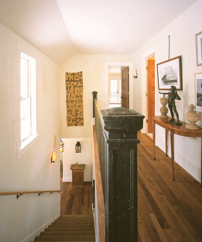
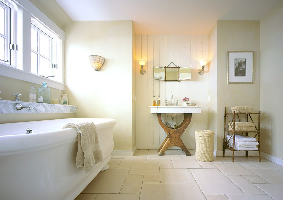
The strategy of investing in a few quality items to add character applied even to the bathroom: While the wall behind the vanity is the same faux tongue-and-groove board, the floor is reclaimed Jerusalem-stone tile, and the imported tub from England.

Linden Hills Cottage
Minneapolis, MN

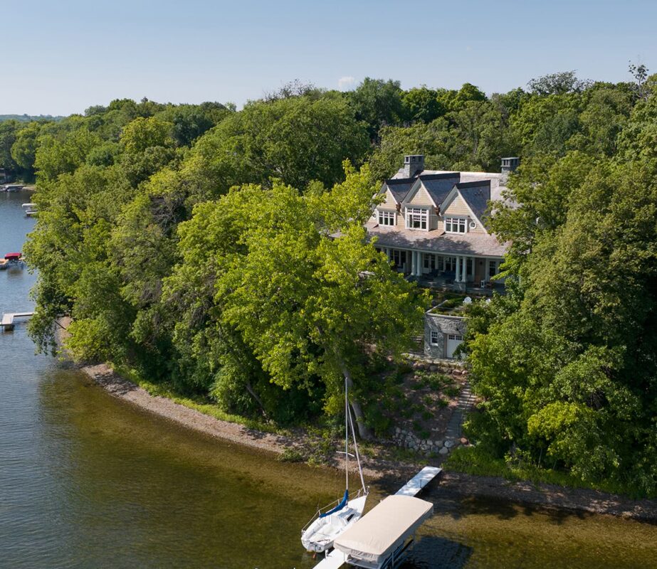
There are only a few dozen houses on this historic island, and our clients felt fortunate to acquire a rare lot when neighbors sold off part of their own.
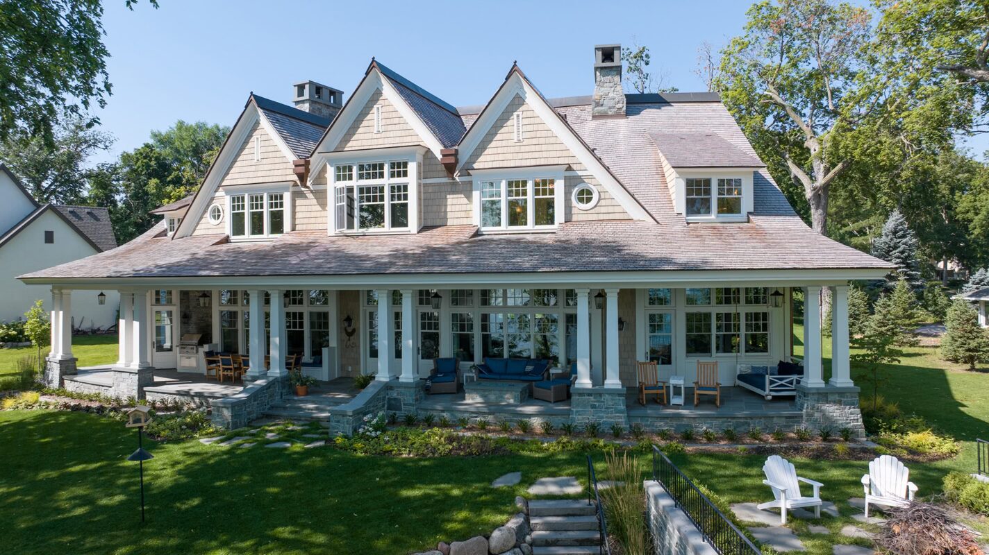
What to build on a dream-come-true site on a historic island? A structure that would have looked at home when F. Scott Fitzgerald lived there 100 years ago. Shingle-style architecture, born out of summer homes, provided us with a flexible language to weave sweeping roofs, expansive porches, and playful forms into a casual and harmonious design.
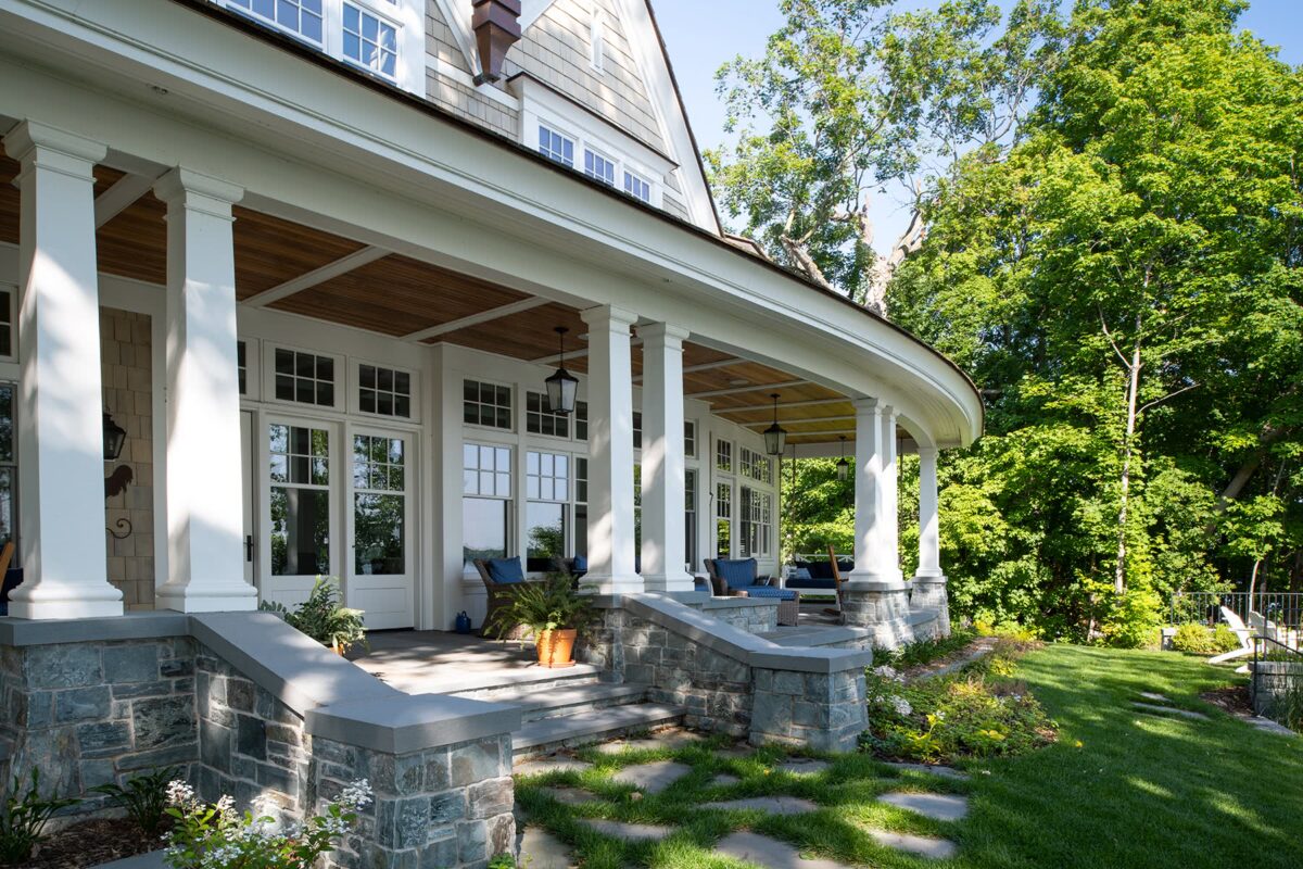
Despite the pie-shaped lot presenting challenges, we creatively leveraged its unique characteristics—such as designing a graceful curve for the desired full-length lakeside porch.
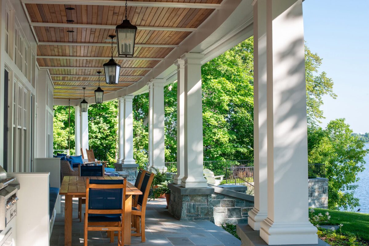
Every detail was thoughtfully designed and constructed—from the proportion, placement, rhythm, and profile of the double columns to the curving beams above and tapered stone piers below, that flow all the way down to the ground.
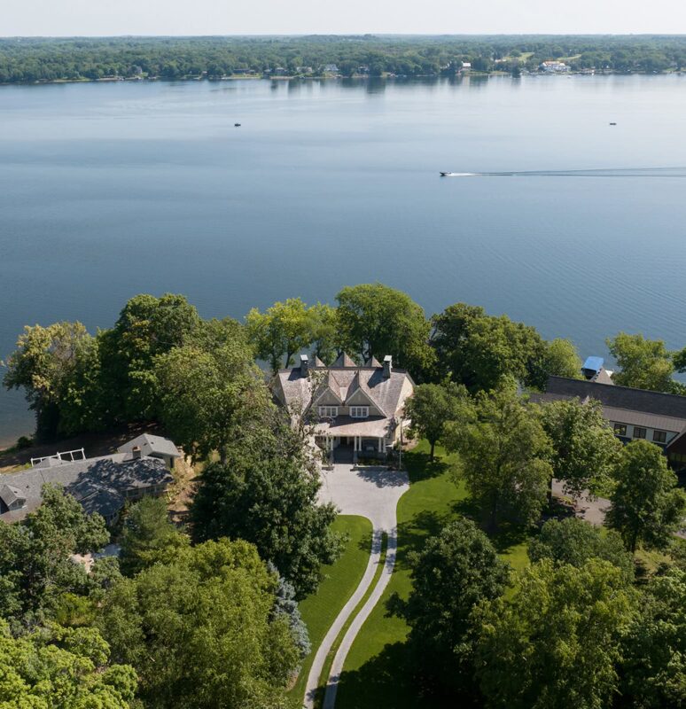
The lot narrows considerably toward the street and expands towards the lake. The house form follows this shape closely, resulting in a more intimate entry side where two gables alternate positions with the three gables on the expansive lake side. Achieving symmetry on the exterior and square rooms within required a high level of creativity and skill.

Twin peaks and double chimneys bring symmetry to the roadside entrance. To prevent the garage from becoming a focal point in this narrow space, it is turned sideways, pushed back, and “stepped” progressively smaller.

The combination of cozy porch, gables curving forward like outstretched arms, and warm materials gives the home the welcoming feel of a cottage. The entryway, with curving bay, is an intriguing invitation—with the lake visible even through the door.
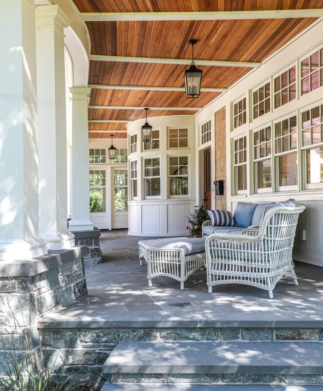
Afternoon sun warms the front porch; tongue-and-groove cedar adds visual warmth. From outside the curved bay, the eye climbs the elegant staircase inside. To the right, the glass expanse floods the kitchen with light.
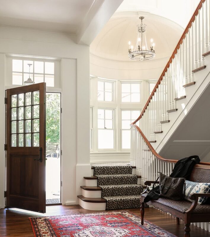
To help achieve their classic-home vision, the homeowners embraced thoughtful details and charming forms that were well-crafted. For instance, a beautiful half-dome ceiling above the landing was cleverly tucked under the porch ceiling, granting a special moment as well as needed height for the handrail to gracefully ascend the stairs without interruption.
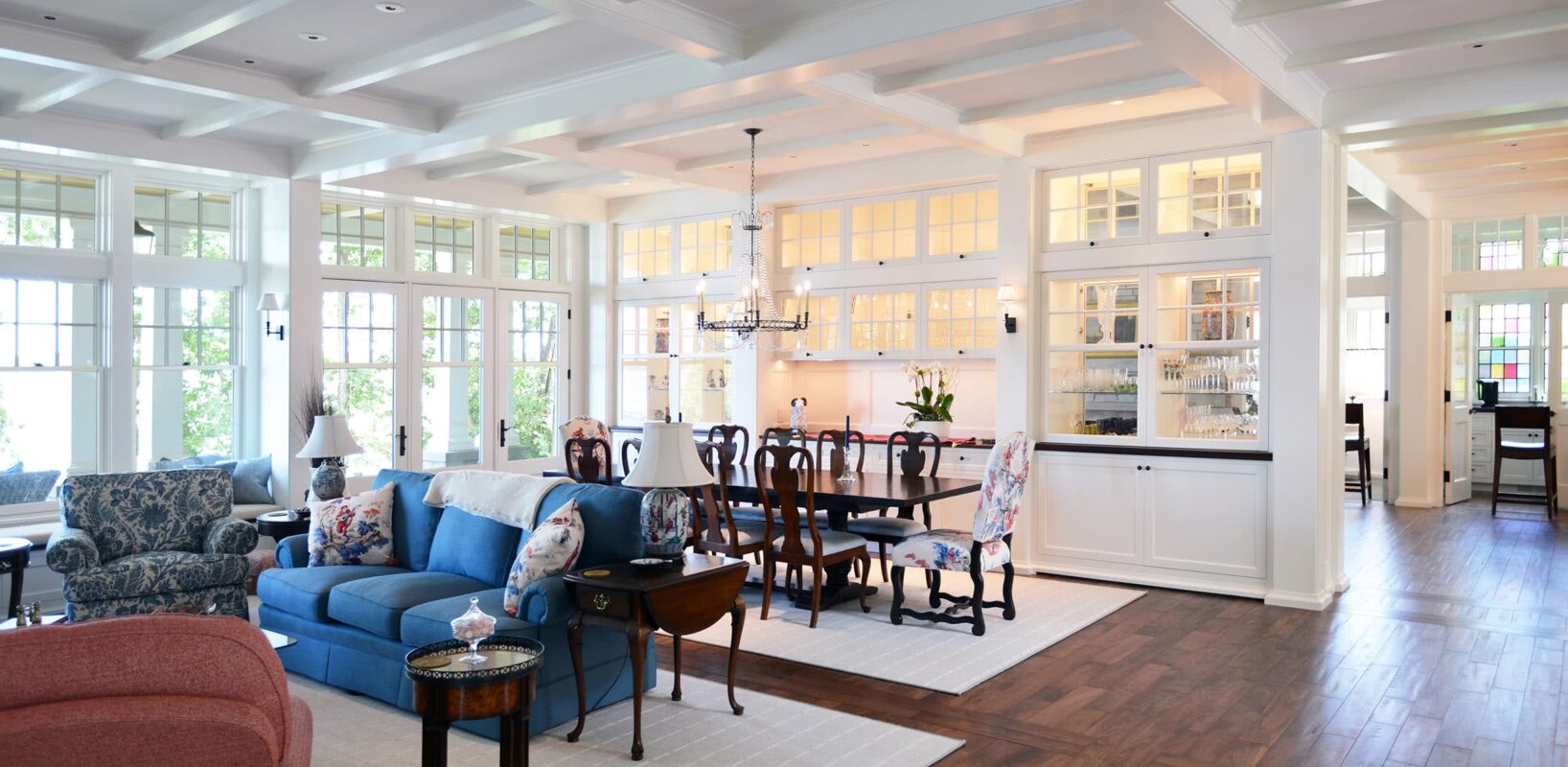
To keep the full-length porch from stealing the light, exterior walls are almost floor-to-ceiling glass. Rooms along the lake are not divided by simple flat walls; often, they incorporate see-through cabinets that extend the lightness and transparency of the exterior walls. This also offers wraparound texture and glimpses into neighboring rooms.
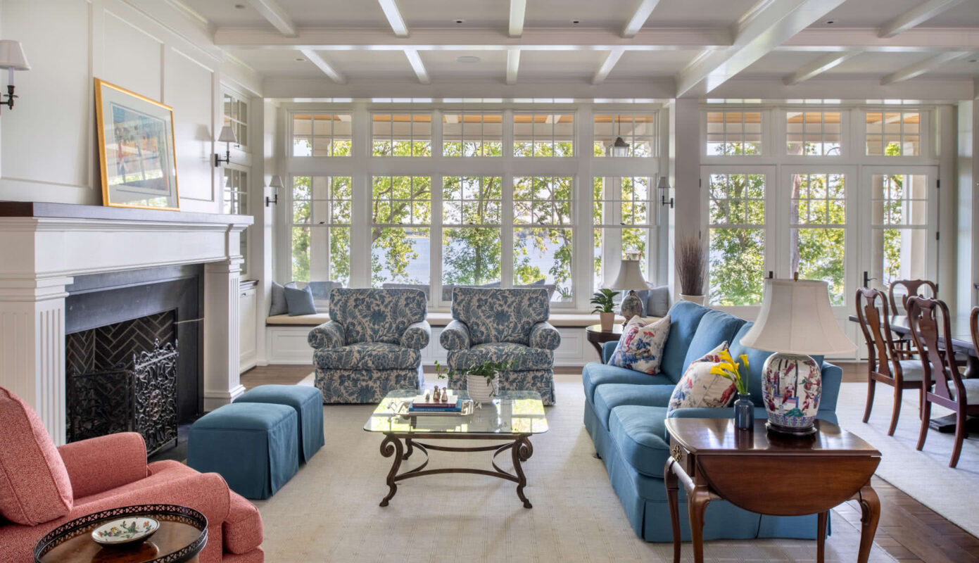
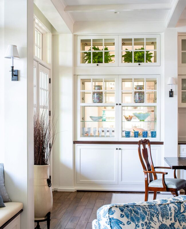
The view from the living/dining areas to the family room (and vice versa): Transparent edges not only allow daylight to travel between rooms, but also extend the lake view more broadly into the other rooms.
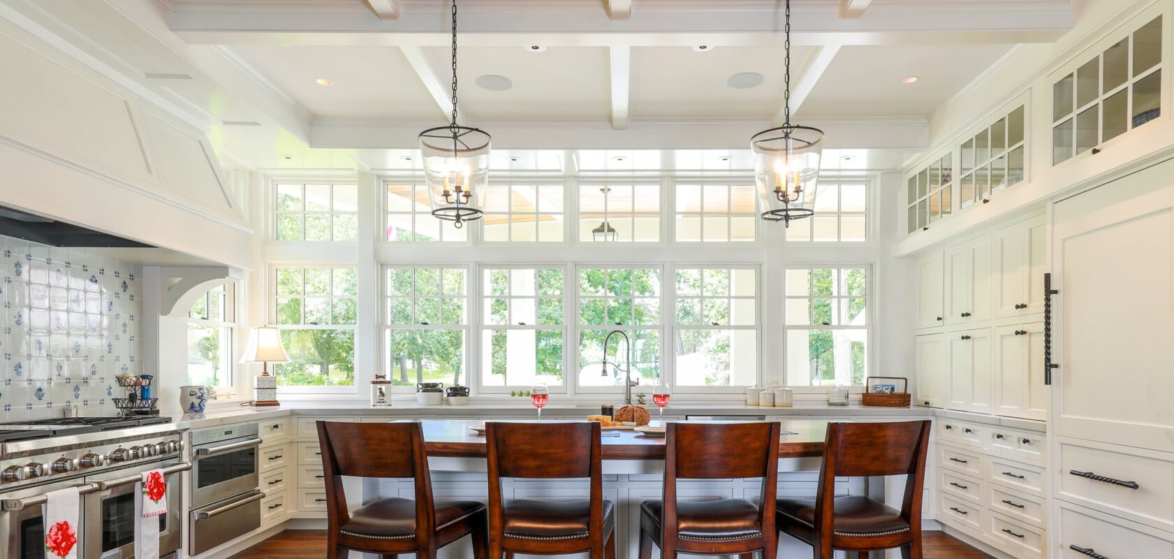
The kitchen swaps upper cabinetry for a mass of windows with wonderful southwestern light; full height storage and refrigeration are organized into the interior wall. With its natural wooden slab top, the island becomes an elegant perch for enjoying views of the front porch and wooded lawn.

Art glass at each end of the house hides neighboring homes while splashing the end vista and pantry with colorful light. The pantry doors feature wavy glass, gently obscuring the pantry when closed. Extra storage for dishes, appliances, etc., is located to the sides and below to keep the window as the focal point.

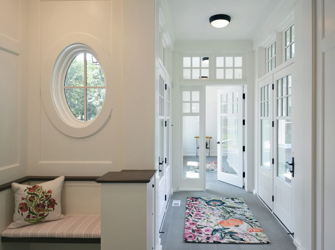
The light-filled mudroom and passageway from the garage offers a delightful daily welcome home. Adding a touch of whimsy, the oval window provides a playful moment that brings a smile to one's face upon arrival and departure.
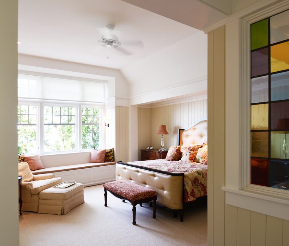
In the primary bedroom, the bed tucks into an enclave — a cozy counterpoint to the lofty and expansive ceiling. Windows bay outward toward the lake, making the perfect view from the window seat. To the right, art glass provides an enchanting peekaboo from vestibule to bedroom.
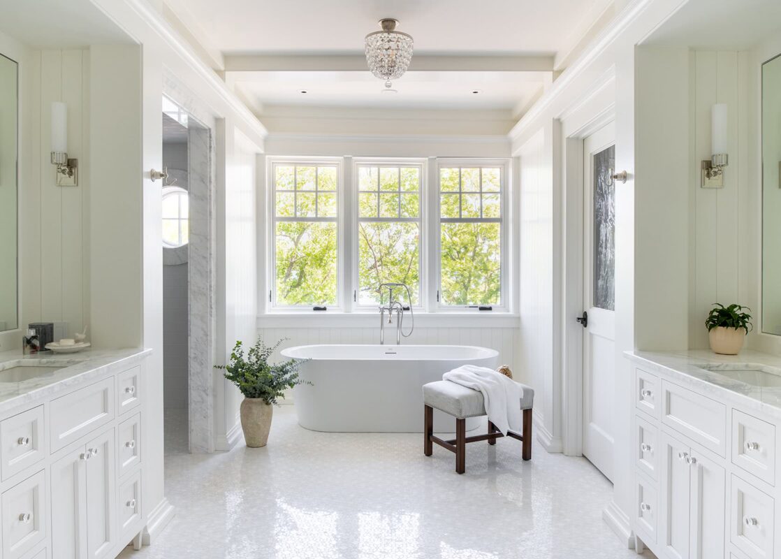
The owner’s bath has its own view of the lake, while the shower gets its own glimpse through one of the playful circular windows.

The owner's closet also serves as her office, with a step up providing subtle separation. The closet design was centered around enjoyment of her favorite things, and features glass-topped display cases. Ample windows overlooking the lake enhance the sense of a private treehouse.

The guest bedroom is playful — like a visit to a ship’s cabin, with its tucked-away bed, built-in shelves, and ladder (behind the paneling to the left) that invites a child up to the loft area.

Part of the joy of a window seat? There, with book in lap, we become a receptacle of the light ourselves. This one has pull-out drawers for extra storage.

The lower level draws inspiration from the old, board-formed concrete basements of over a hundred years ago. Its casual warmth is a pleasing complement to the upstairs and serves as a great backdrop for a bit of fun.

One of the homeowner’s favorite pastimes is jamming with a few instruments alongside his friends.
Lakeview Shingle Style
White Bear Lake, MN

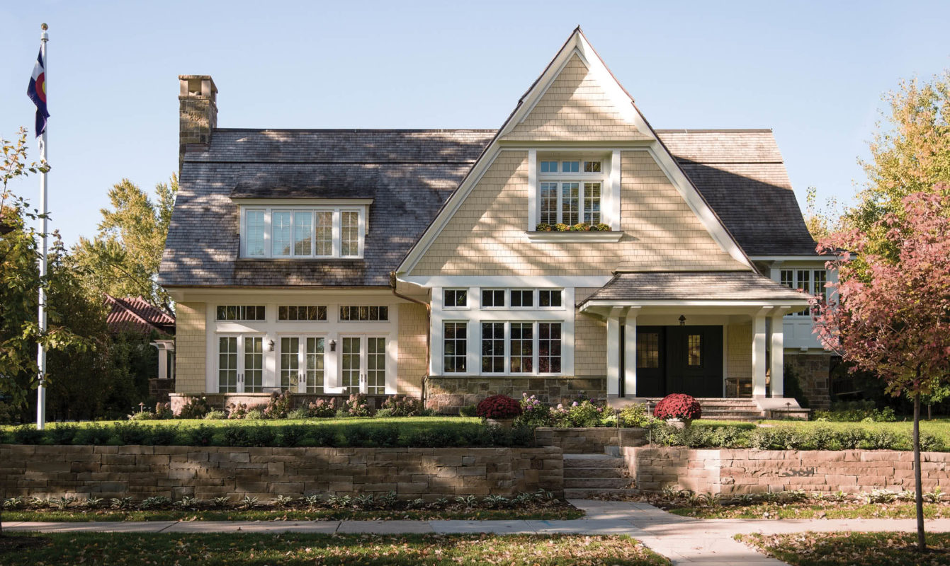
Shingle style is a less formal interpretation of many historical styles—with shingles wrapping the house and creating playful forms while unifying its elements. Here, shingles sweep from the wall to embrace the entry roof.
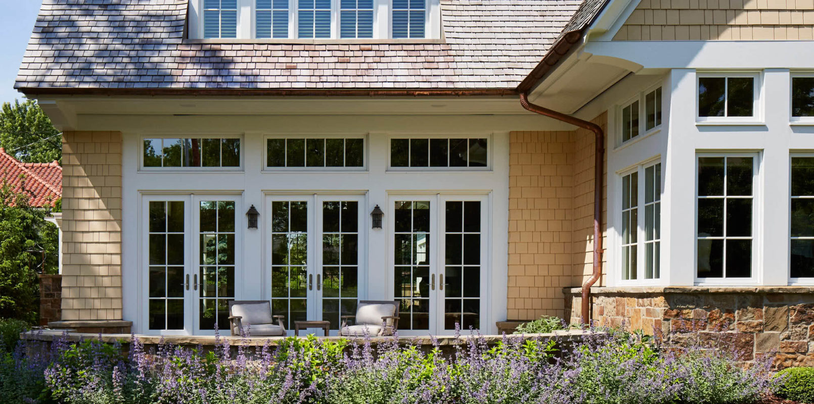
Named Best In Show in the 2016 Blend Awards—a competition recognizing projects that blend harmoniously with the neighborhood. Not only are scale and form appropriate, but the detail expressed also resonates with turn-of-the-century neighbors.
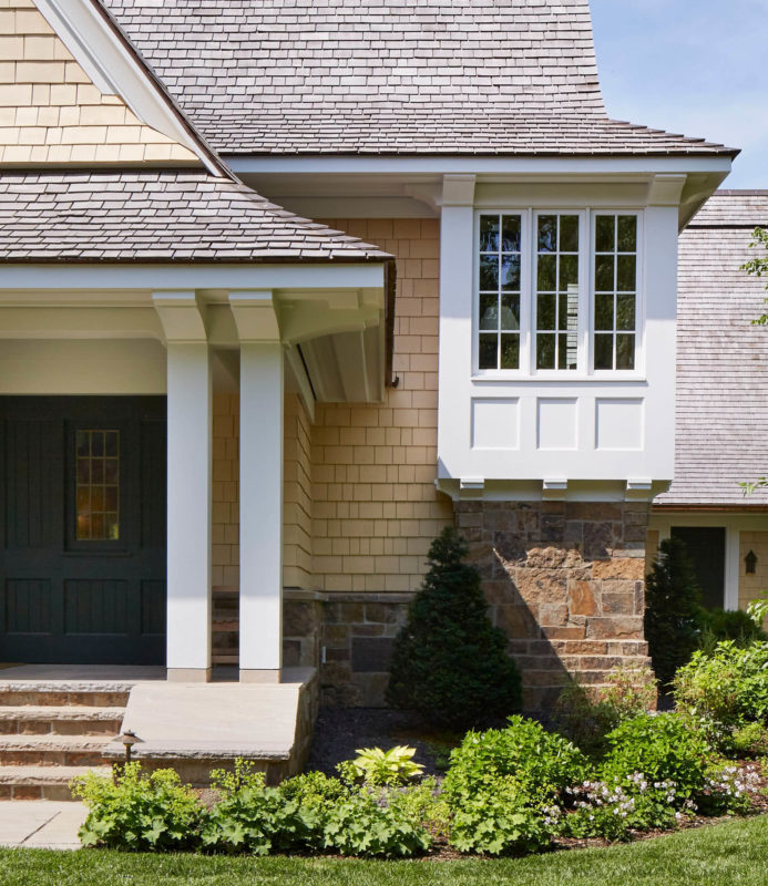
The homeowners’ favorite feature: a unique and intriguing bay on the stair landing which provides a view down the street and an architectural “moment” from without as well as within.

The trellis is an integrated extension of the architecture, creating and enveloping another “layer” of the house; an outdoor oasis in an urban neighborhood.
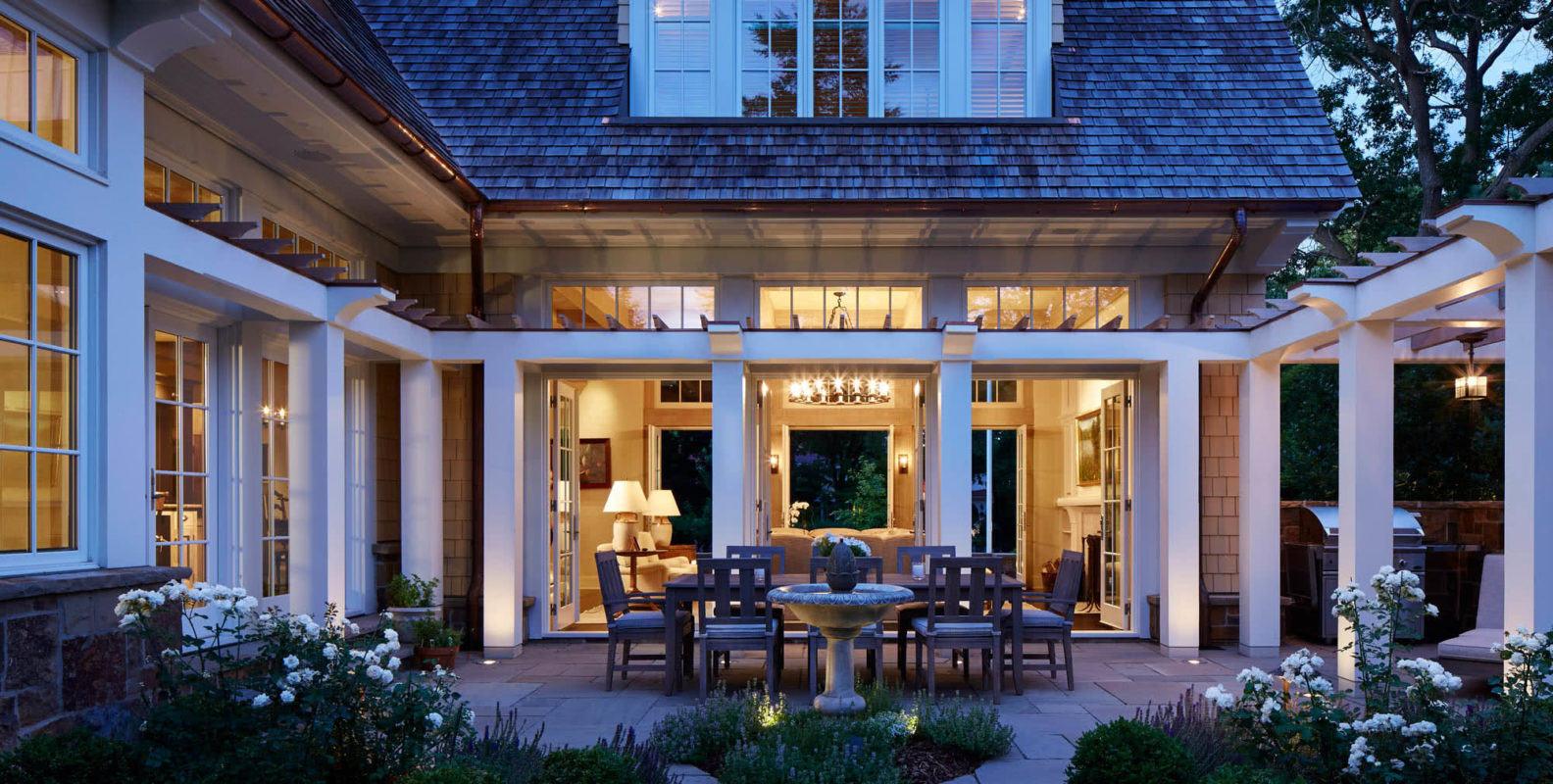
Such a strong indoor-outdoor connection is rare with “historic” homes, but enhances livability and joy, and is well worth achieving.
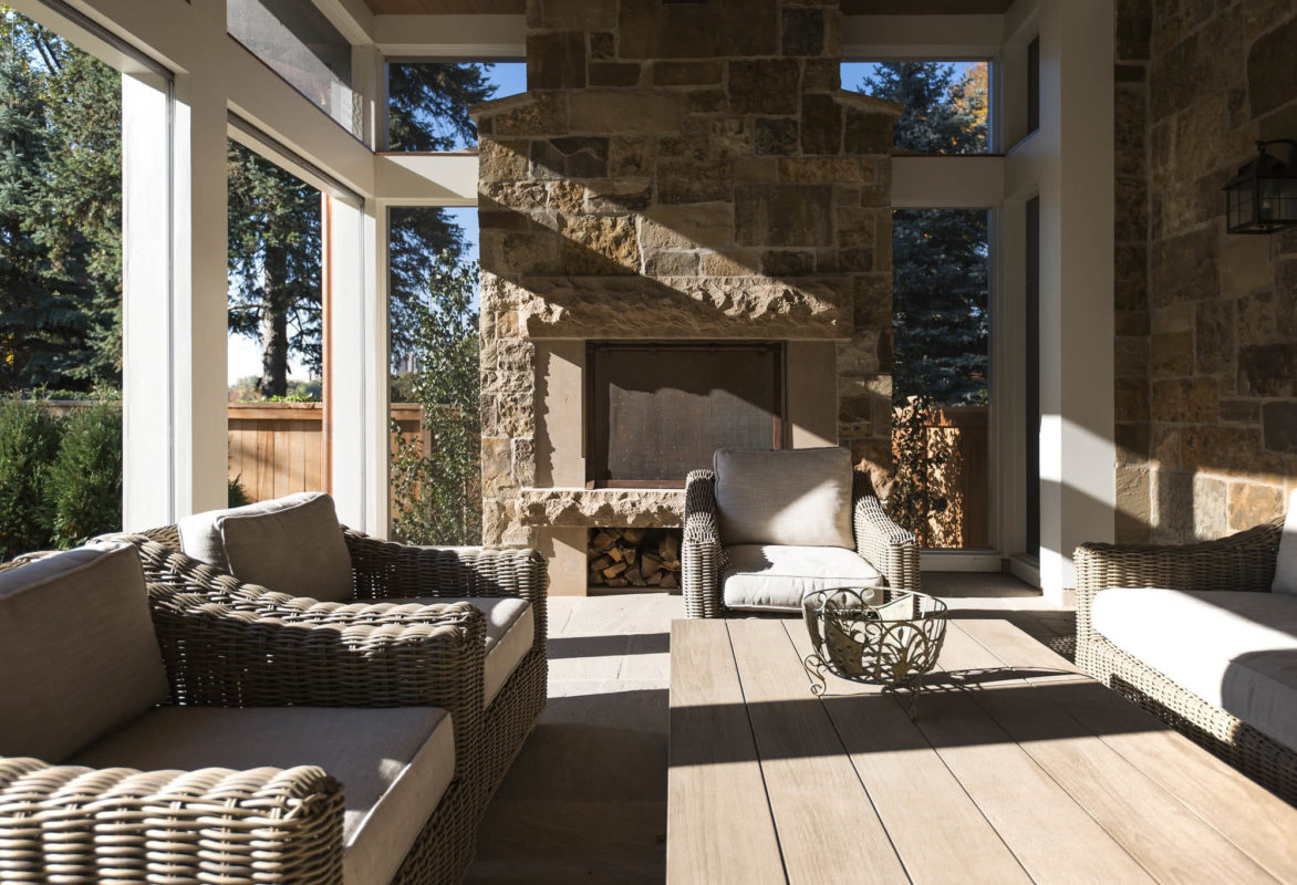
The owners wanted a porch that was warm, earthy and textural, yet felt light. Retractable screens help achieve this by hiding seamlessly within the trim, maximizing outdoor connections.

We often use design to curate the view: Here, window walls look onto public and private green spaces while the fireplace wall invites south light and obscures a nearby home. This wall was also designed to accommodate a favorite piece of art.
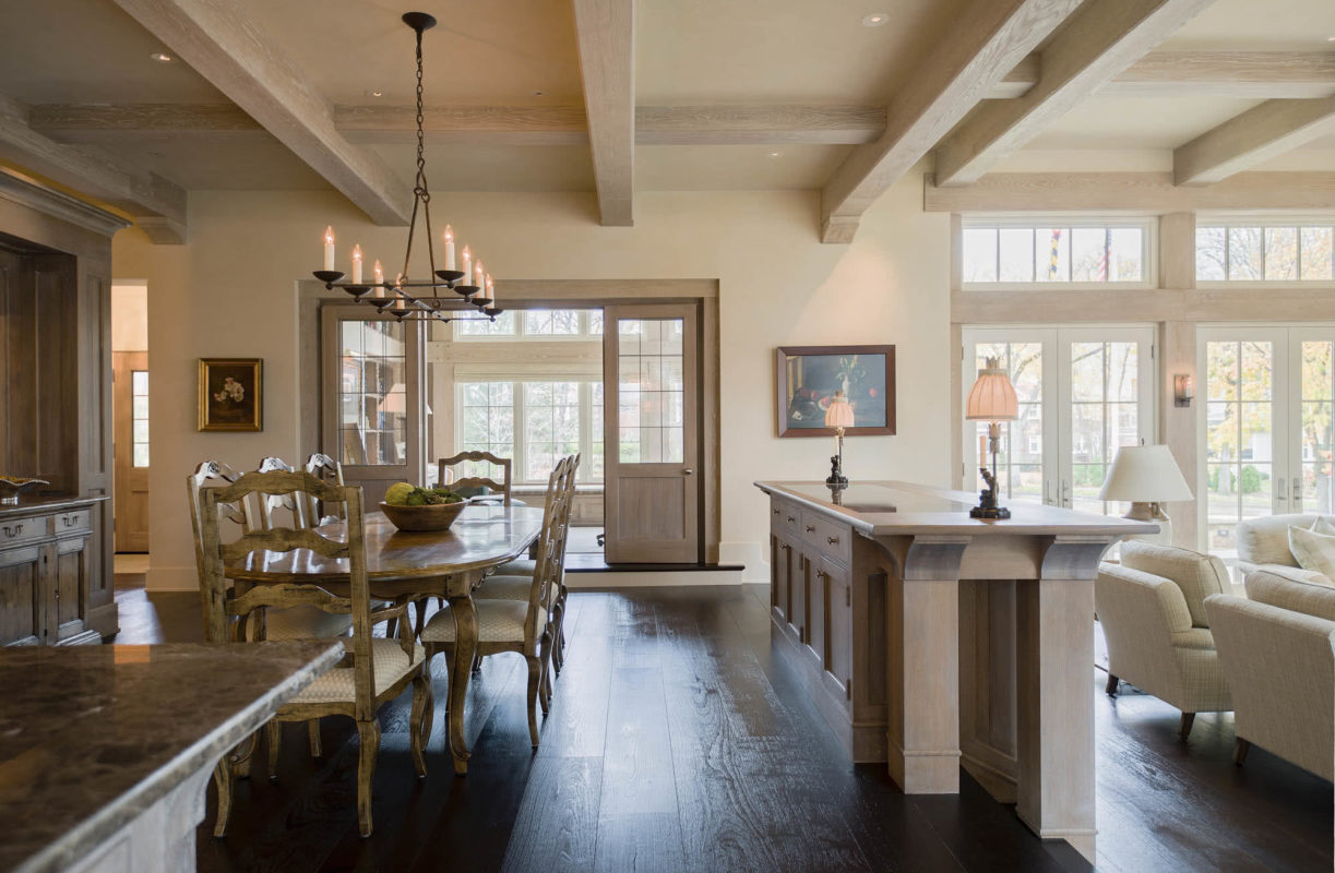
The homeowners wanted open but distinct and comfortable living areas, so we used “architectural furniture” to define space—in this case, custom cabinetry to separate dining and living rooms.

A 16-foot island allows the kitchen to be one-sided yet highly functional for our client, a fabulous cook. French doors to the left provide light, views, and easy access to courtyard dining.
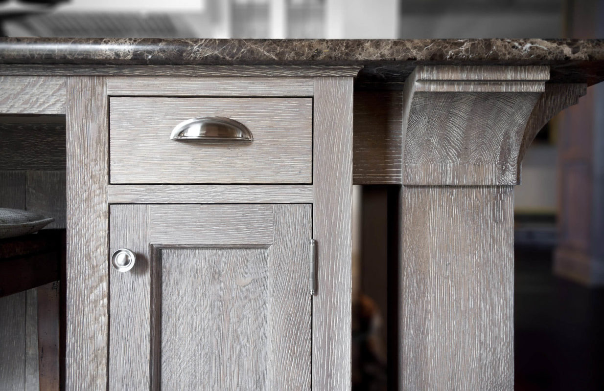
Cabinet details echo the home’s exterior elements. The weathered finish integrates beautifully with the textural, casually elegant architecture.

A shallow exterior bay with deep-set windows creates a light, bright nook that opens onto the porch, allowing le petit déjeuner en plein air.

The kitchen is in the center of the open floor plan. To keep it uncluttered, we designed a unique pantry behind the range: Guillotine doors hide cooking essentials while making them accessible to both sides.

The vocabulary of timbers and beams flows seamlessly from inside to out. Inside, oak beams are textured and pickled; outside they’re white: a sense of integrated architectural unity viewed from either side.

The home’s thicker walls create substance and depth. Deep sills, cabinets, ledges and window seats are integrated into the windows—becoming vessels to receive and bounce light.

Custom-curved wainscoting creates a home for the bathtub. Outside, a reflecting curve embraces a lovely planter—deeply recessed for shadow and privacy.
Kenwood Shingle Style Cottage
Minneapolis, MN
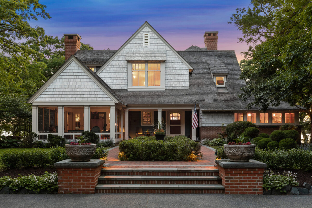
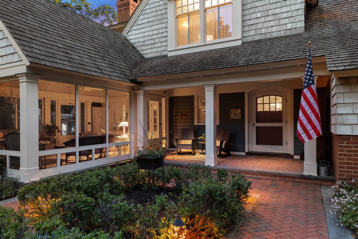
The homeowners’ desire to re-create a nostalgic up-north camp experience influenced many design decisions — starting with the low, planked porch ceiling, wide but short front door, and screen-only porch off the main entrance.
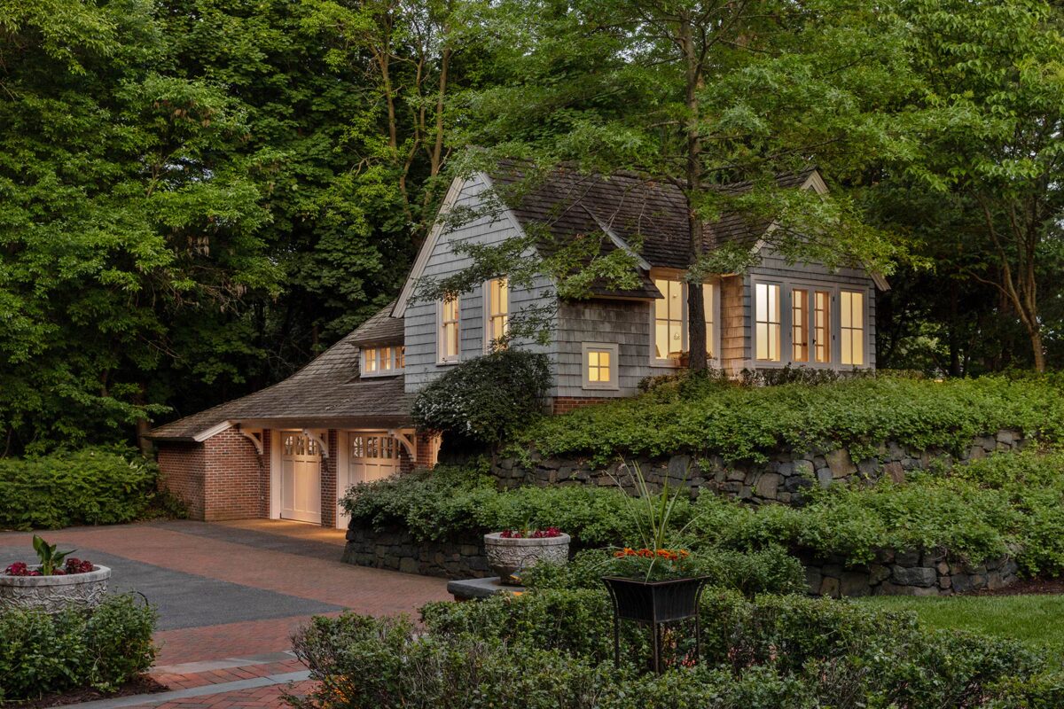
Like the house, the garage feels diminutive, but isn’t — its charm comes from varied rooflines, custom corbels, wood shingles and surrounding stone walls. Studio space above provides views of the lake.

The sense of cozy enchantment continues into the front hall with clear Douglas fir on walls and ceiling. The furnishings, and even the lock on the front door — an old-fashioned rim lock — contribute to the narrative.

The house grows around you as you step inside, with increasingly higher ceilings and ever-larger glimpses of the lake. Painted finishes in the main areas make the small, wood-filled niches feel especially magical.
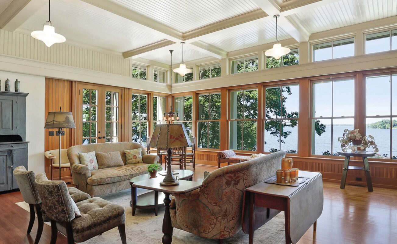
The view opens up entirely in the living area, thanks to an eleven-foot-plus ceiling, walls of windows, and additional transom windows above. Corner windows further amplify light and views.
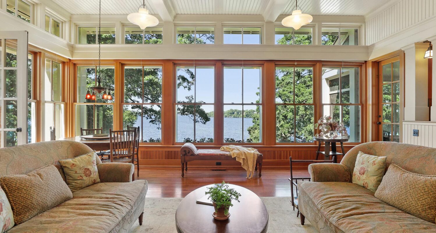
Period fixtures, along with customized bead board, wider-than-usual tongue and groove paneling, and rift-sawn oak floors perpetuate the been-here-forever illusion. The lot is narrow, but the home carefully situated for broad, expansive views.

An inglenook made irresistible with split-boulder lined hearth and a massive, artisan-created copper fireplace hood. The oval window feels like a secret porthole to the outside world.
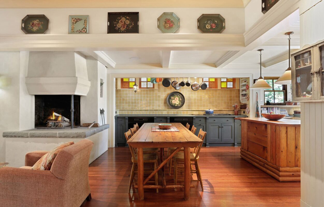
The cooking alcove is lined with handmade tile. Handmade art glass in the windows is individually set for a random, haphazard look. The island, once a sales counter in a country grocery, adds to the authenticity.

The Norwegian farmhouse-style corner fireplace provides a cozy transition (literally) from living to dining area. A ledge along the ceiling beam provides display space for collectibles, while the drop in ceiling height makes the kitchen more casual and inviting.
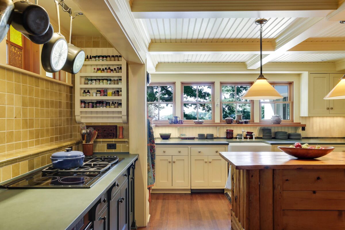
At the sink area, 36” deep counters and deep window shelves allow for stacks of dishes out in the open, cottage-style. Cookware and spices are also purposely visibly, a spice rack custom-sized for the nook.
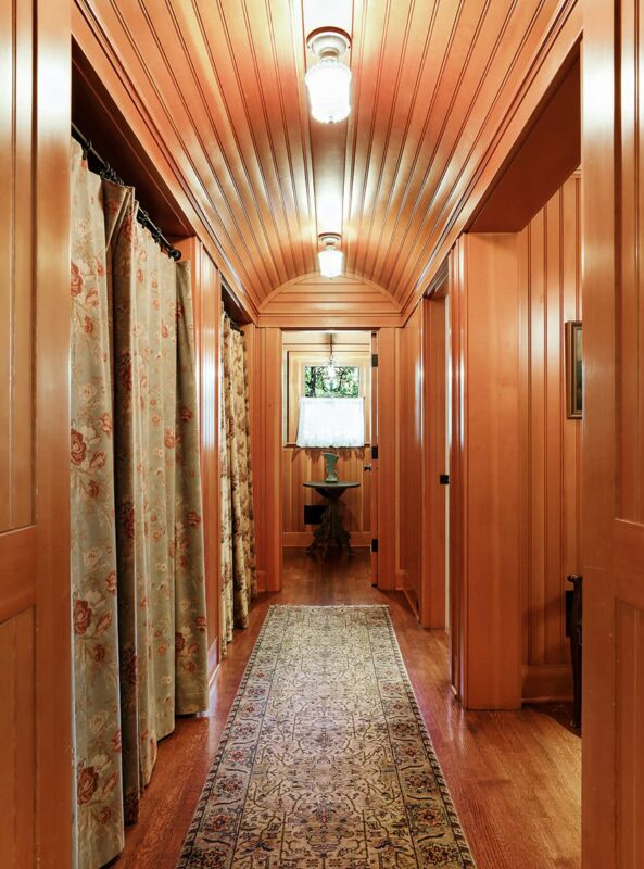
A barrel-vaulted ceiling makes even the hallway memorable. Like you’d find in a rustic cottage, curtains cover closet doors and invite peeking behind.
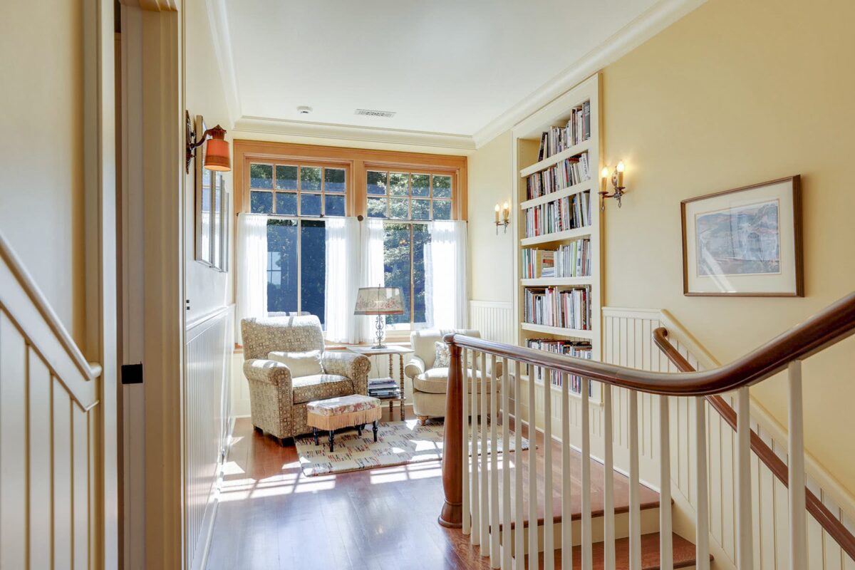
The window at the landing adds exterior character, just as the landing itself adds interior character and a respite—with space for books, light for reading, and a view of woods beyond the house.
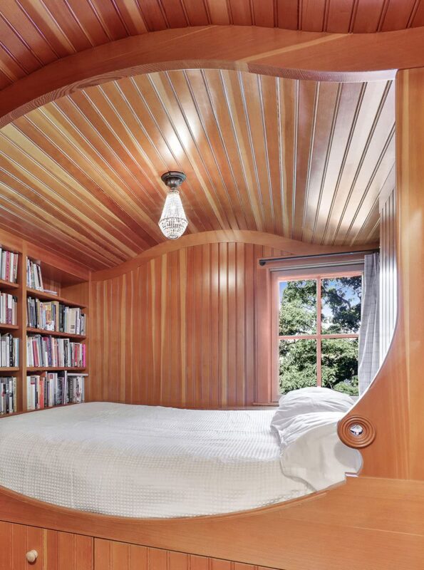
Also at the landing is access to an enchanting bedroom suite, with bed nook custom built by a guitar-builder carpenter. Curves are turned from Swiss pear wood, custom marbles wedged into the medallions.
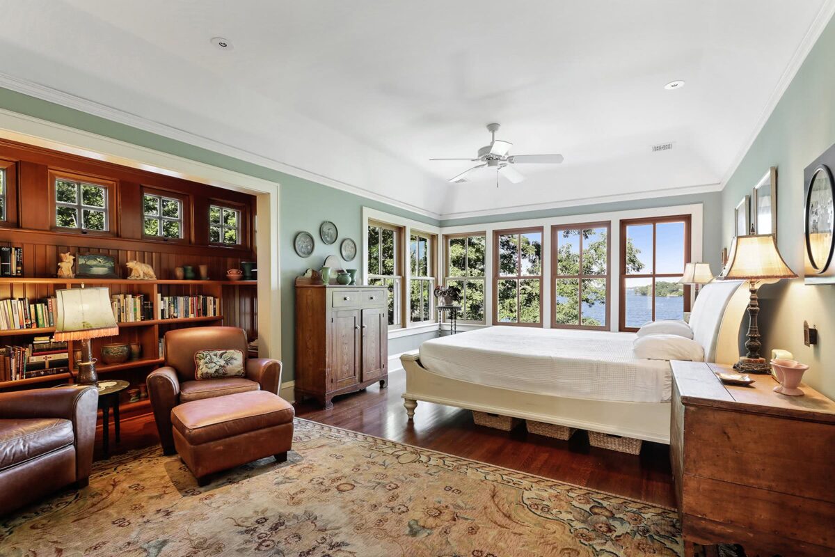
A vaulted cove ceiling gives the primary bedroom a light, airy feeling. Corner windows are reminiscent of those seen on old sleeping porches, and take full advantage of a breathtaking view.
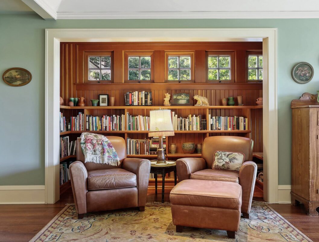
Echoing similar special areas on the main level, the wood-wrapped alcove in the primary bedroom invites you to explore every book.

The landing, the steep, turning steps, the built-in shelves and drawers suggest more discovery and magic beyond.
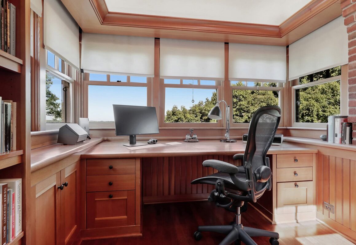
A final climb leads to a high tower office adjoining the chimney — just large enough to accommodate a custom-folding desk. Windows on three sides provide a birds’ eye castle view.

Three stories below, the sense of adventure and discovery continues — with bunkrooms, a built-in children’s library, and getaway spaces for kids.
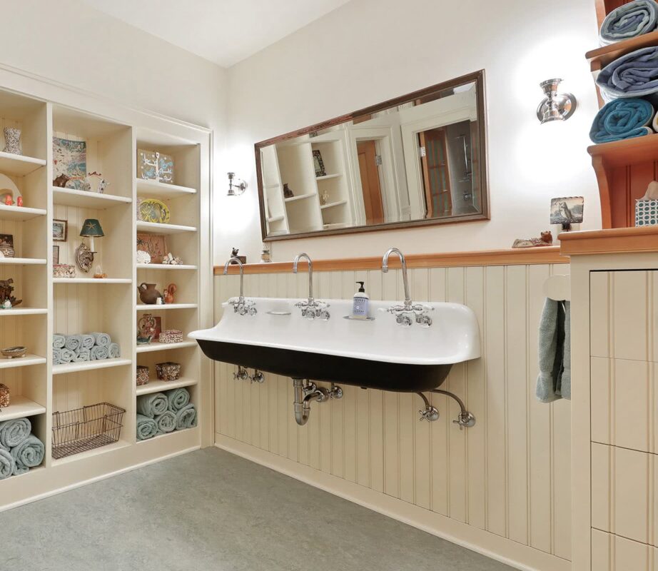
The echoes of an up-north camp carry all the way to the lower-level, with the large, open bath, complete with beadboard paneling and trough sink.
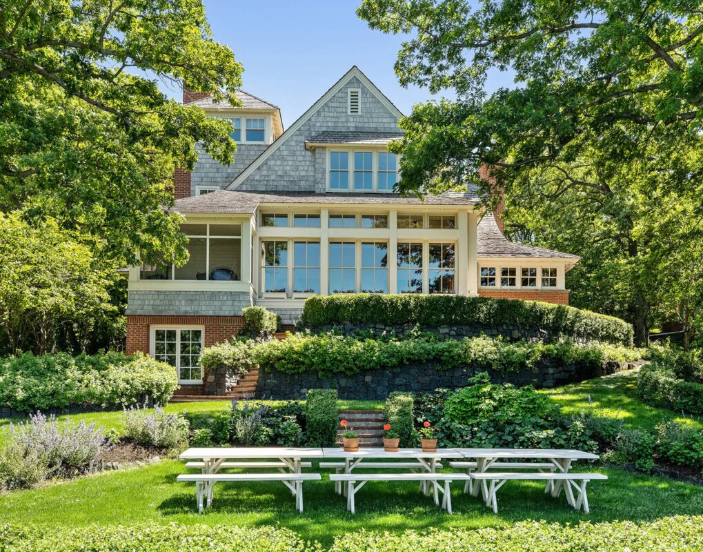
From the lake, the home appears uniquely traditional, thanks to shingle detail and brick patterns. A thoughtfully sculpted landscape sets off the home, and invites guests to dine camp-style.
Timeless Lake Home
White Bear Lake, MN
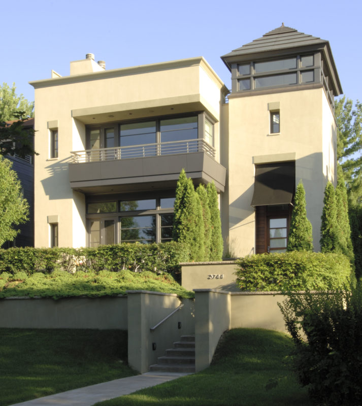
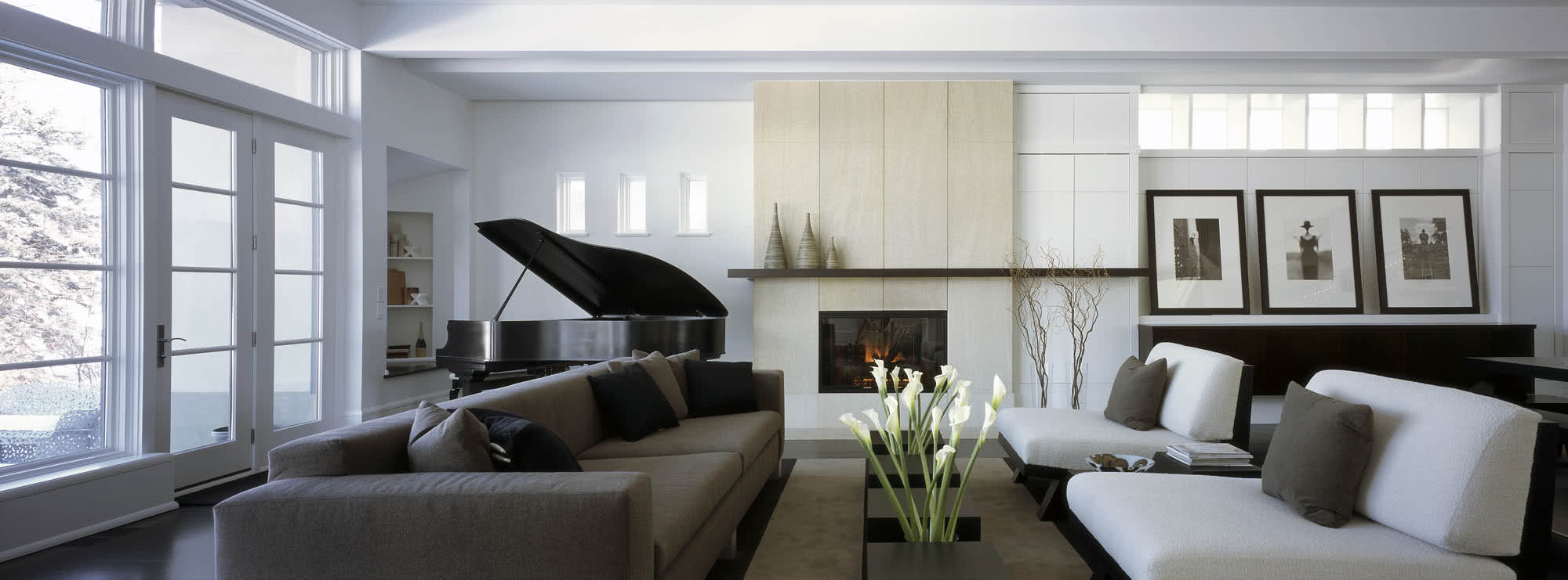
Old row houses are long and dark, all rooms lined up front to back. This open floor plan expands the space; a large skylight over the stair and variety of strategically placed high windows fill it with light.
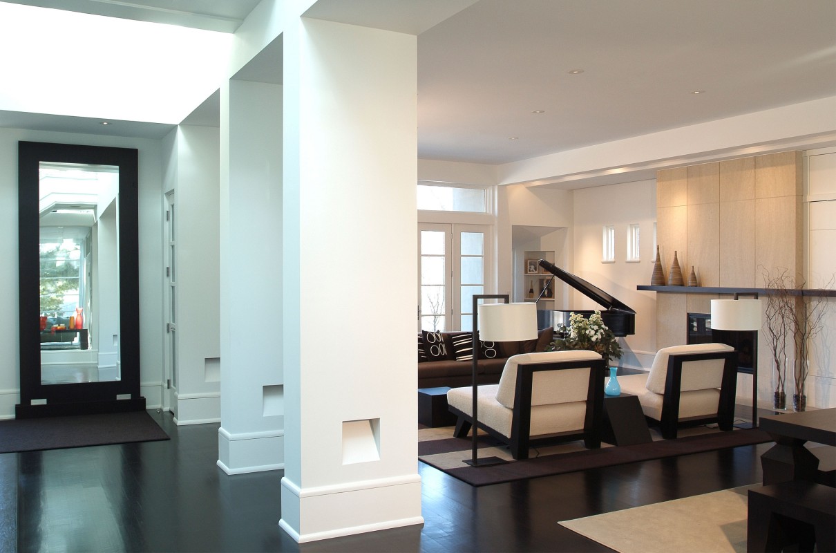
A floor plan this open requires serious stabilization. Custom wide columns conceal an anti-racking wood-and-steel structure—and become integral to the design.
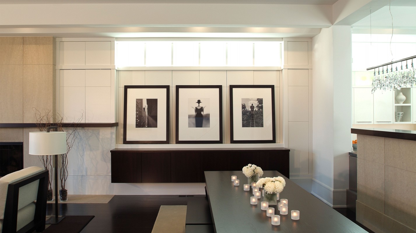
The homeowner needed storage space, and a home for his art. We collaborated with the client in designing unobtrusive cabinetry along the wall, which allows art to be layered in front.

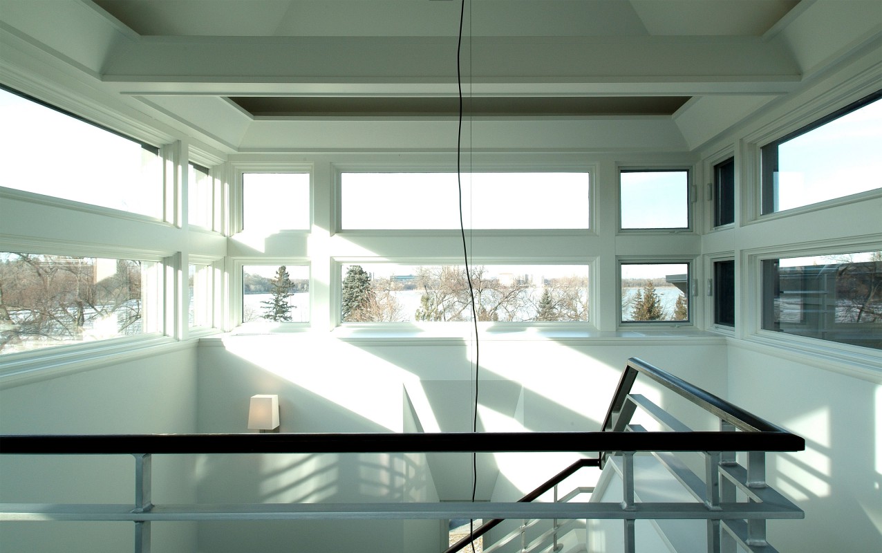
Not the dark, back-hall stairway you’d find in a traditional row house; this north wall is splashed by light from a south-facing skylight at the top.

The design takes advantage of every inch of the site: The wall of kitchen windows provides bright views of the raised garden terrace positioned over the lower-level garage, and a cozy TV room is up the steps beyond.

The north side houses powder room, entryway, and stairs—allowing living spaces to be in the southern, light-filled side. Clean lines and monochromatic stone provide a tranquil respite and expand the space.
The stairs lead to a large, private rooftop space with Jacuzzi and outdoor fireplace overlooking the city lake.
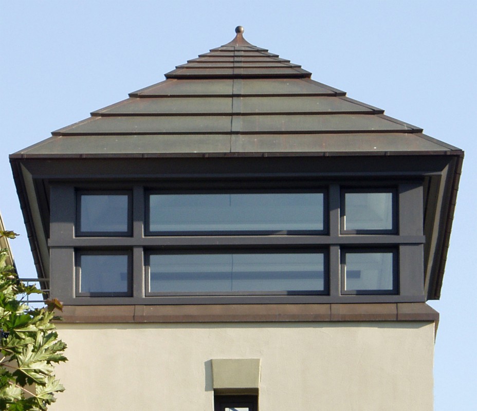
The Bermuda-style roof was custom made in copper. Even the vents and small gutter were carefully designed to disappear into the horizontal lines. Can you find them?
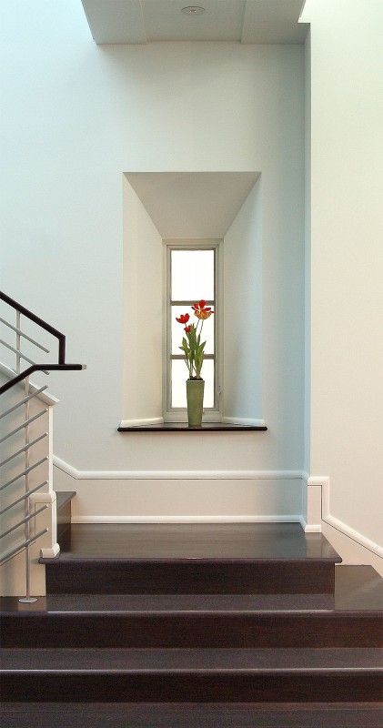
The narrow, deep-set window creates a little “moment”—bringing in light but no view of the neighbor’s home, and picking up the rhythm of the horizontal railing and other windows. It’s the kind of detail we love.
Calhoun Contemporary
Minneapolis, MN

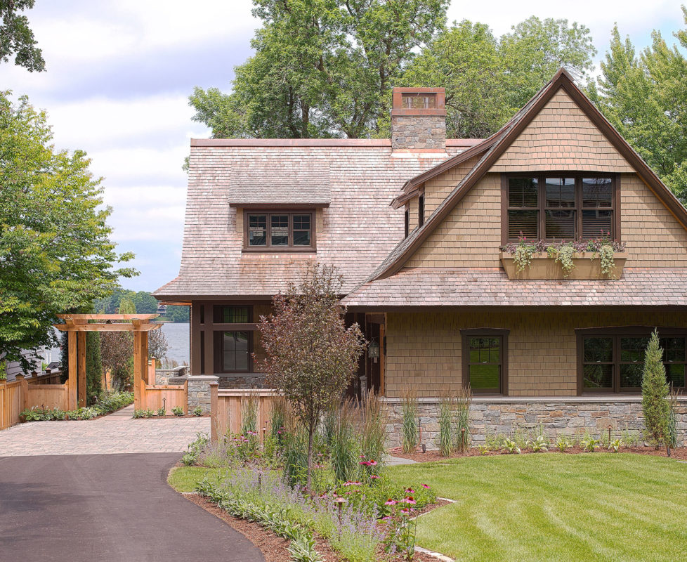
TEA2 was enlisted to replace a clumsy, many times-remodeled lake house with a gracious, character-filled home. The priority was quality and aesthetics over size. Here, a careful choreography to minimize the garage and invite guests through the side yard.
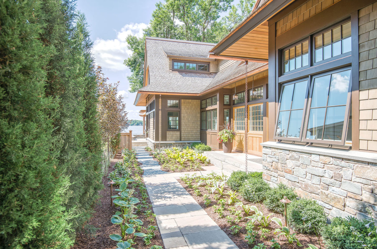
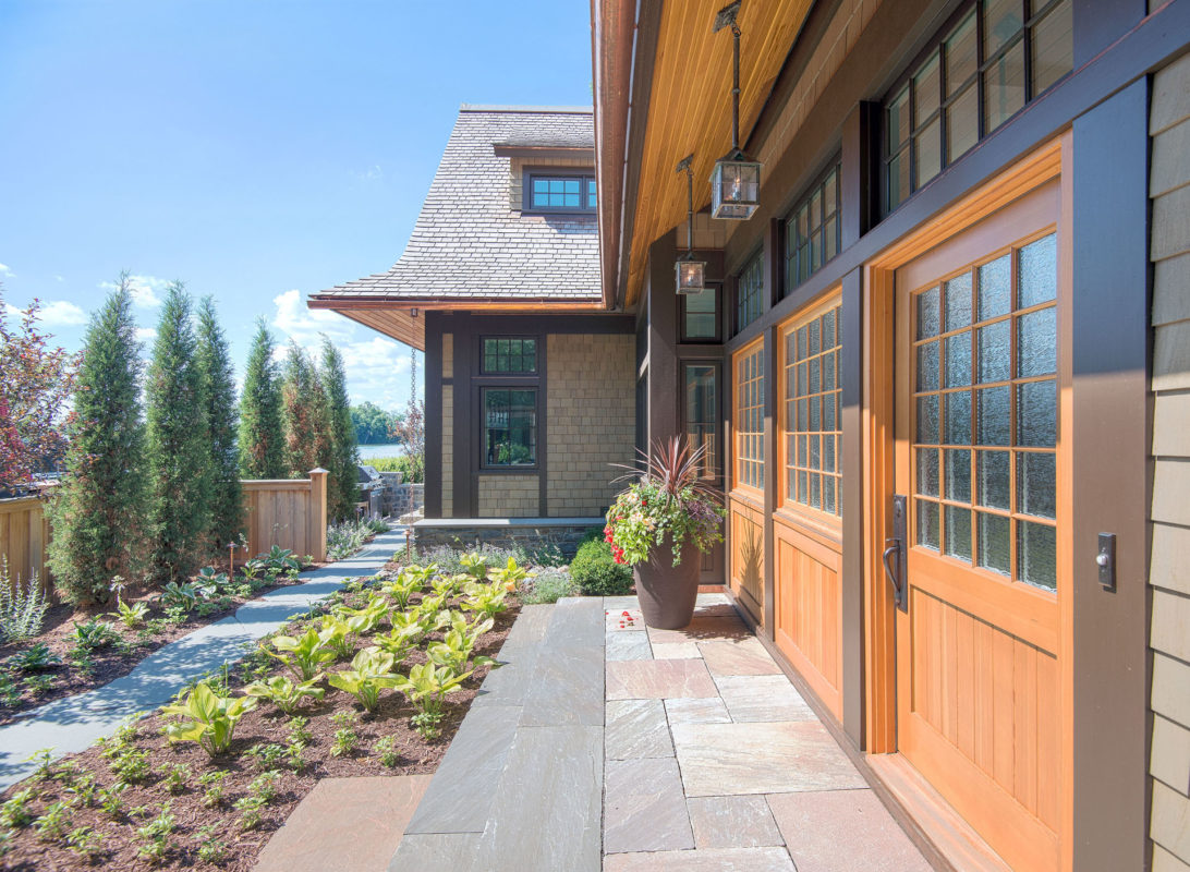
When the garden is fully grown, the path will feel like a lush invitation to home and lake. Deep eaves, cedar clear-finished soffits, and details like the rain chain suggest a subtle Asian influence.
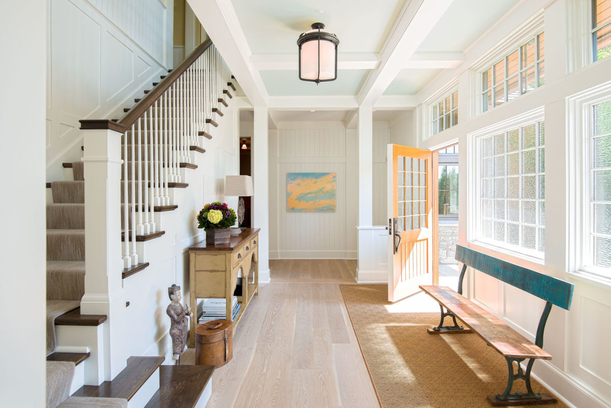
The oversize 3” Douglas fir door, wall of windows and greeting of the stairwell make for a memorable, sun-splashed entrance.

The homeowner wanted to use materials that felt authentic, respectful, and conveyed a narrative. For instance, the patina of the floor harkens back to his early days working in a flourmill.
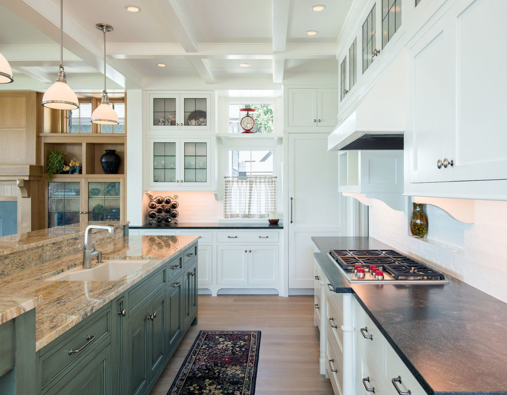
Ovens and freezer drawers were placed in the pantry, freeing up space for storage under the cooktop and reducing the need for confining kitchen walls. The variety of finishes and asymmetrical lines contributes to a friendly informality.
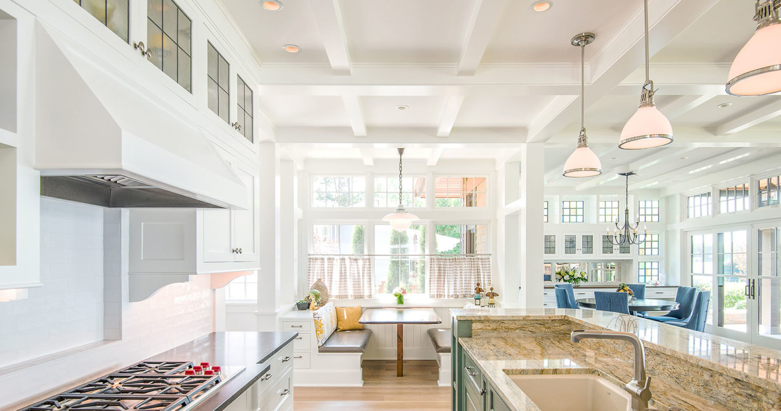
The breakfast nook at the end of the room does double duty, creating coziness amidst the open floor plan and serving as a light receptor for the space.
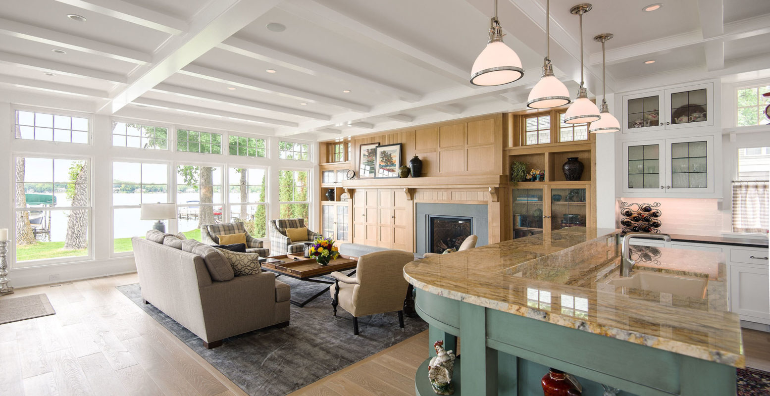
The island begins a conversation with the white oak fireplace wall, blurring lines between kitchen and living area. The rug isn’t a throw, but a carpet inset into the floor—no straightening required.
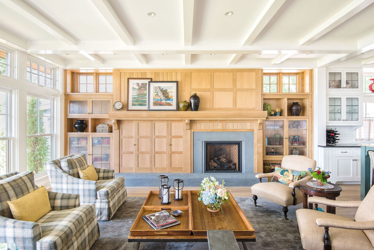
In a more formal room, the fireplace wall would have been symmetrical. But to create an informal cottage feel, we offset the bluestone fireplace and paired it with a concealed TV and different cabinets on either side.

Subtle nods to the nautical are found throughout the home—including in this leaded-glass window wall. The art glass both screens a neighbor’s house from view and glows in afternoon light.

A dormer window stretches the length of the upstairs hallway, animating the entry stairwell with light.

The homeowner liked the idea of irregular ceilings, reminiscent of grandmother’s attic. Recessed bookshelves flank a fireplace to create a cozy reading area. Deep window boxes add a pop of color.
Excelsior Bayside Cottage
Excelsior, MN

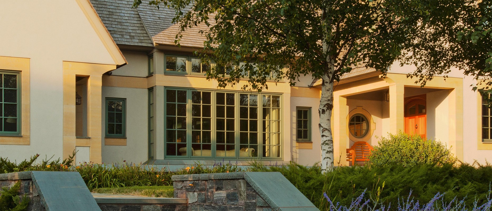
The wood shingles, roofline, limestone columns/trim and carefully planned gardens hearken back to early 20th century English Arts & Crafts style—but we re-interpreted it for modern, comfortable living.

Landscape and house were composed in tandem: Added fill raised the level of terrace and home, a courtyard at the back created privacy and a view—and at the front, a choreographed path allows guests to experience the exterior before arriving at the door.
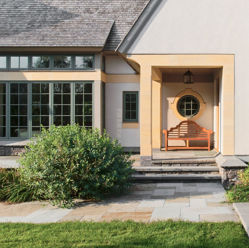
The entry experience of the house is not immediate: A meandering path leads through a protective layer of trees, turns—then, an “outdoor entry.”

The property didn’t have a sumptuous view, so we gave it one: an inner courtyard bracketed by home and pergola. Walls of glass make the home feel light and open, but the shape creates an outdoor “room” and sense of protection.
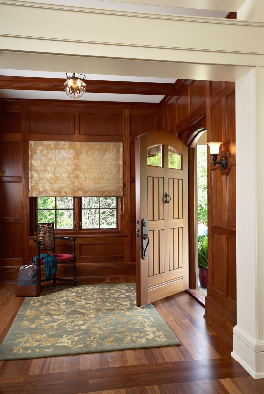
Using materials like mahogany selectively, in spaces like the foyer, creates important counterpoints of warmth and richness without eating a disproportionate amount of the budget.
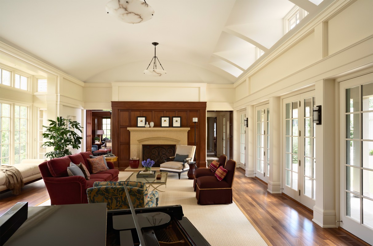
Although the house conveys a sense of history, spaces are filled with light and outdoor connections. Here, two sides of glass and an open feel greatly enhance a traditional living room.
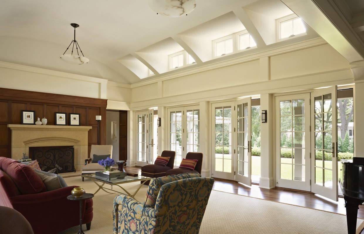
Dormers carved into the barrel-vaulted ceiling create unique “light vessels,” artfully animating the room.

We don’t expect clients to fit their furniture into a plan; we create a design that features these special possessions—from grand piano to dining room buffet and table.
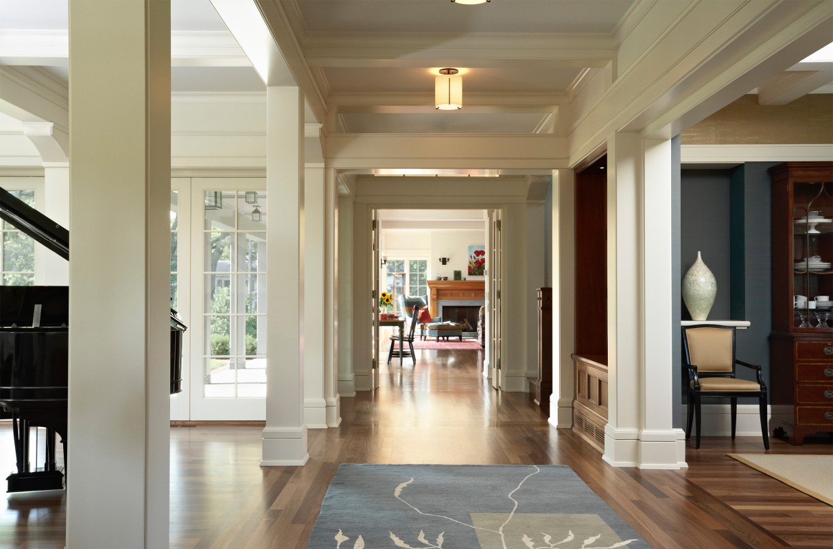
The private “L” wing of the house was designed to be closed off as needed, making a family-only area while the adults are entertaining. It also becomes part of the outdoor courtyard, in close proximity to the pool.
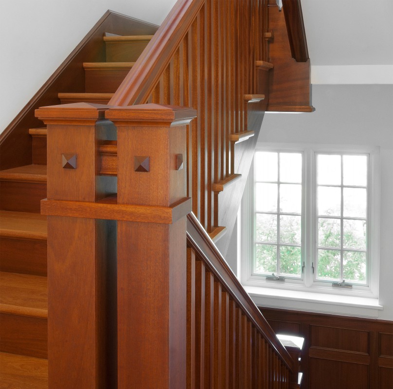
Not a grandiose front staircase, the stairwell discreetly and strategically divides the house into formal and informal areas.
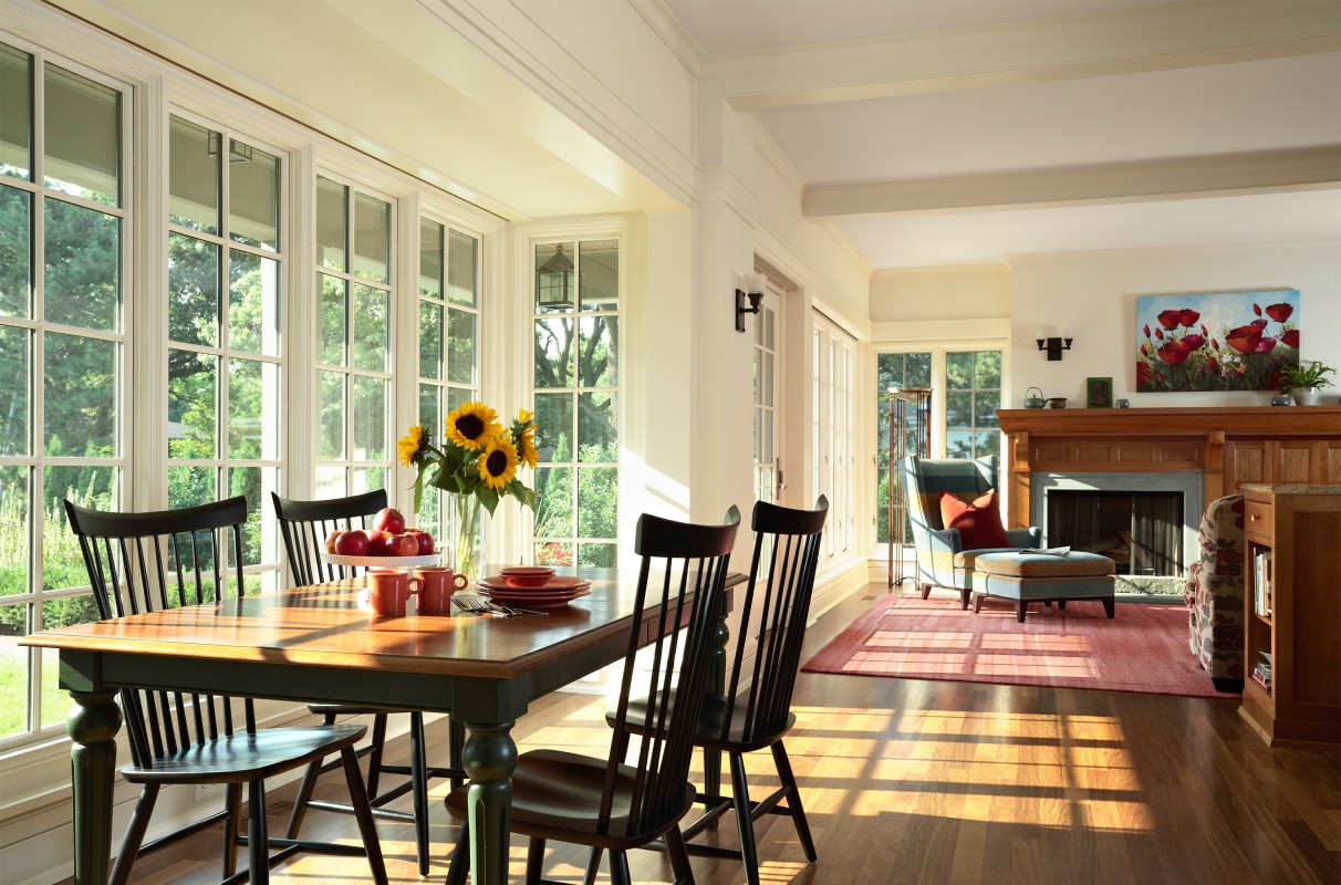
Instead of the more constrained (and dark!) rooms of the classic English Country house, eating and sitting spaces flow from one to the other, enveloped in light and outdoor connections.
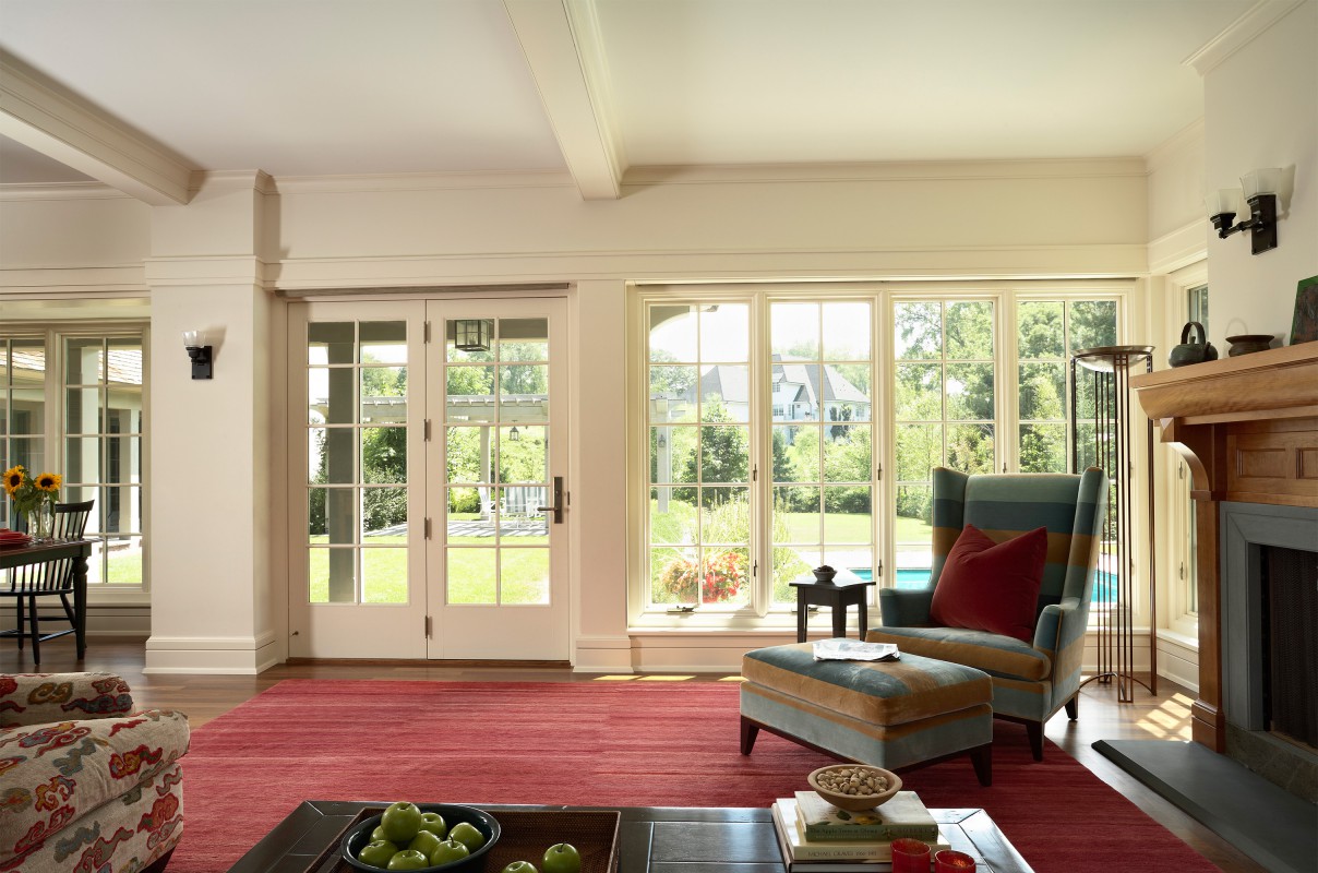
The family room allows a view to the pool, but it isn’t the focal point. We consider this key in climates where pools are aesthetically inviting only a few months of the year.

The round overhead window highlights a round motif. The inside plaster opening is larger than the window, and splays downward—providing a sculpted view of clouds and a bouncing of light.

The homeowner wanted the home to feel unique and eclectic—but with rich, authentic materials harkening to its heritage. Here that’s accomplished with slate tilework and custom cabinetry that looks like found furniture pieces.

Full-height windows, walkout doors, and the level of detail in ceiling, stairwell and cabinetry combine to make this lower level feel like a main-floor space, not a basement rec room.
Modern English Country House
Edina, MN

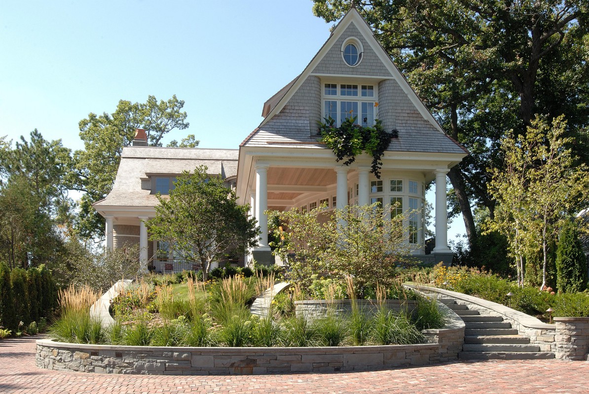
This spacious home was designed to convey a smaller, charming cottage on a knoll. Built on a narrow ridge, we aligned main rooms with lake and marsh views front and back, with supporting spaces to the side. A multi-car garage is tucked from view.

The combination of teak and leaded glass is set in curves to echo other architectural curves and sweeps—creating a graceful and inviting entry.
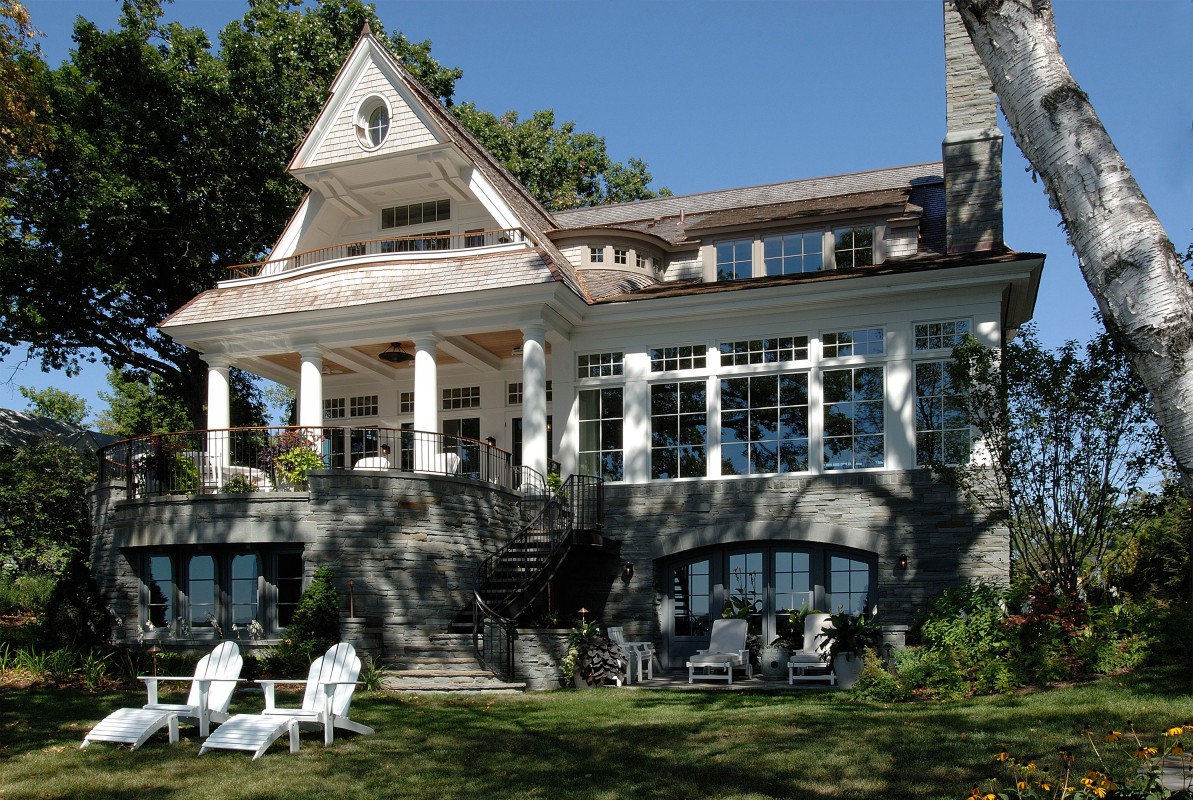
The bluestone base is “dry-stacked” using tight mortar—a complement to the lighter, glass-filled structure above. The dark foundation reduces perceived height and grounds the house to the land.
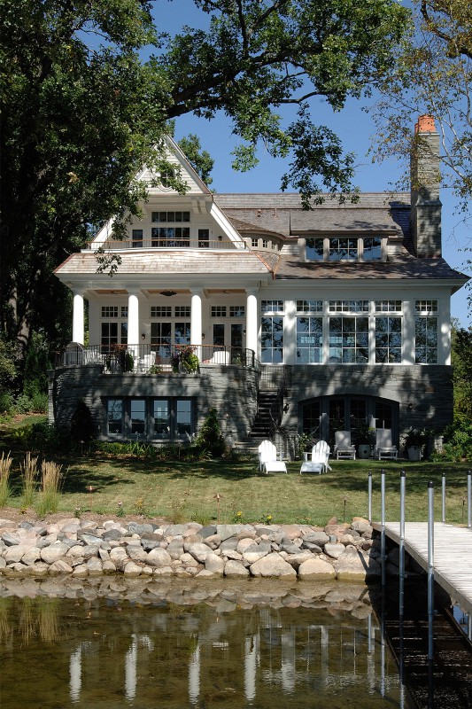
Each story’s look reflects its purpose: The basement is solid and supportive (yet has abundant windows). The first floor is full of glass, light, and sweeping views. And the master suite, tucked in the roof, affords spectacular vistas through gables and dormers.

The terrace of our dreams: partly covered, with columns framing broad and tall views, to combine the best of indoors and nature—creating a magical place.
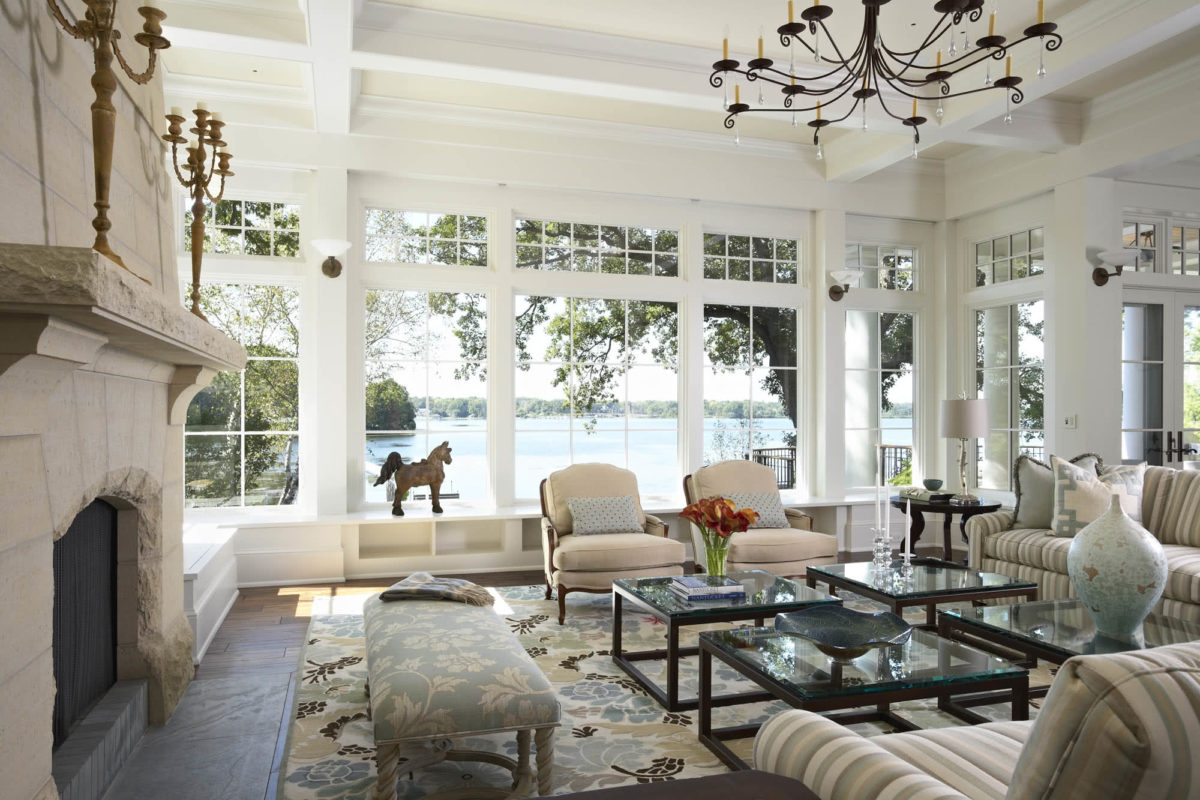
Highly divided transom windows over more open-paned glass lend character while preserving the view.

We designed the dining room around a beloved heirloom cabinet. Graceful stairs enhance the room’s character, as do hand-scraped floors.

Not just a “cell within a box,” the sun-filled kitchen commands a 270-degree view from marsh to lake, and sightlines to living and dining spaces.
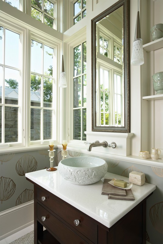
Even the simple act of washing is enriched by abundant light spilling over the basin, stone and woodwork.
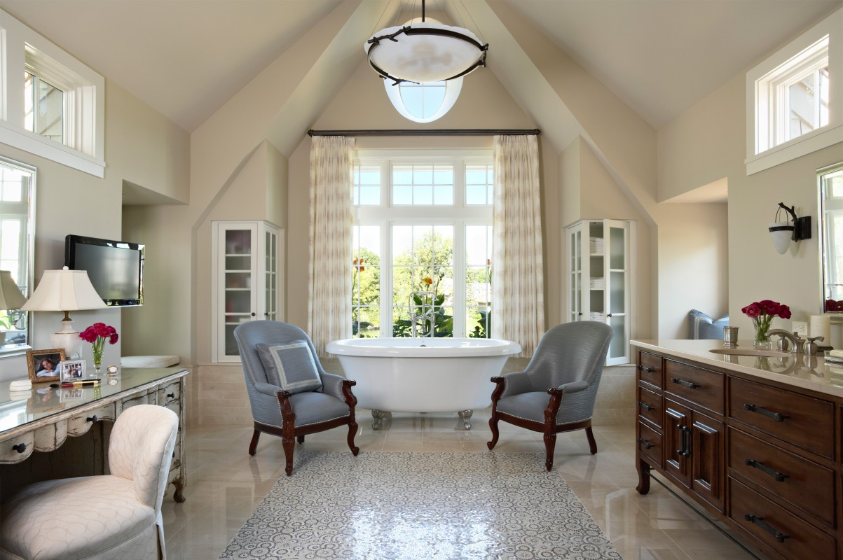
We used inset tile in the master bath to create a mosaic tile “rug.” Built-in glass cabinets provide airiness and balance to the room.
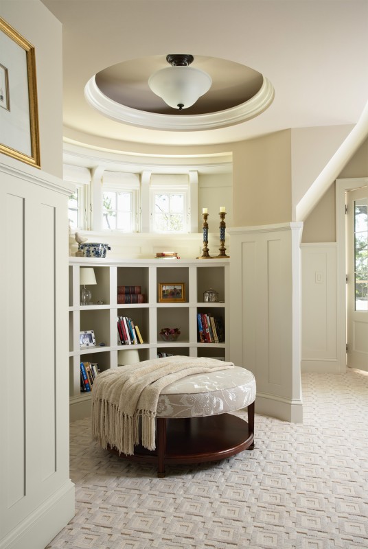
We use features like this curving dormer to create little “moments” both in the home and on the roofline. Here it allowed us to gracefully “cut the corner” between rooms as well as roof gables.
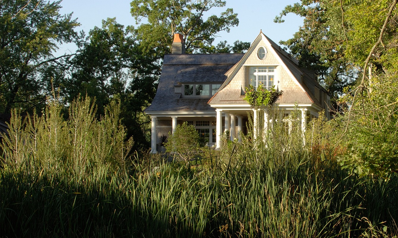
People long for homes that meet their size needs but feel like comfortable cottages, at home in their environment. It’s possible to have both.
Minnetonka Shingle Style
Minnetonka, MN

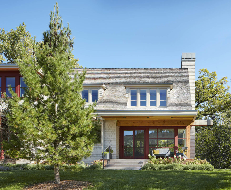
Our clients liked Cape Cod Shingle style, but wanted a more contemporary take. The look was made fresh by adding large window groups with super-sized panes. These windows, combined with carved-out recesses that create shady areas, also make the home more livable—providing controlled light and inviting spaces.
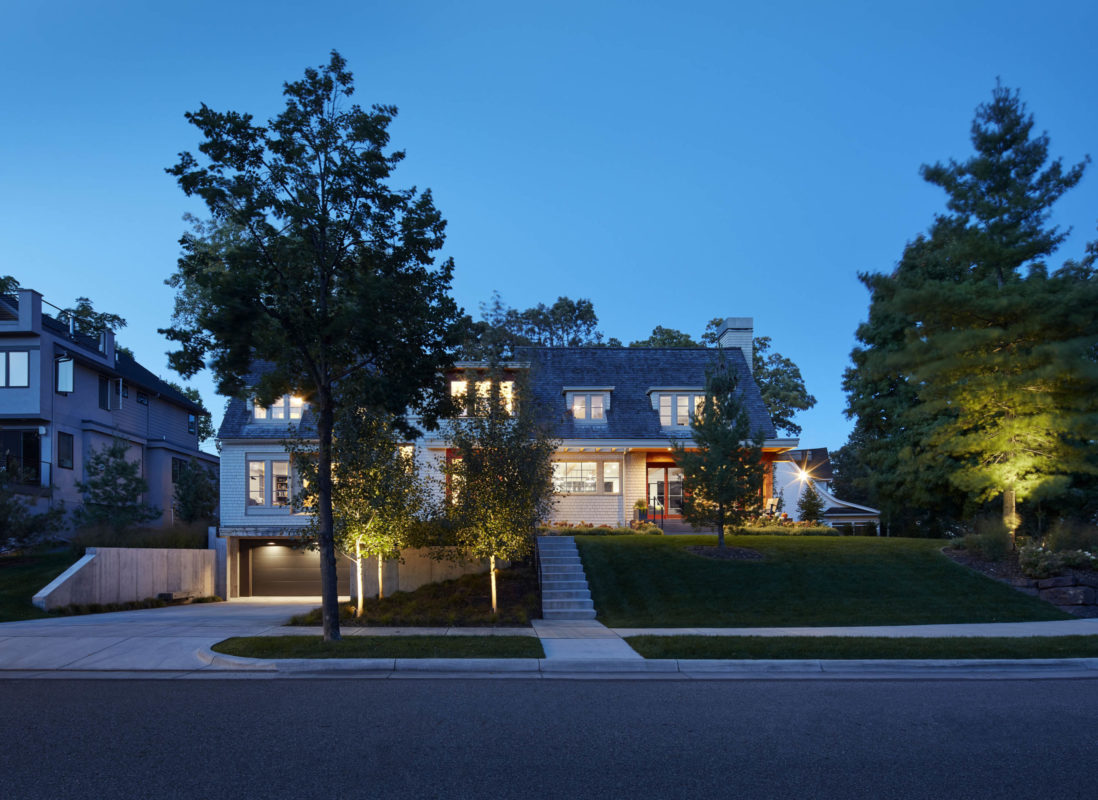
Built on a unique pie-shaped lot with sweeping front curve, the house was designed and sited to provide views of the wooded park while maximizing yard space and maintaining privacy.

A central entry and reading tower above are deeply recessed to create shelter and animate the exterior. Expansive corner views “break open” the conventional Cape Cod.
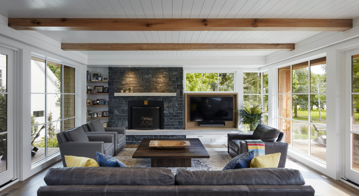
Who knew a Cape Cod could be so full of light? We kept the living areas one room wide to bathe interior spaces with sunshine, and provide wraparound views to front and back yards and the park beyond. Covered porches on each side provide a layer of privacy.
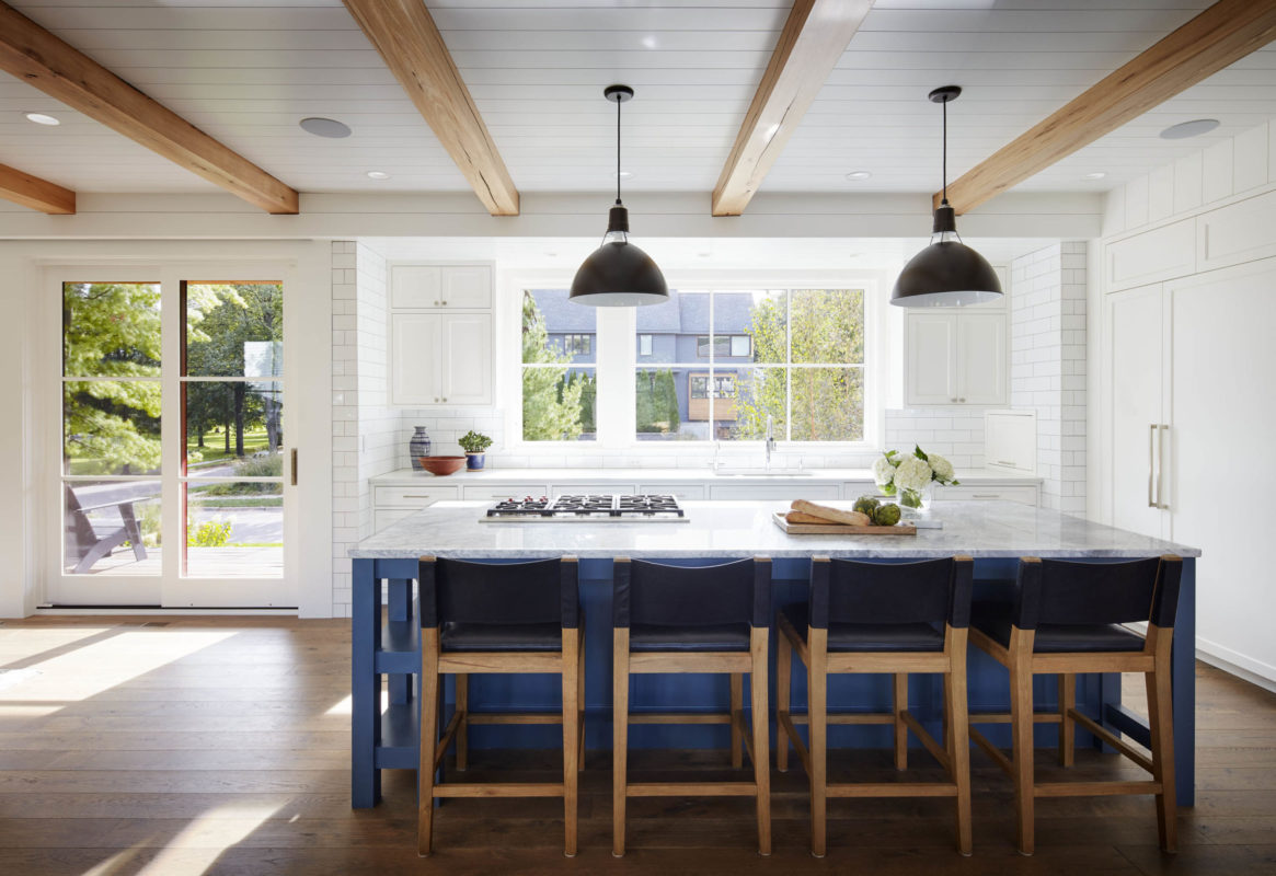
Finding the right balance of windows to functional space is a challenge we embrace. Here, the outdoors takes center stage, even in the kitchen. The palette was kept simple: crisp white shiplap, warm finishes, splashes of color.

We love open kitchens, but plan carefully to keep them from becoming too dominant. Here, kitchen, dining and family room co-exist beautifully. A pantry provides kitchen back-up, reducing confining walls and view-blocking cabinets.
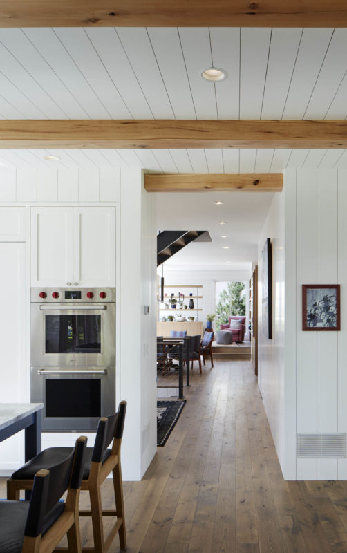
Secrets are hidden in the hallway. The right wall contains kitchen support; across from the stairway, a concealed closet. Beyond, an ordered layer of rooms, ending with a tree view.
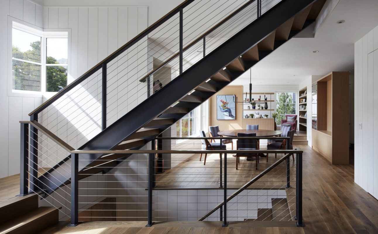
Even the stairway was designed for light, with cable railing and space between treads to invite sunshine. The natural wood cabinets and niches provide a warm balance to the modern aesthetic of white and steel.


Skylights illuminate the stairway and invite you to the second floor. (In fact, they invite you to lie down, stare into the sky and escape the peopled world.) Bonus: The window bench doubles as storage space.
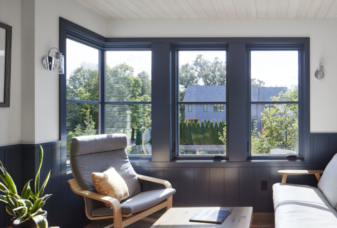
A second-floor reading tower overlooks a wooded park. Corner windows contribute to the sense of borderless-ness. Inside and out, muted grays and neutrals stand in for more typical Cape Cod blacks and whites.
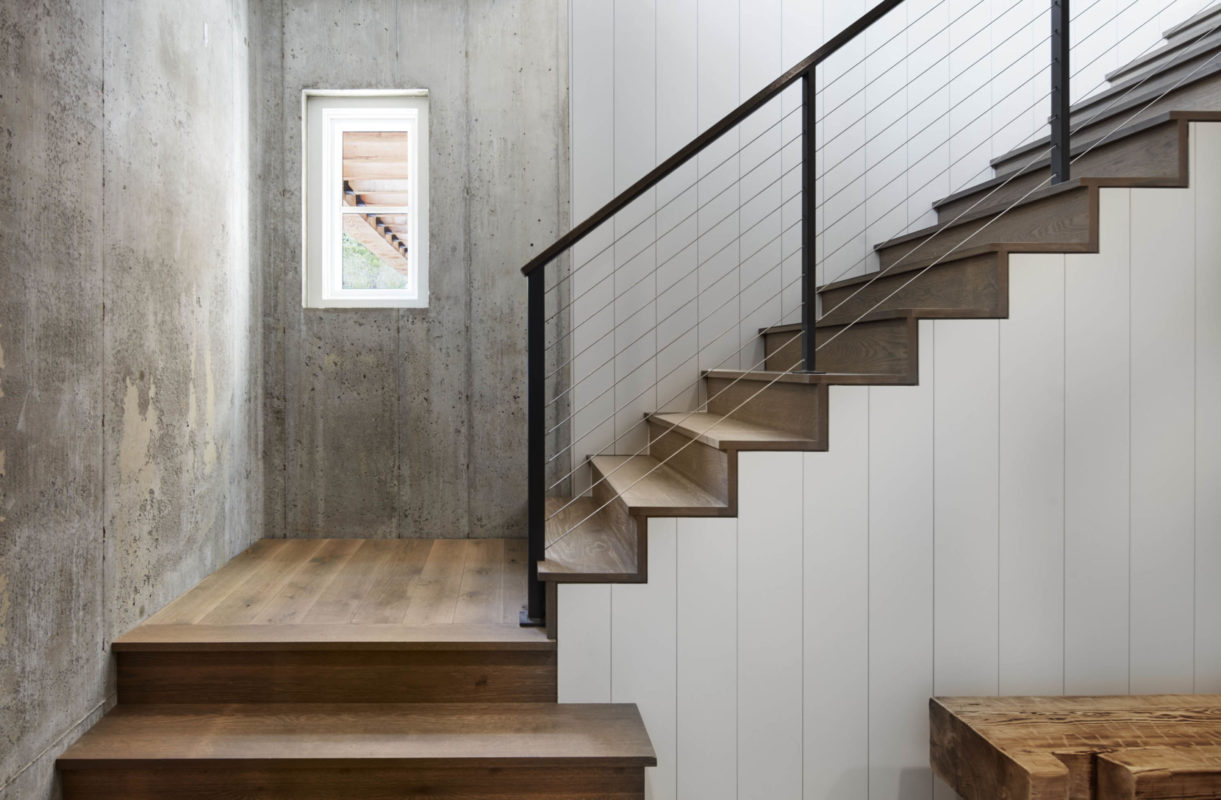
The combination of concrete and natural gives the stairs a contemporary, semi-industrial look. Merging interior finishes with exposed structure between floors provides a smooth transition and a more honest and integral quality to the spaces.

Even the tuck-under garage/workshop is unique and full of light, finding its beauty in basic materials like pristine concrete flooring and walls.

A first-floor guest bedroom overlooks the back yard and deck. Wrapped in warm shiplap, rather than the white timber used elsewhere, it provides a reclusive counterpoint.

A conventional Cape Cod might have a rear window or two, and a covered porch. We contemporized it with a wall of windows to blur the lines between inside and outside. Recessed areas under projected roof eaves provide covered seating on the deck.
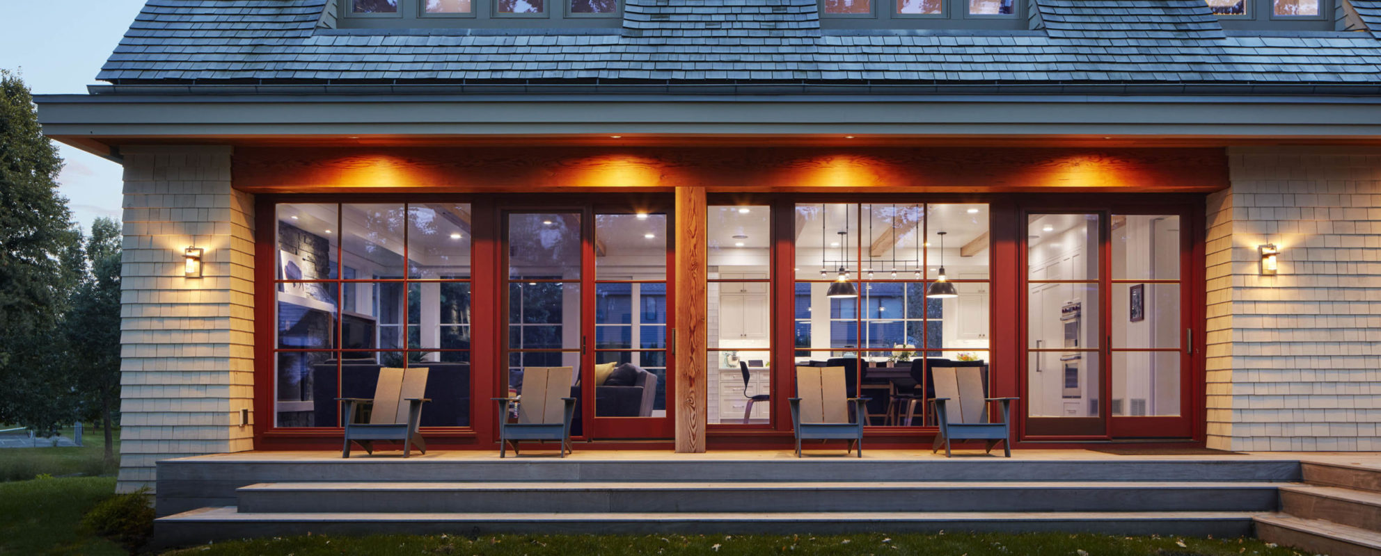
We used continuous, full-height windows and doors for family room, kitchen, and casual eating spaces—giving the homeowners a sense of lake living in the city.
Contemporary Cape Cod
Minneapolis, MN
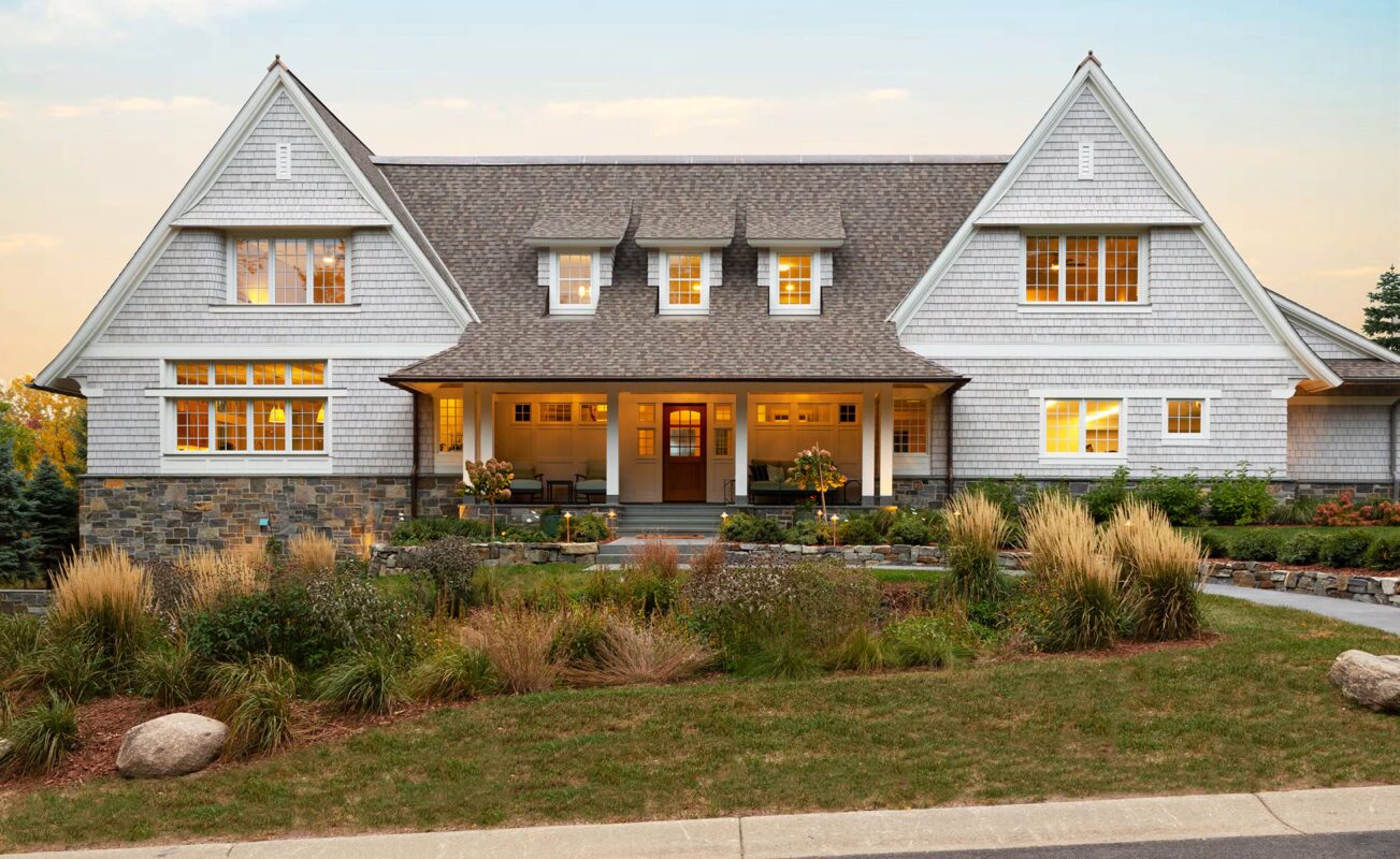
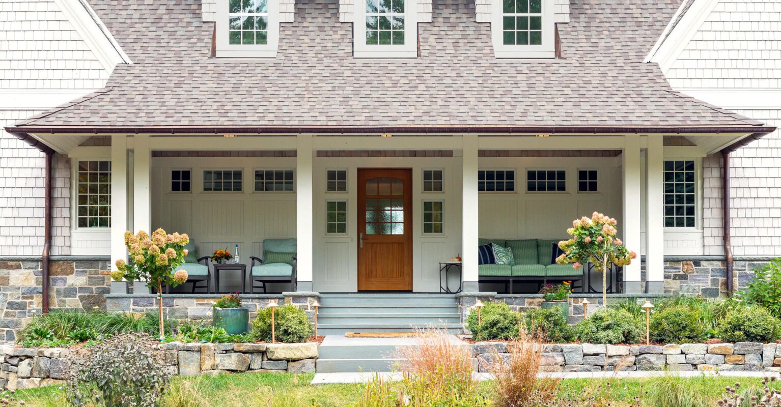
A new home with timeless character and charm? Yes, please! The invitation begins at the front porch with hand-tooled stone walls, whitewashed cedar shingles, a satisfying sense of symmetry with welcome variations, and a sweeping roofline.
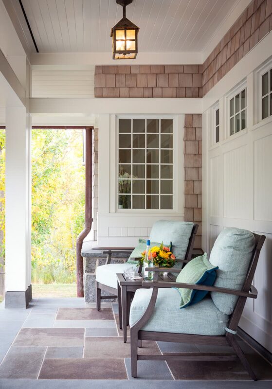
Full-color bluestone with a select blue border coordinates with outer stone walls and defines the porch. The pantry window peeks into the corner, giving the interior light and exterior character. It’s mirrored by a mudroom window on the other end of the porch.
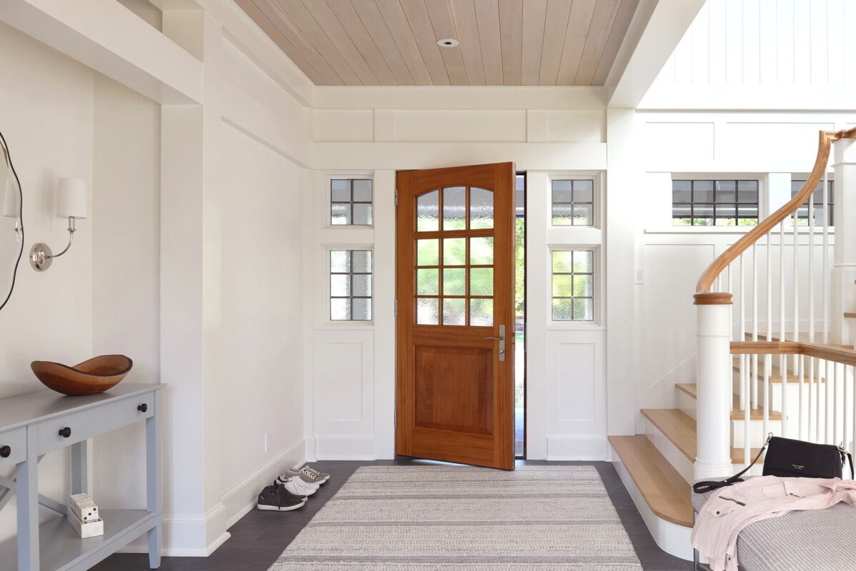
The entryway is open and bright; articulated beams and columns nod to shingle-style architecture, with natural wood tones adding warmth and character. The handcrafted door hints at the barrel-vaulted living room ceiling.
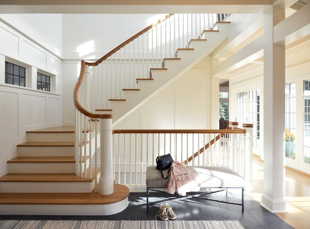
One of the homeowners, the son of a cabinet maker, grew up appreciating meticulous craftsmanship. The elegantly curved stairs and compound-curve handrail are but two examples showcasing the fine craftsmanship in the home.
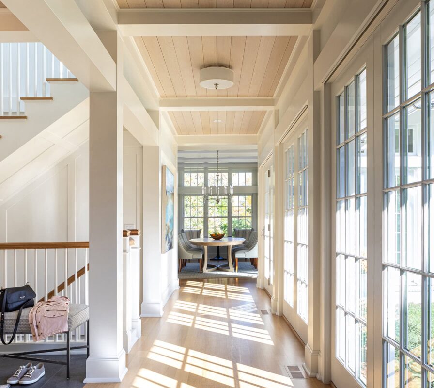
To maximize views and southern light, the house is designed around a center courtyard. White oak flooring and a stained cedar nickel-gap ceiling frame the main hallway. For us, every detail matters—from the movement of sunlight across a room to the location of each mechanical grill.
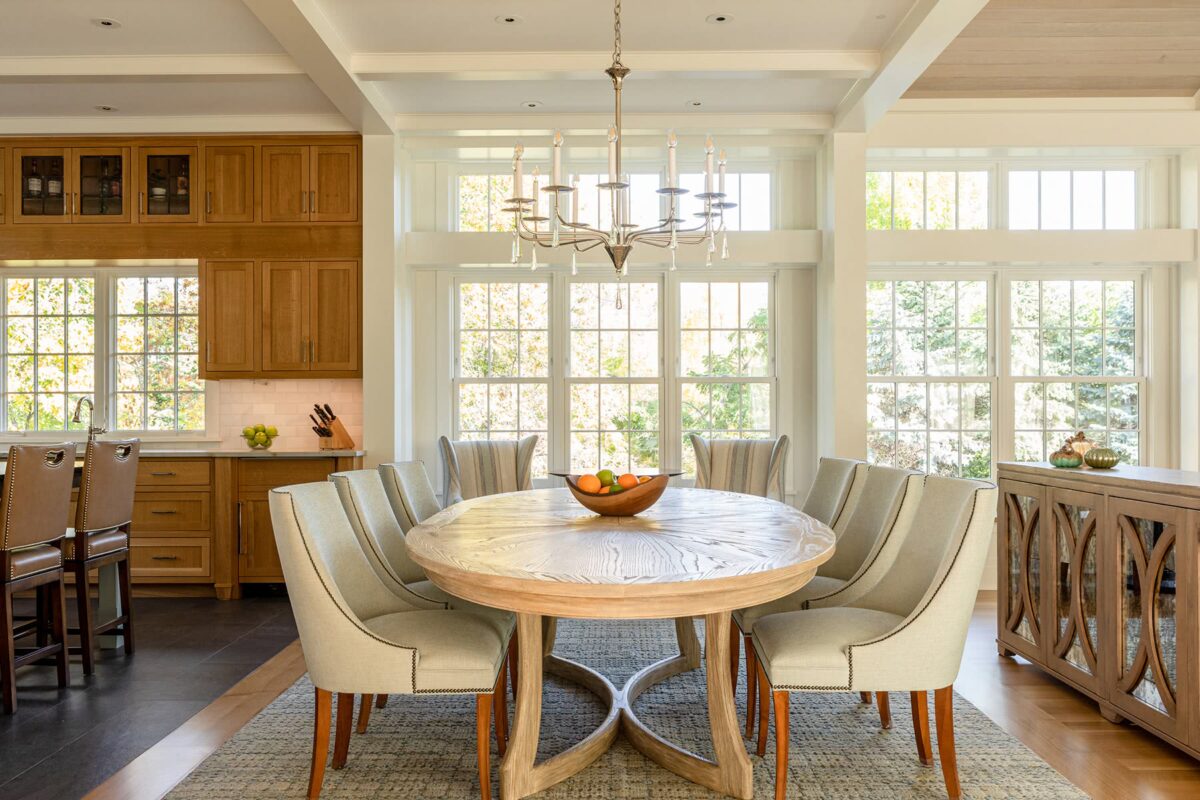
Changes in flooring, the use of architectural elements such as the beams, and thoughtful furniture choices provide the sense of rooms—without traditional, confining walls. Living room, dining room and kitchen spaces flow together, yet remain unique and distinct.
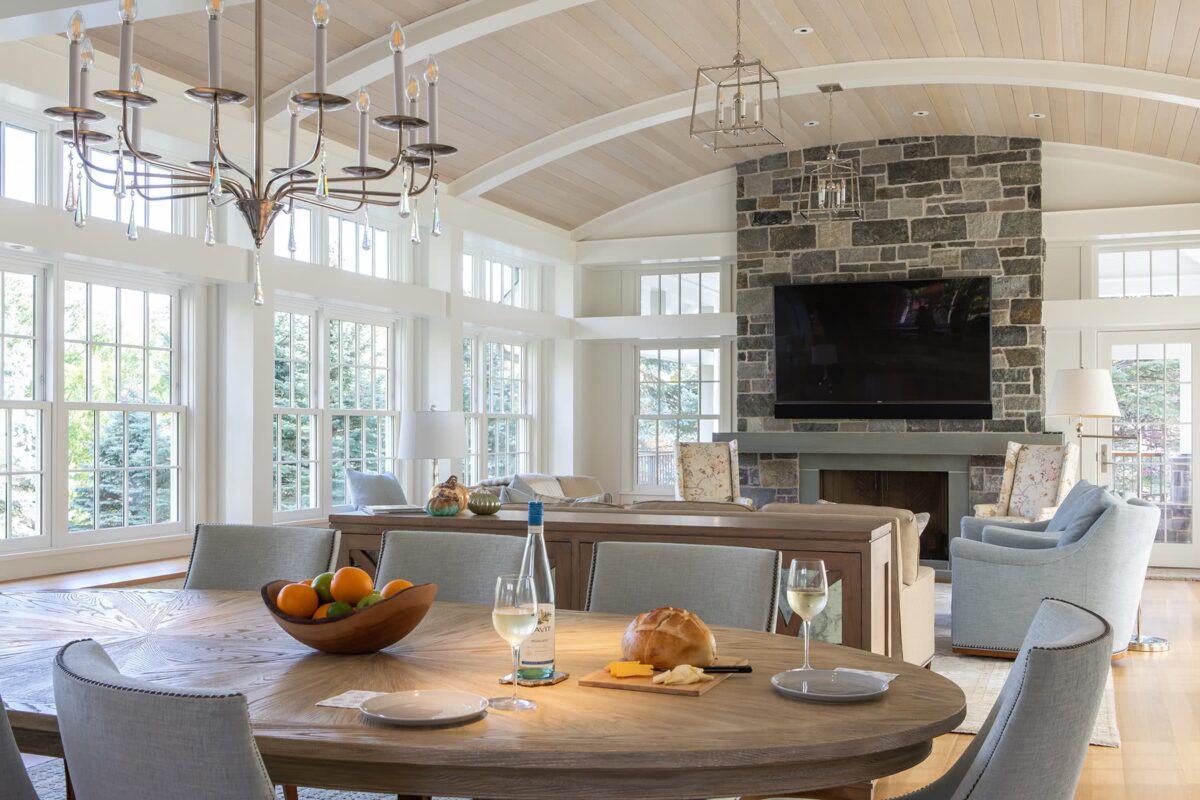
Thanks in part to the center courtyard, the living room has views in three directions. A natural stone fireplace anchors the room; the barrel-vaulted ceiling lifts it; the full length of windows expands it. At room’s end, an open-dining porch.

Marble subway tile flanks the broad kitchen window for counter-to-ceiling drama. Cabinetry is crafted from rift-cut white oak—a woodworker’s dream and historical favorite—keeping the look classic, rather than trendy. A hand-tooled, perfectly patina-ed range hood completes the kitchen.
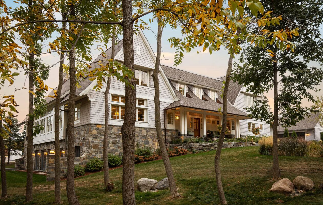
A north side, lower-level walkout takes advantage of the sloping topography of the site and creates an ideal location for a future pool. The gentle curve of the stone pier lets the house and land meet gracefully, instead of abruptly.
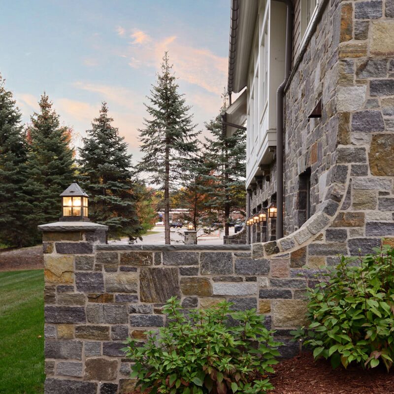
A custom, local-stone blend was created just for this project—taking color, texture, size and shape into consideration. TEA2, the homeowners and master masons worked together to create the well-crafted look; stones were hand-tooled to allow tight and consistent mortar joints.

The open dining porch offers a wraparound view of outdoor spaces, while the stair provides a sunlit path from courtyard to lower side yard. Even more evident from this perspective: the careful artistry of the stone foundational wall.
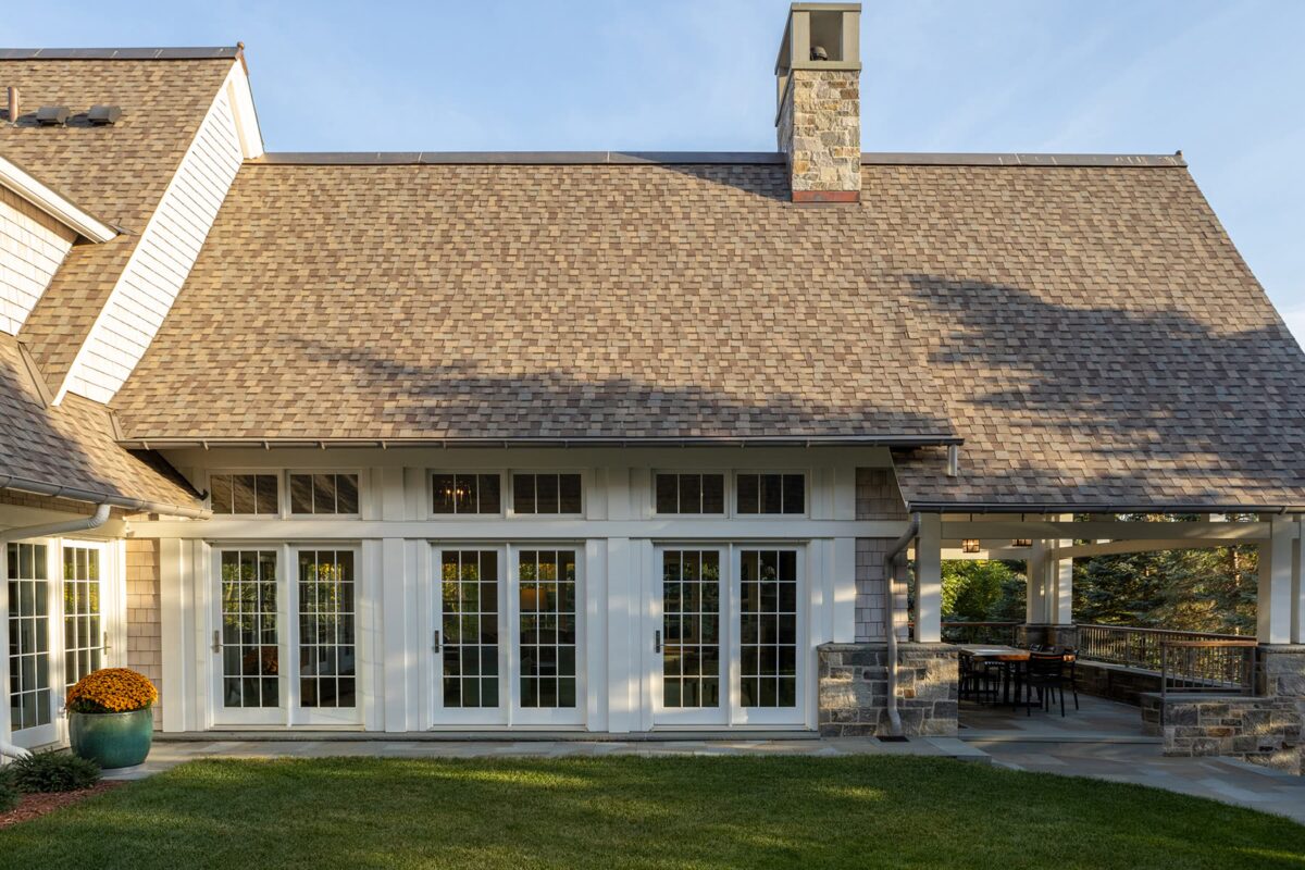
The courtyard is the home’s inner sanctum: a refuge from busy streets and a schoolyard nearby. The entry hall, dining room, living room and owners’ suite all surround the courtyard, enjoying views and access to the calm sanctuary.
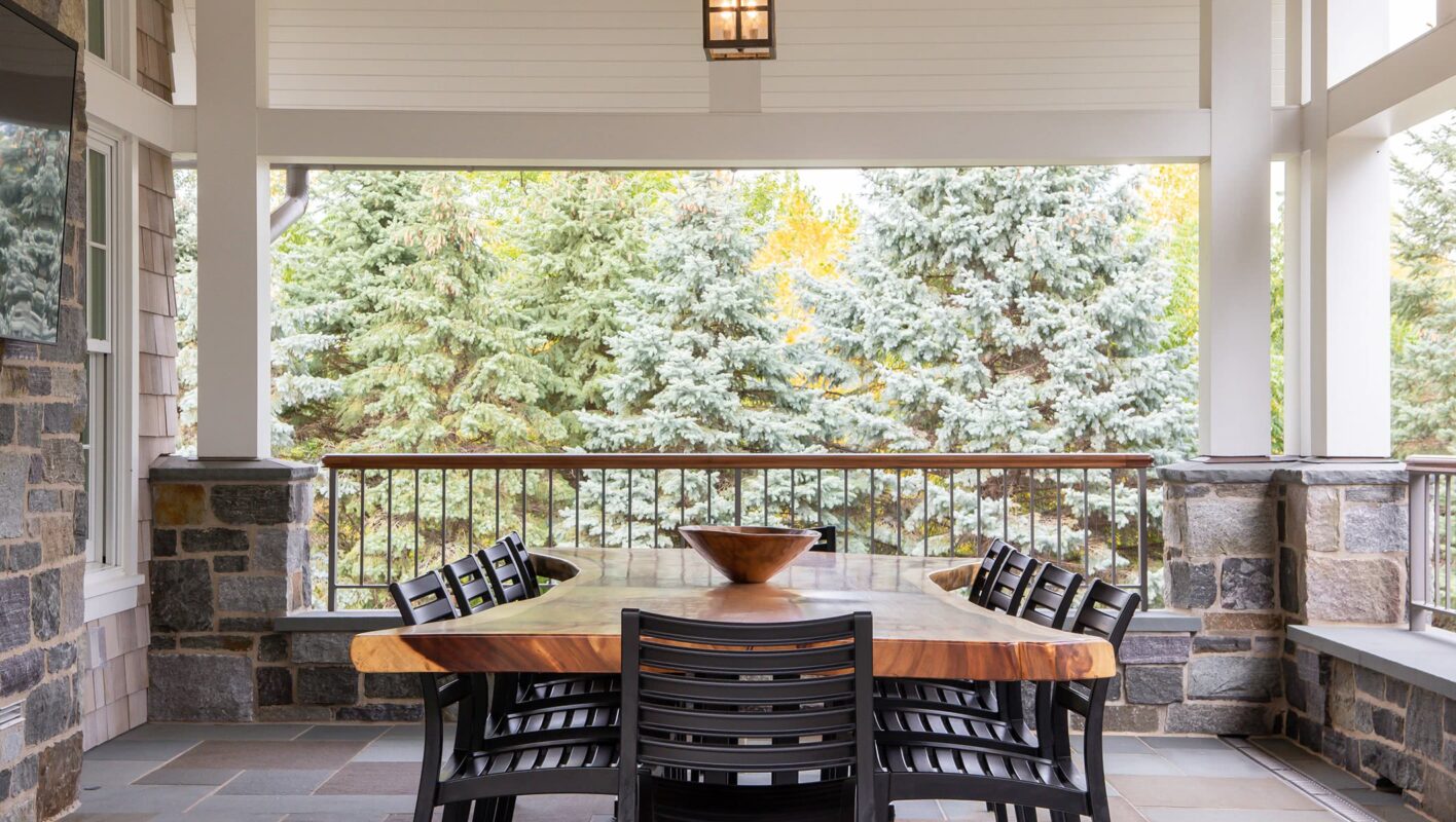
The dining porch is meant for all-season entertaining, with heaters built into the ceiling, and an outdoor-rated TV. It feels cozy, but the stone walls are scaled for sitting, and allow the space to comfortably accommodate a large gathering.
Stone and Shingle Courtyard Home
Shorewood, MN

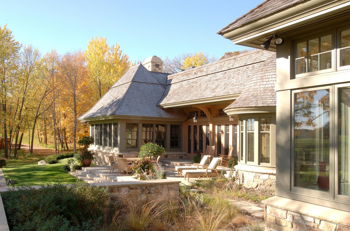
This Minneapolis couple decided to retire to horse country. They wanted a home that felt as if it had always been there, part of the bucolic landscape. Graceful, curving lines echo the surrounding rolling hills.
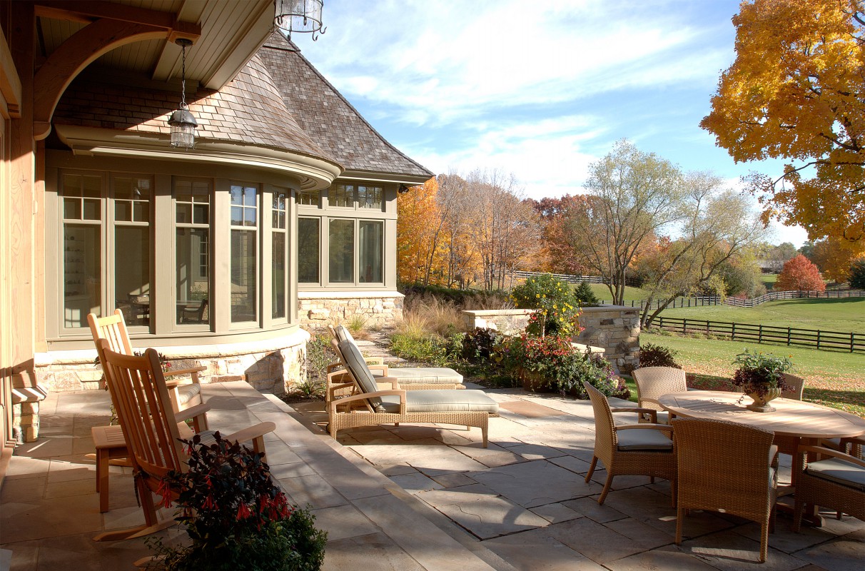
A large overhang creates a kind of outdoor room, perfect for sitting, even in the rain. The multi-level terrace integrates the house into the landscape gradually—yet from every level, one enjoys a sense of prospect over the land.
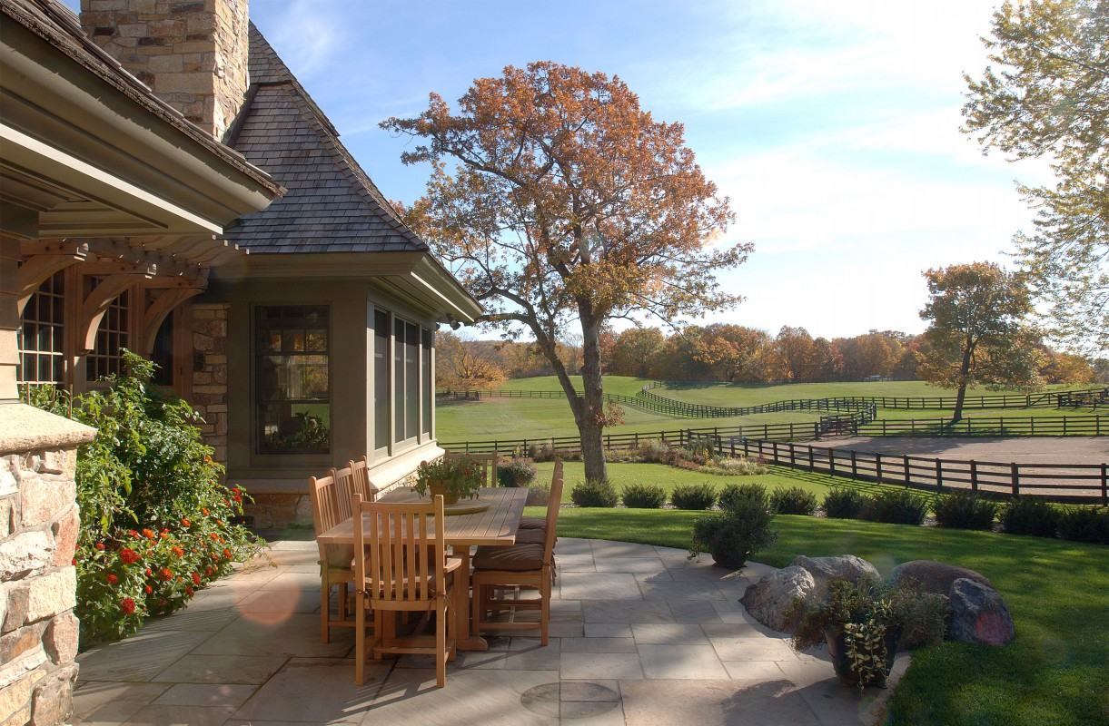
An organic, soft palette and natural materials like stone and wood help the home feel connected to the landscape. Deep-profiled eaves protect wood from weathering. Thick walls and wide millwork convey richness and permanence.

The house is relatively long and thin where main spaces are, allowing views from horses and pasture on one side to woods on the other. A “rumble strip”—instead of a solid drive—maintains the connection between living room, woods, and distant pastures.

A clear sense of quality without ostentatiousness is a hallmark of our work. Instead of a pretentious entry, we curved the eave line sensuously, creating an eyebrow that is subtly, gracefully, intimately welcoming.
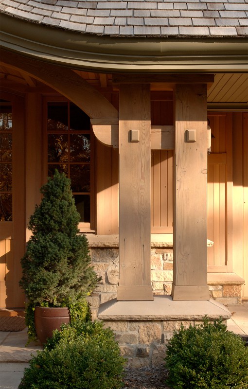
Profiled cove moldings, plus tongue-and-groove oak paneling under the eaves, add warmth and the play of light. Pegged wood “piers” do more than support the roof; they become a design element.

Here, the lines of the roof, the support beams, and the rolling hills are echoed in a simple exterior side panel.

From the front door, an arcade opens to the living room and views of fields beyond, while leading to kitchen and dining areas. Roof dormers animate the vaulted ceiling with light.

The centerpiece of the long, main room, the fireplace needed to be substantial. To provide a casual counterpoint and connectedness, we used the same stone used outside. The vaulted ceiling and arching beams also echo the home’s exterior curves.
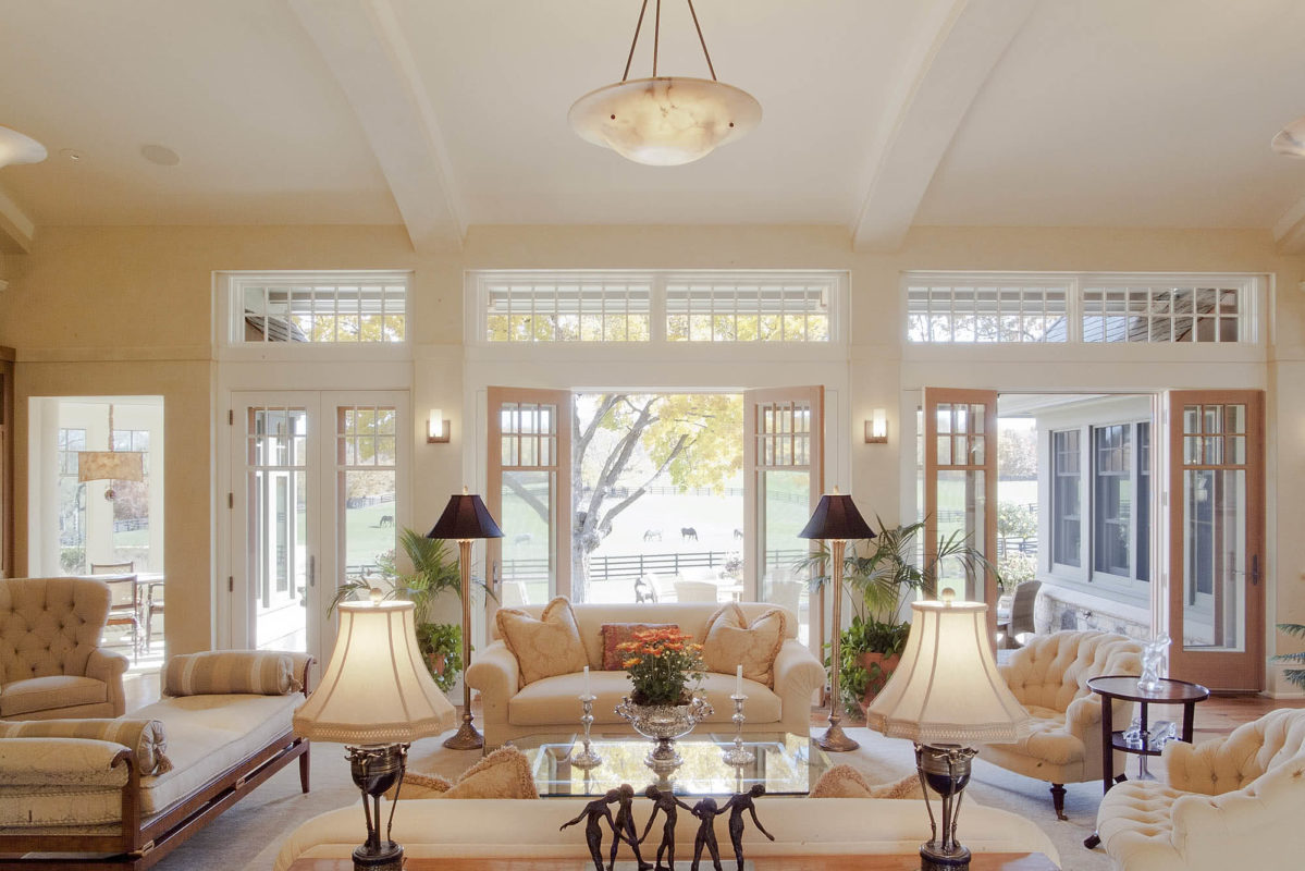
A sequence of french doors opens to the east, providing ample morning light and a real connection to the landscape; while the house feels traditional, it lets in far more light and views than a traditional design would.
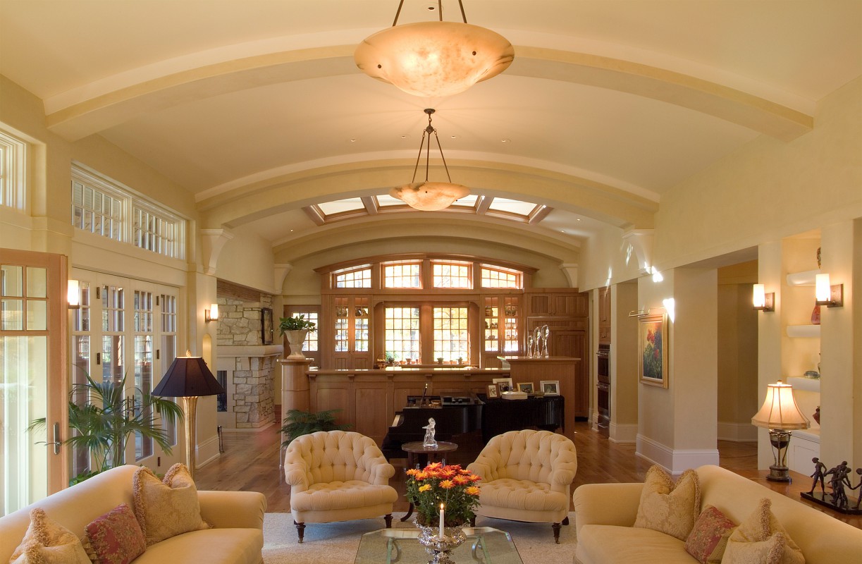
The main, vaulted room extends over a baby grand piano—and beyond that, the kitchen. The homeowners wanted the kitchen to feel integrated but not completely exposed. Natural south light pours in through an interior glass ceiling.
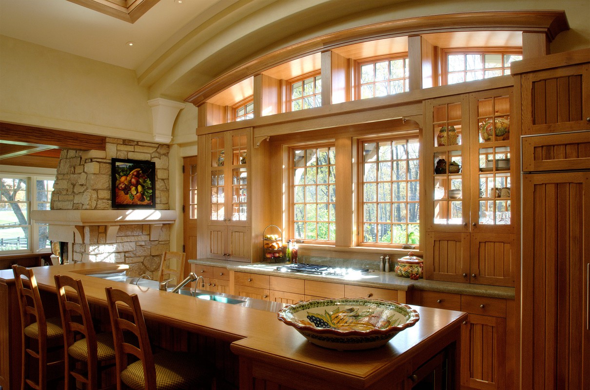
How do you design a kitchen that doesn’t feel overly kitcheny? By adding pantries for hidden storage, concealing appliances, using lines and materials that echo other parts of the home, and building cabinets that double as windows.
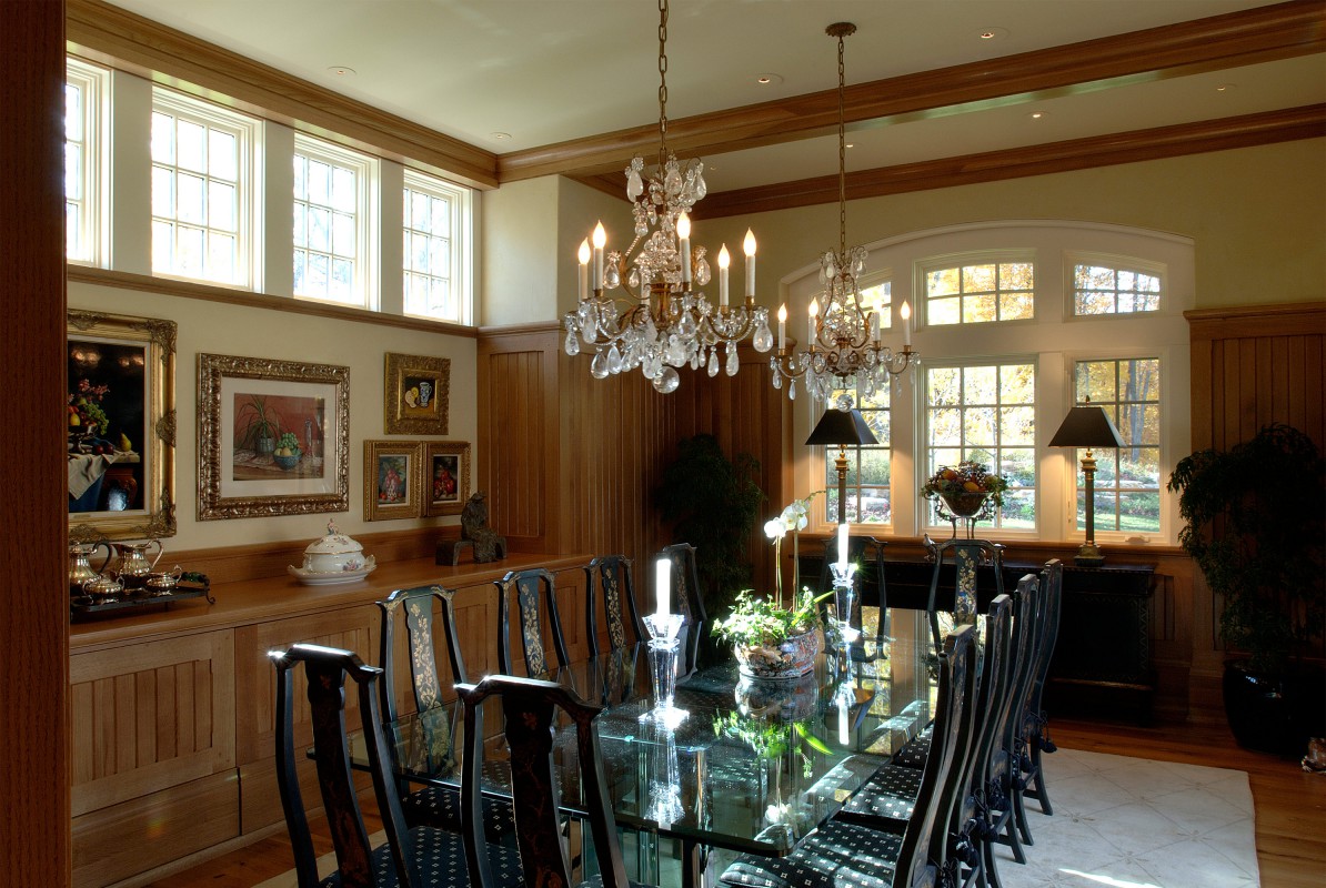
Dormers cut into the roof edge light up the room. Here and throughout the home, cabinetry is quarter-sawn oak, pegged at the corners, with beveled frames. Casual architecture balances the homeowners’ more formal belongings.

The homeowners love entertaining and have an evening card-playing ritual. Here, a circular room envelops a circular table.
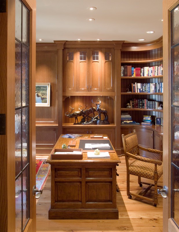
Cabinet-quality woodwork frames the office, with sinuous curves that quote the rest of the home. Lead caming and seedy glass french doors add texture and detail.
Equestrian Country House
Medina, MN

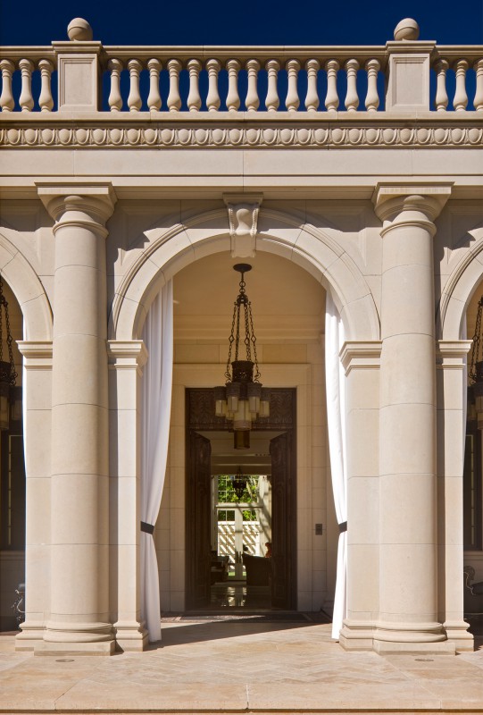
Our clients admired Italian Renaissance arches and columns, and wanted a classical home with exuberant style. We researched classical profiles, and delineated every column, cornice and wall down to the joint pattern.
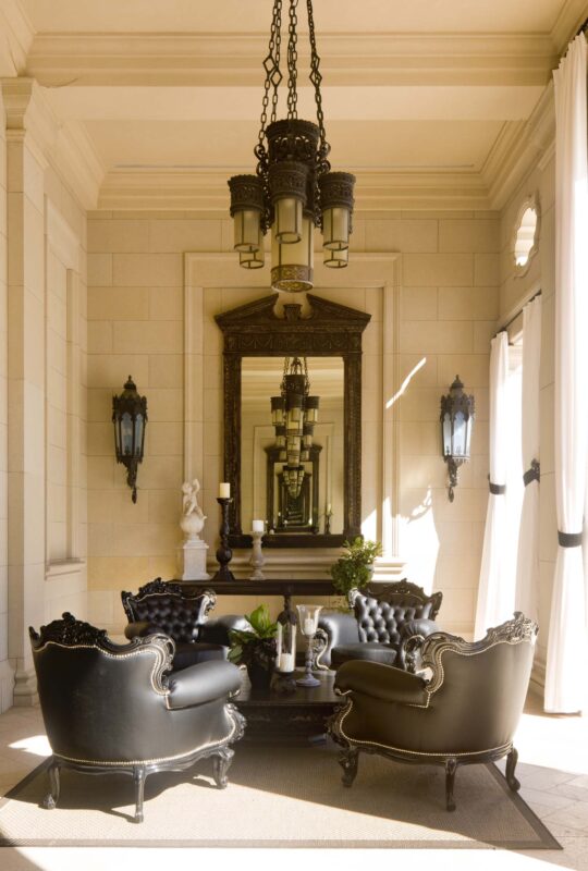
What looks like a sitting room is actually an outside loggia. This gracious entry space—where interior comforts meet fresh air—has a wonderfully inviting ambience.
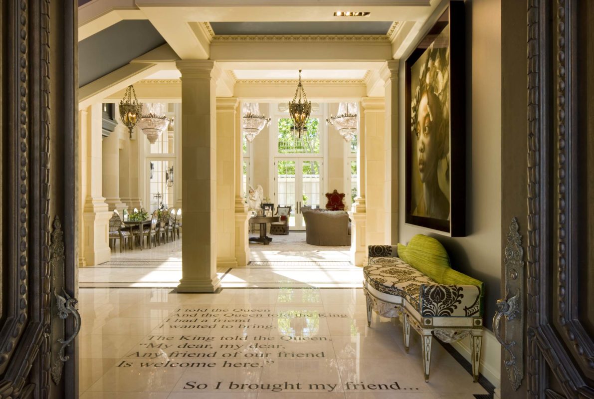
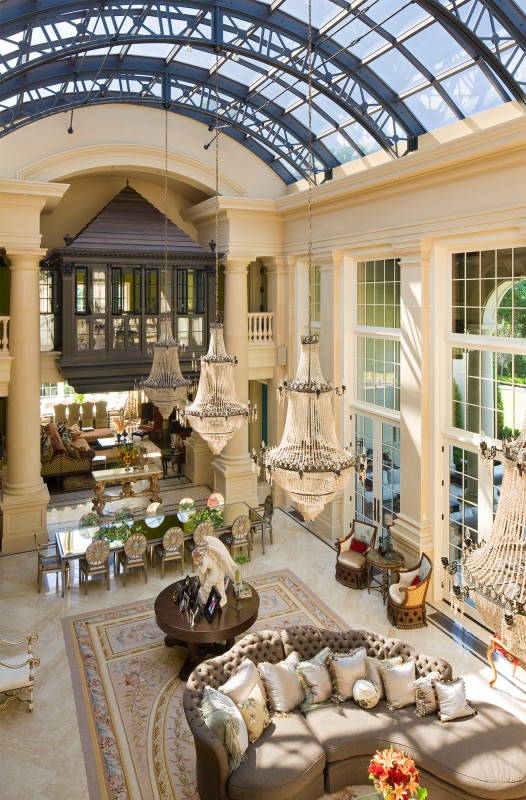
The 40-foot, atrium-style grand salon is illuminated by a metal-framed skylight inspired by Victorian railway stations. It required precision planning and engineering; a crane installed the frame as a single piece.
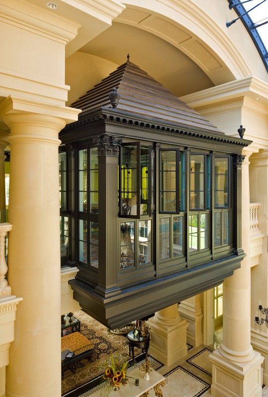
The homeowners wanted a loft that “floated” between the grand salon and family room. By breaking the arched ceiling’s entablature and giving the room its own roof and distinct materials, we were able to create the effect.

Suspended day beds further the sense of floating. The wall of windows looks out onto the arched skylight.
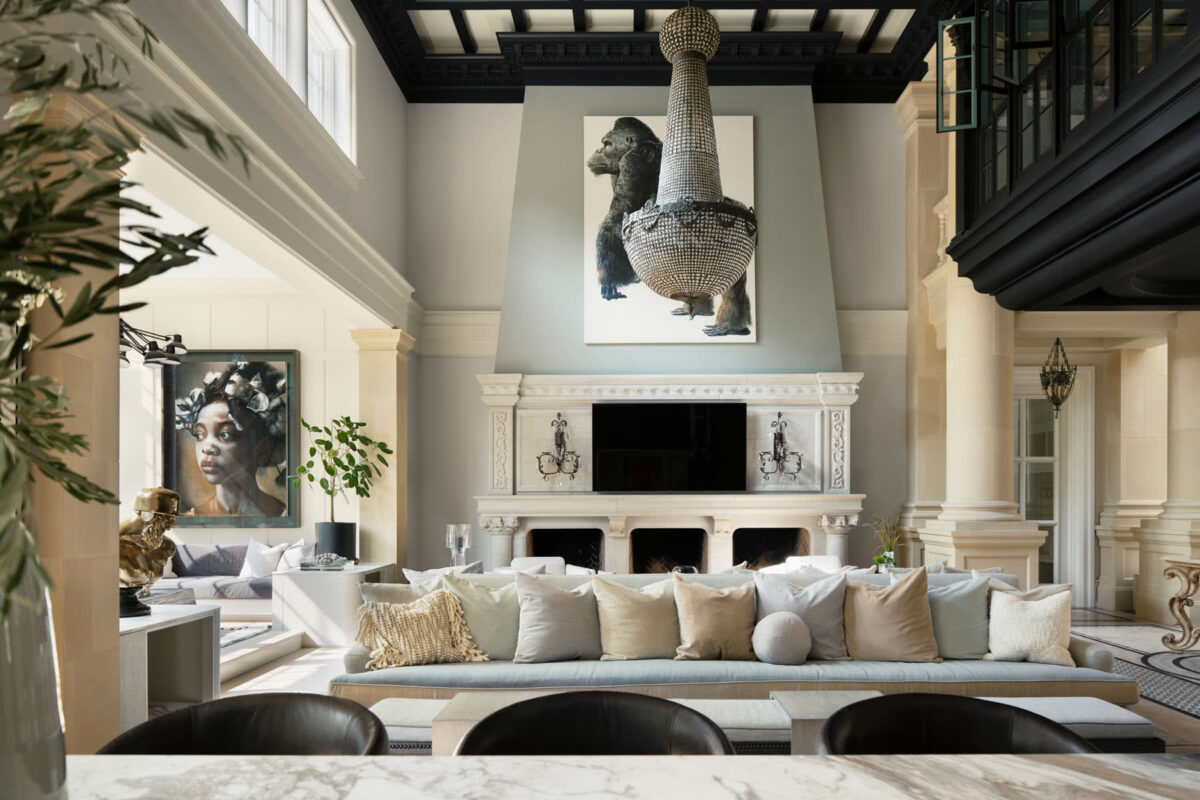
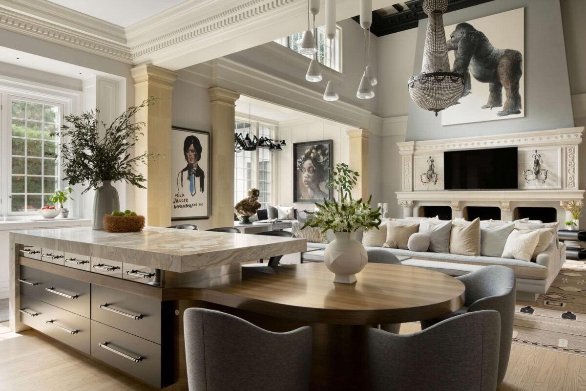

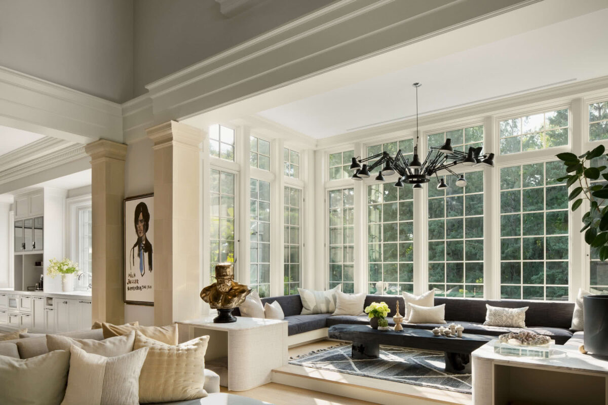

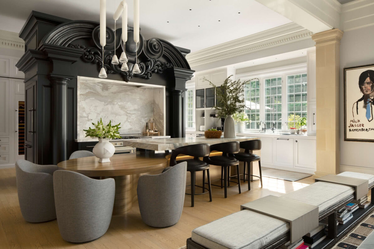
The kitchen is elaborate, sculpted, yet functional: the back, a pantry space for caterers; the front for daily use. We sketched the sculptural elements, realized by old-world style woodcarver Konstantin Papadakis.

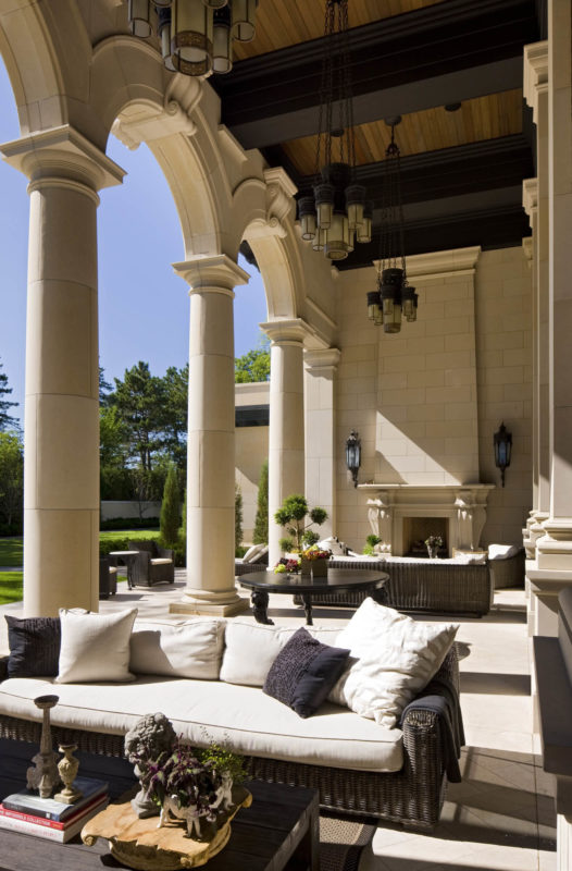
The rear loggia overlooks a picturesque, Italian garden-inspired landscape. Tall arched openings provide full views into the grand salon. Each traditionally set keystone weighs over a ton.
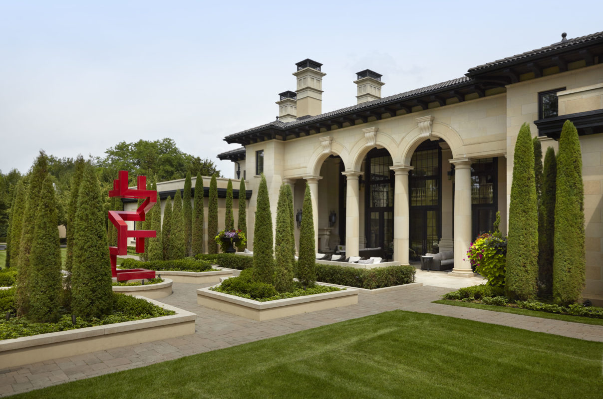
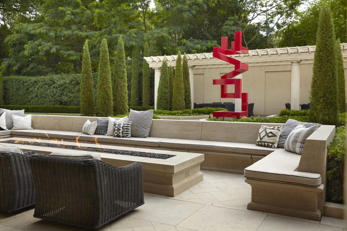
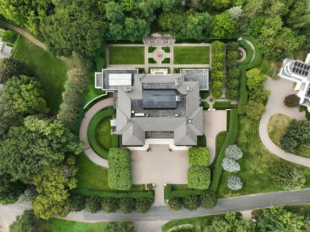

The large courtyard follows the Italian tradition, harkening back to a time before cars. The home’s elegance springs from combining a simple, graceful, symmetrical form with richly textured, deeply profiled details.
Italian Villa
Edina, MN
See the architect discuss this project
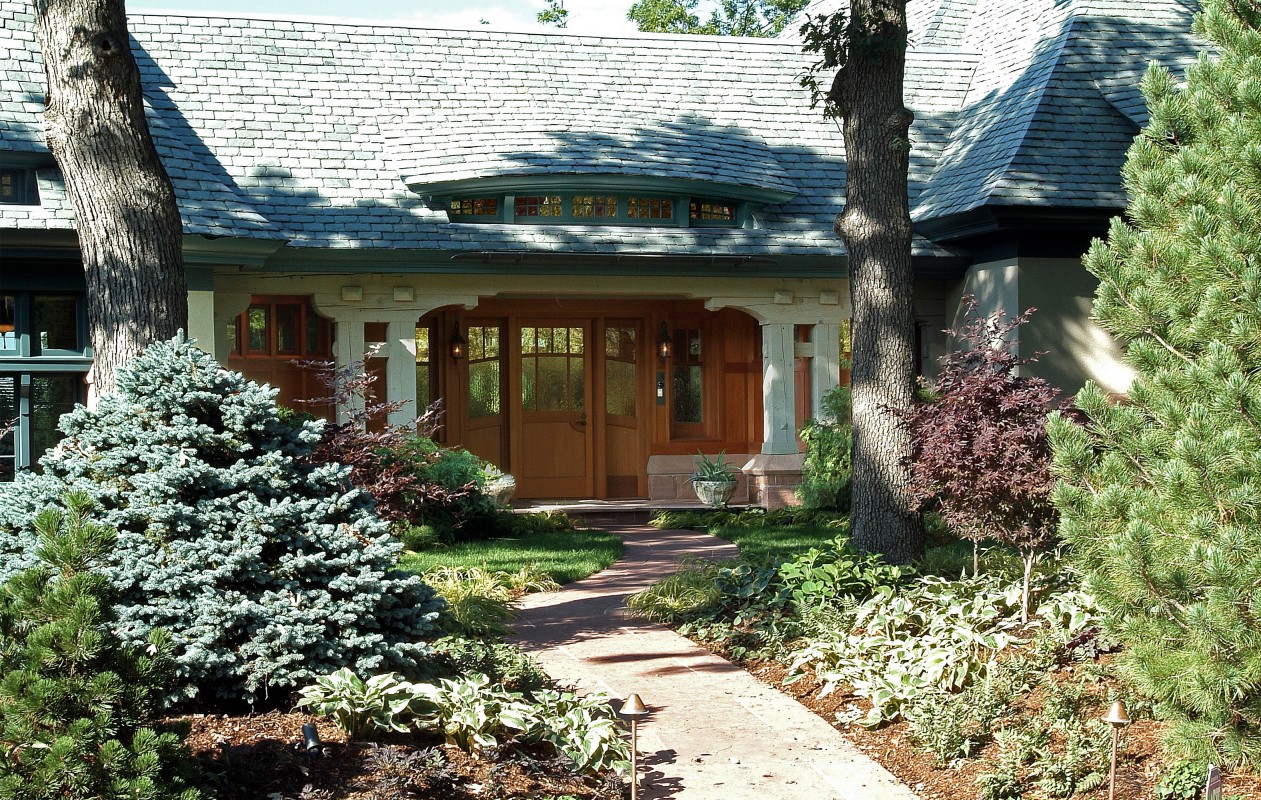
The homeowner wanted an architecture of substance and quality that didn’t feel flashy or ostentatious.

Eyebrow windows and curved walls add a sensual fluidity and grace to the strong forms.

Described simply, every great home is part “tree house” and part “cave,” providing both vistas and secure retreats.
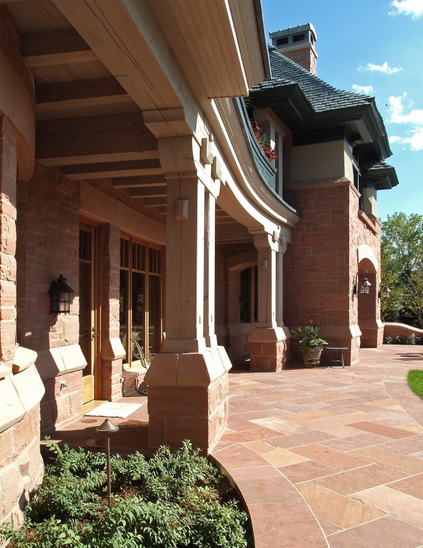
The wedge-shaped lot inspired a subtle curve in the design with “arms” that embrace the backyard.
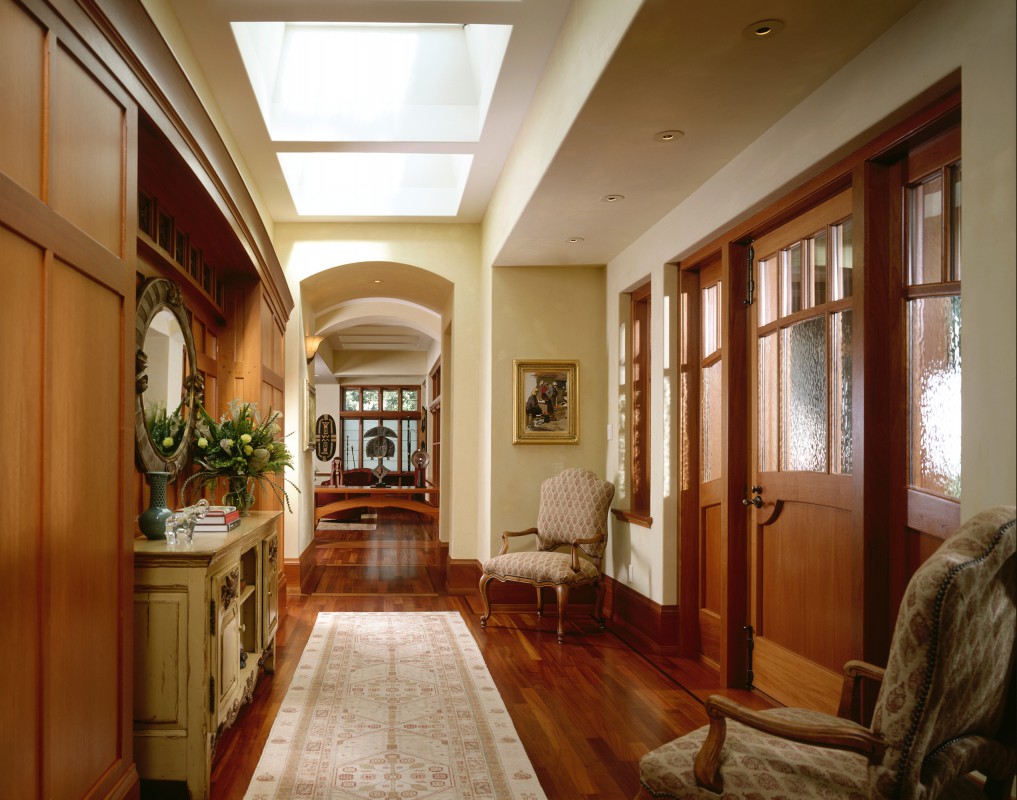
A flat roof zone with skylights—unnoticeable from the exterior— fills the interior with natural light and lifts the eye.

The main floor was designed to showcase the homeowner’s large African art collection: art to hold art.

The art itself becomes part of the architecture—making walls from open air.


Highly designed and detailed millwork by TEA2, beautifully executed by Siewert Cabinet.
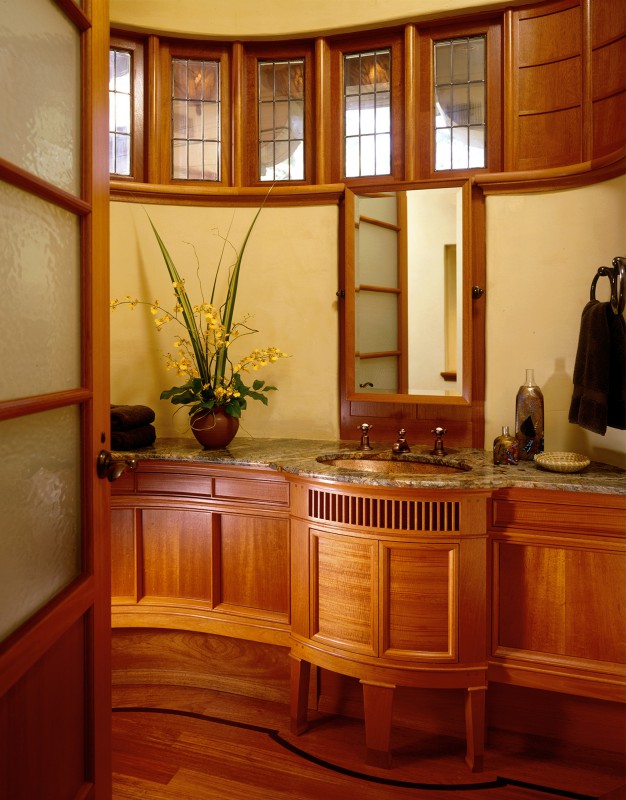
Creating detail and character without being slave to an old style can be a challenge. Here, cabinetry and vanities feel historical, yet fresh.
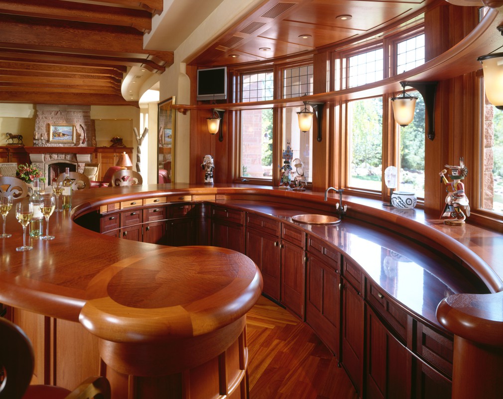
The bar design maximizes seating and allows a view. Careful research and testing led to a natural looking, wineglass-resistant wood finish.

A lower level that feels nothing like a lower level.

The home was featured in Architectural Digest. Pleased with the end result, the homeowner requested we design a second home.
Edina Arts & Crafts
Edina, MN

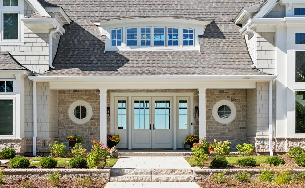
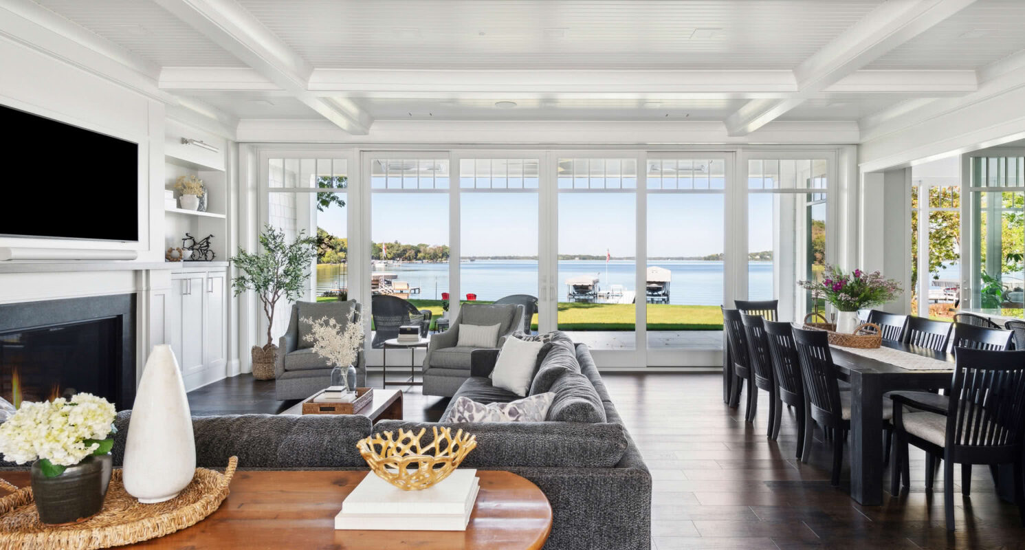
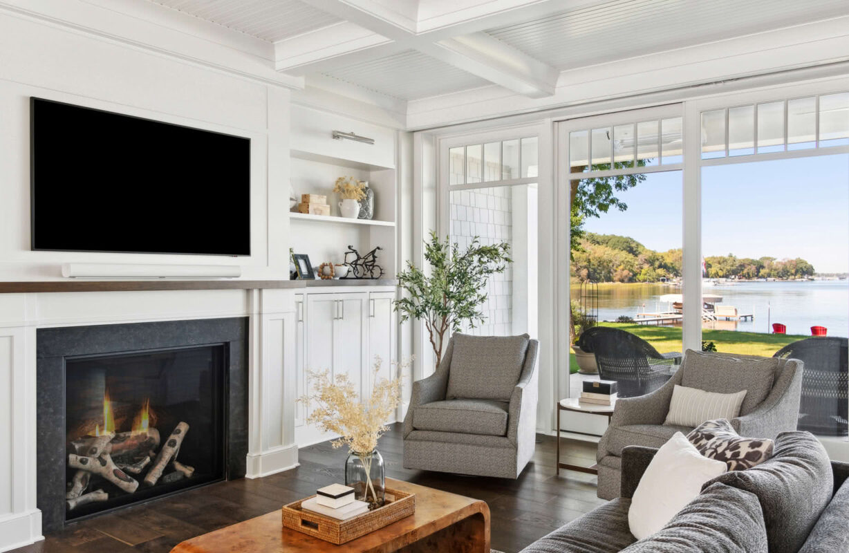
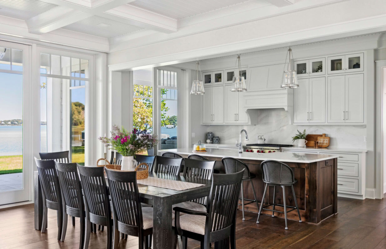


Nantucket on White Bear Lake
Mahtomedi, MN

Modern English Cottage, Roanoke, VA
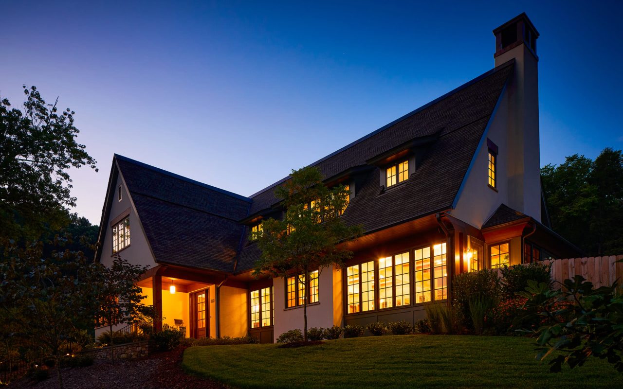
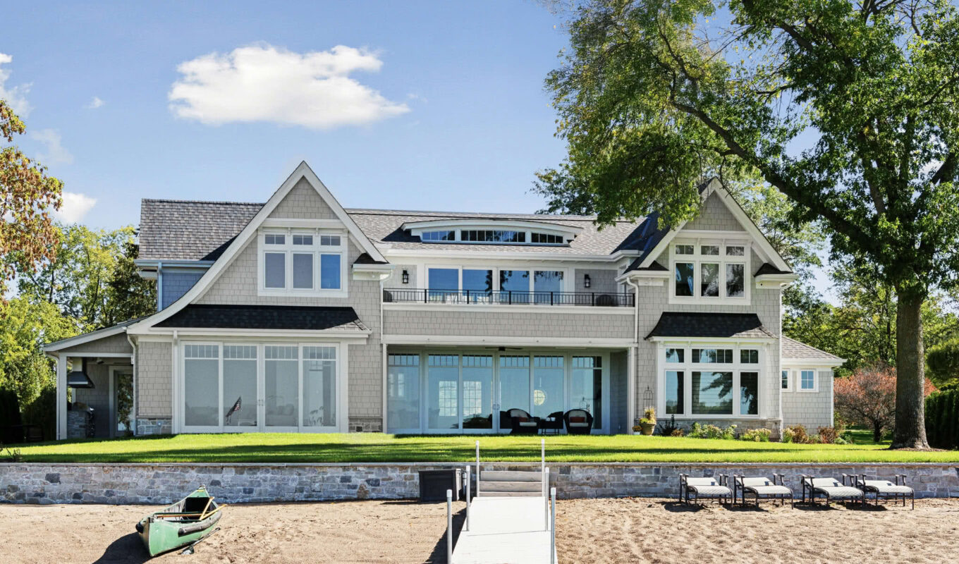
A home that fits in a traditional, established neighborhood, has modern sensibilities, and provides wonderful light and views. Our design took inspiration from the pared-down palette and style of the English Arts and Crafts movement.
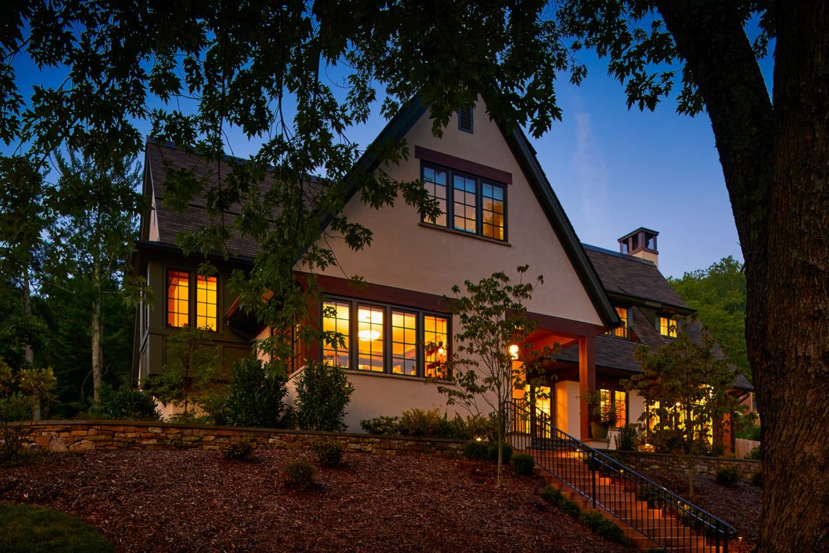
Simple forms and careful proportions create a striking presence when combined with details born of purpose: timber headers, stone, window groups, etc. By limiting the showy details, each becomes more special while being cost-efficient.

The corner library gets a prime location. A reading nook, perched high above the street, is as inviting from the outside as it is from the inside, and provides captivating views, north and east.

A closer look at the stair bay. While detailing in wood is more expensive than in stucco, we used it strategically throughout the project, creating moments of complement and intrigue.
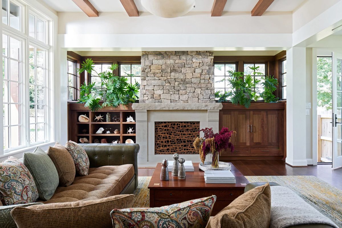
The family room is flanked by windows on three sides; the roofline is raised on the south to bring light even deeper into the room. Natural and painted woodwork lends a casual, timeless feel, and balances warmth and brightness.
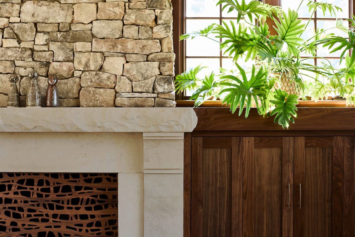
The right collage of stone and wood can anchor a room with inviting texture.
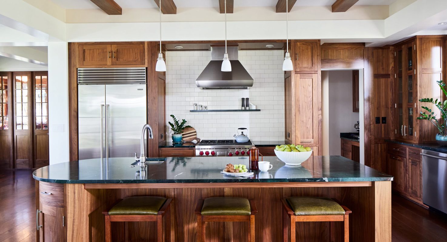
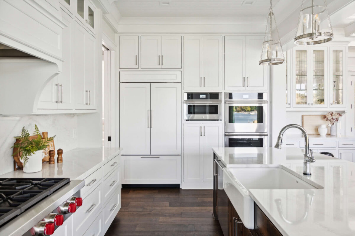
The kitchen is a warm bookend to the fireplace inglenook at the opposite end of the home. It is clean and spare, thanks to a hard-working pantry behind it. Small touches like the curved island-end provide flow and grace.

The dining area, between kitchen and family room, is also aglow with natural light. Beams and pilasters create the suggestion of individual rooms and add a coziness while keeping the space open and flowing.

The functional charm of the English Arts & Crafts style is evident in proportions, materials and styling throughout the home. Here, an everyday chore is transformed into a little getaway with a view.
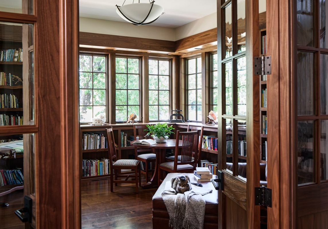
For these book lovers, the library was a high priority. But this is no dark, tucked-away den: The glass-wrapped corner animates the woodwork and the entire room, with French doors inviting you in.

Built-in corner seating, ample natural light and multi-directional treetop views make this bay on the stair a great little getaway.
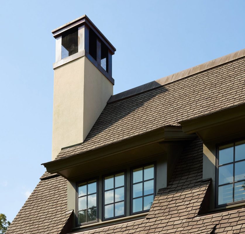
The scale of new homes within older, established neighborhoods is frequently too large. To create the right scale and charming form, we often design living space within the roofline — with carefully balanced dormers, half set in.
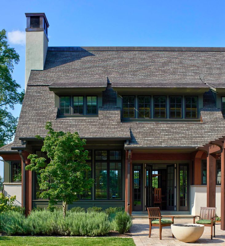
The southern, backyard side of the home is filled with glass while still maintaining the historic sense of form. The family room glass has transoms above, provided by the subtle “lift” of the roof.
Modern English Cottage
Roanoke, VA


Shingle Style Reimagined
St. Paul, MN


Situated in a ravine with a creek just yards away, this home required careful engineering and innovative design, including breaking the home into pavilions.
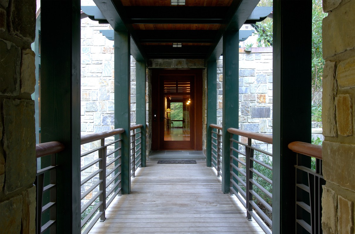
Having multiple pavilions—these connected by a walkway—opens up multiple views, and allows water from volunteer springs to flow down the hillsides unimpeded.
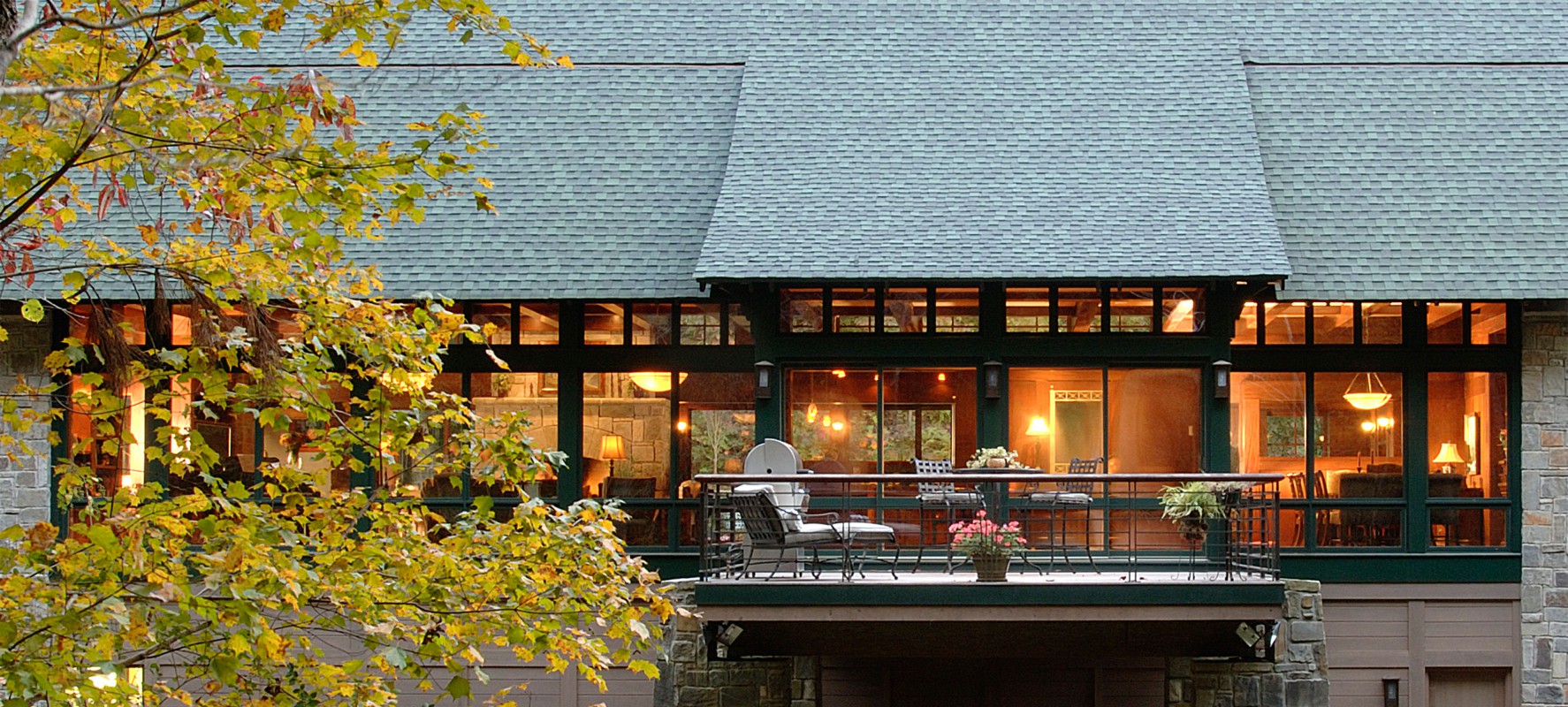
Nestled between steep cliffs, every bit of available light was leveraged. Here, main living areas share a wall of glass for an expansive view of the bluff across the river.

Civil engineers were enlisted to calculate potential water load, and a drain system built under the entire house. The 100-year flood that came after completion left it unharmed.

The pavilion on the left houses an office studio and five bedrooms, the master looking out over the picturesque ravine.
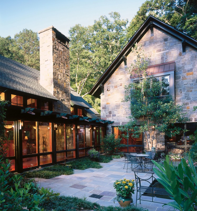
The house wraps a stone courtyard, creating a cozy, outdoor room. With sunlight at a premium, clerestory windows bring in southern light and a view of the steep hillside.

The kempas wood floor and suspended mahogany beams bring more of the outside in. Window walls on two sides bounce light about the main living pavilion.

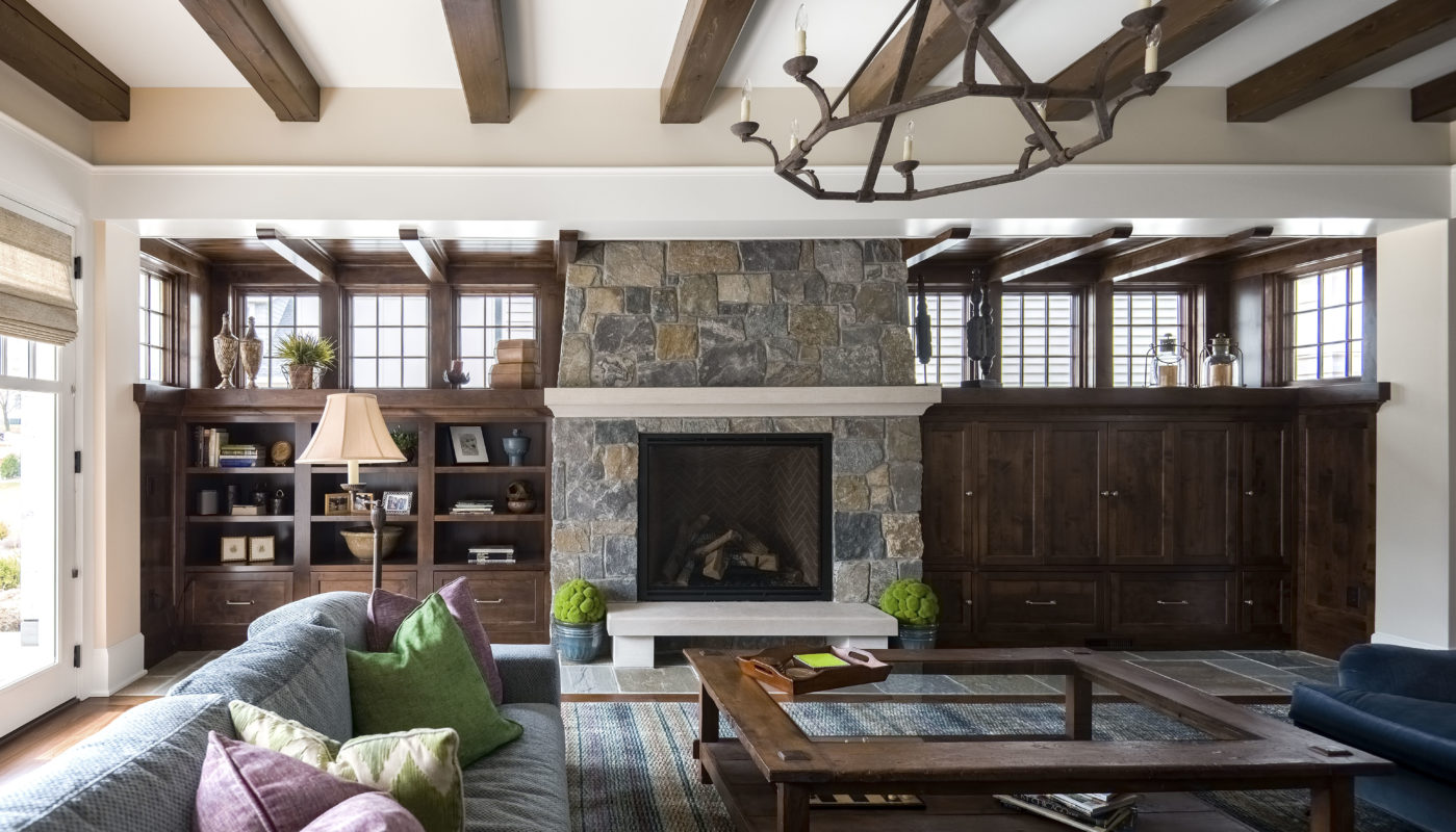
The homeowners wanted a warm, Frank Lloyd Wright-ian vibe—created with a central limestone fireplace, geometry of beams and windows, wood, and distinctive lighting.

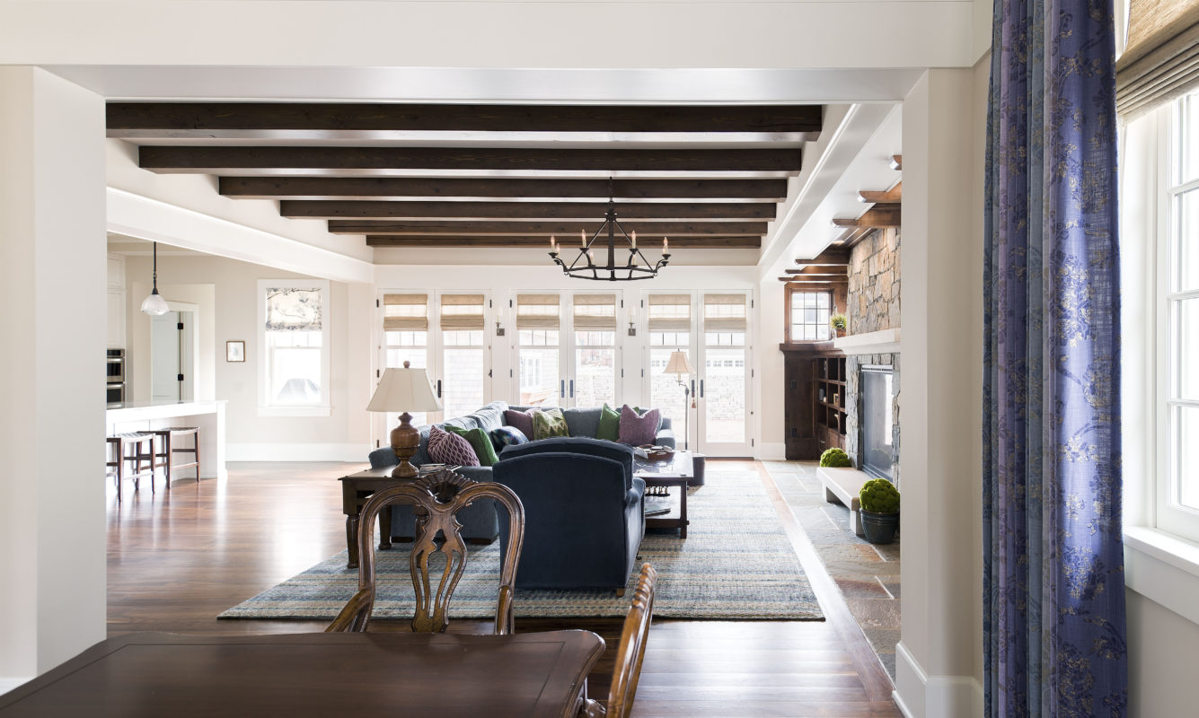
The progression of overhead beams connects living room, kitchen, and dining area. Windows at the rear of the pantry provide visual relief, seeing through to the other side.

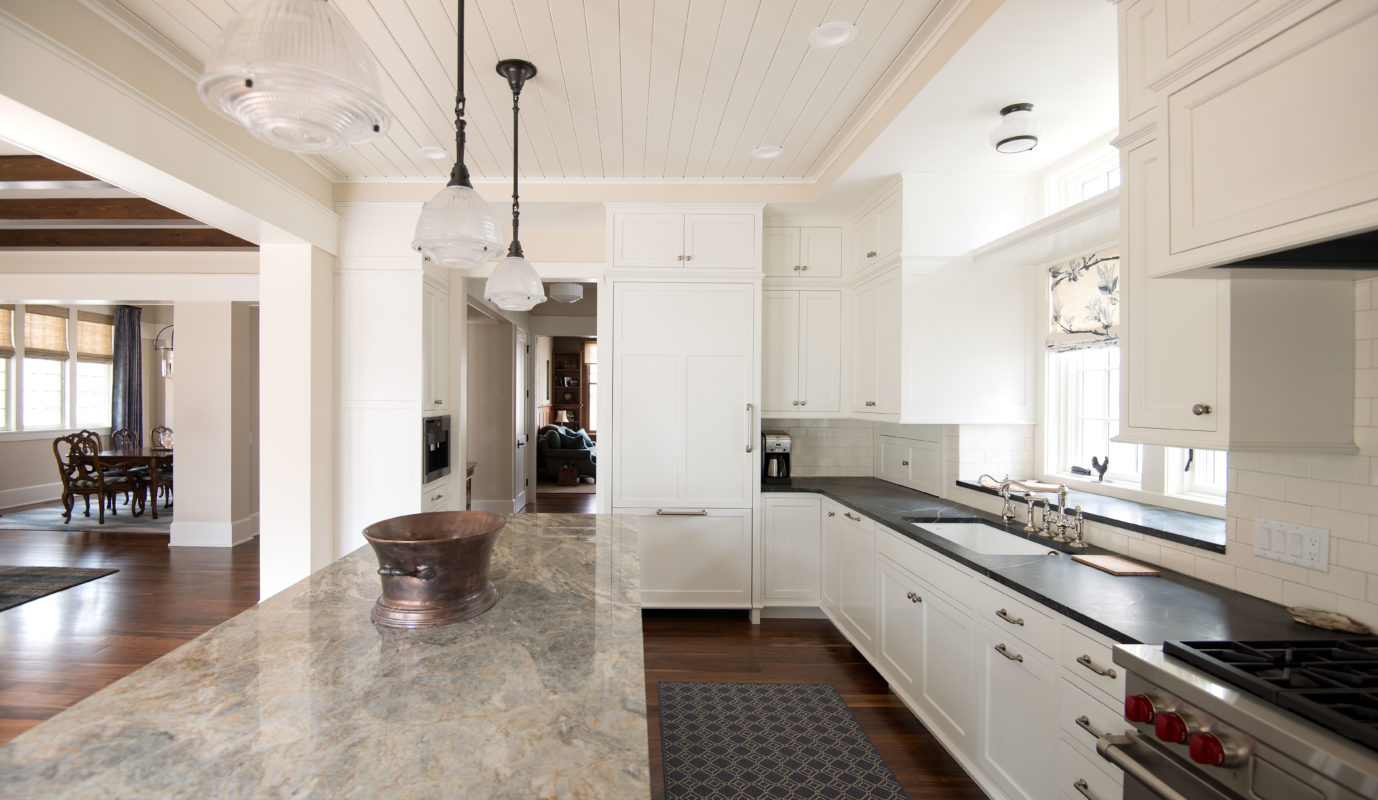
No gleaming white appliances here. The kitchen is as anchored in wood and warmth as the rest of the home, while bringing in light and offering views on both sides.

The creek bends around the knoll where the house sits. A bay window provides an arresting view down the long axis of the creek and ravine.
Bluffside Home
Mountain Brook, AL